
Stroopfabriek Borgloon

Cover of an information brochure.
Loonse Stroop is a regional speciality from Borgloon, a city in the Belgian province of Limburg. The syrup was originally cooked at home, from the locally grown apples, pears and other fruit. After a factory was founded in 1879, making stroop became an industrial activity, and by the beginning of the 20th century, Borgloon was the center of the syrup production. This industry eventually came to an end in 1988, and the former factory was made a protected monument. Since 2017, the renovated Stroopfabriek houses a “fruit experience center”. The exhibition with its interactive modules allows kids of all ages to get to know everything about fruit and its processing.

The Stroopfabriek has a shop with regional products, including buckets of original Loonse Stroop.
The typeface chosen for the visual identity of Stroopfabriek Borgloon is Los Feliz. This peculiar design started out with photos taken by Matt Tragesser in Los Angeles:
I happened to find a place called LOS FELIZ AUTO PARTS & SERVICE. The letters painted on and around this business were fantastic. It was the kind of typography that some people call crude, but it wasn’t crude at all. A lot of care was put into each letter. The lettering exhibited several artistic flourishes – the kind that someone who went to design school just wouldn’t think of.
When type designer Christian Schwartz saw these pictures, he –
realized it was an excellent time to take everything I’ve learned and turn it inside out to ask myself “If I didn’t know what I was doing, what would I do?,” and to forgo tradition in favor of expressiveness.
Los Feliz, “an experiment in balancing typographic convention with hand-drawn exuberance” (Tragesser) was released with Emigre in 2001. Read the whole story in the specimen pdf.
Via Armina Ghazaryan.

The windows of the visitor center are decorated with fruit-themed sayings, in French, Flemish (Dutch), the local dialect, …

… and in English.
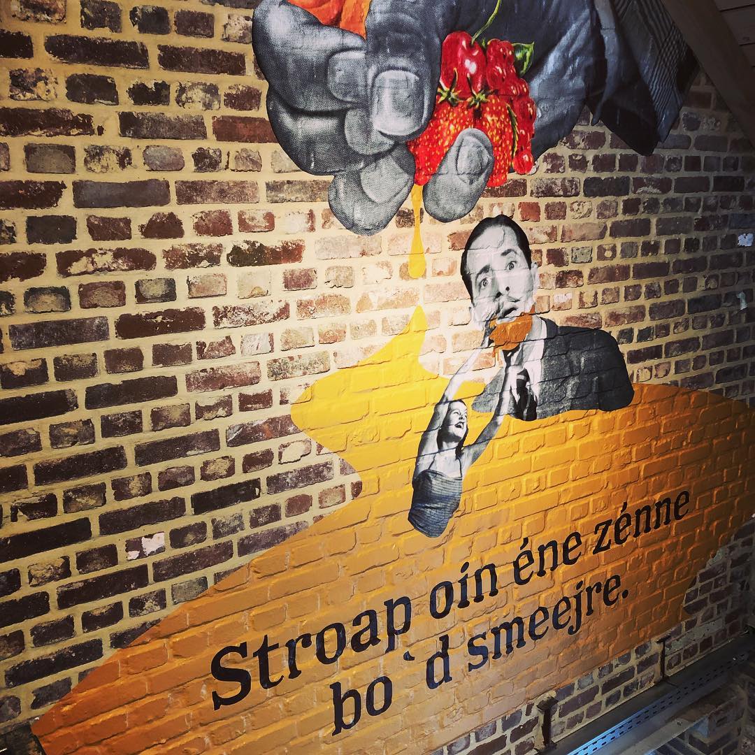
Los Feliz also appears in a hand-painted rendition on the walls of the exhibition room, coming full circle.

Visitors can customize the labels and add a (pet) name.


")


")


")


