Razorfish identity and website
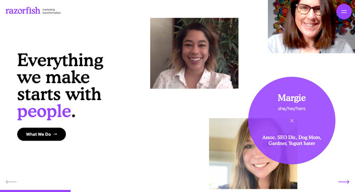
With over 1,400 employees and 15 locations across North America (as of December 2020), Razorfish is one of the world’s largest interactive agencies. The company has been acquired multiple times since its founding in 1994. In January 2020, the agency rebranded as Razorfish, returning to its original name after four years as Sapient.Razorfish.

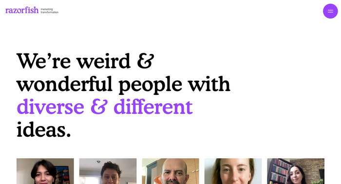
The logo is in all-lowercase Cooper BT Medium (Bitstream’s digital extension of Cooper Black) with a custom ‘o’ that accentuates the angled stress in the original typeface. Unfortunately, it’s too light. The ‘i’ dot is also dropped and reduced, presumably to keep a safe distance from the ‘f’. With the ‘r’ on its other side, and the logo’s tight spacing overall, the ‘f’ is uncomfortably distant from everything. I guess one could rationalize this as 1970s-style tight-not-touching spacing, but some more thoughtful type modification — or entirely custom lettering — would result in a more cohesive mark.
Beyond the logo, Cooper plays a central role in Razorfish’s visual identity, including the corporate website and social media graphics. This extensive use by such a high profile multinational firm is further proof that the web design trend toward friendly, expressive serifs (and away from geometric sans serifs) is reaching the mainstream.
In general, Razorfish’s new look does a decent job riding the soft, warm wave of new tech typography. That said, while Bitstream’s Cooper is ok, if I was giving an old brand a new voice I would consider brand new type. There’s no shortage of contemporary reinventions of this subgenre, such as Doyle, New Kansas, and if you’re feeling especially lighthearted: Gooper.

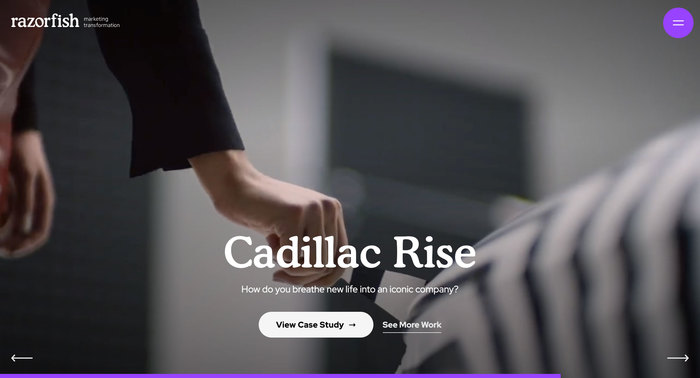
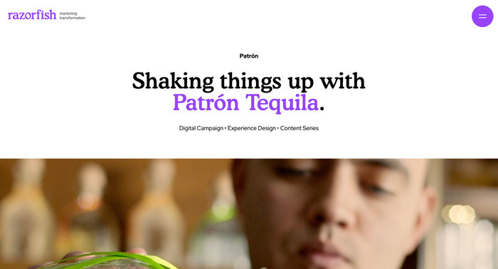
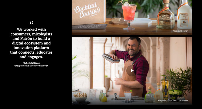
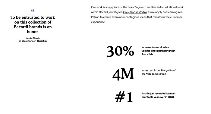
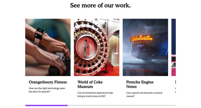


Social media profile banner with a straight apostrophe ('), sadly missing the curvaceous warmth of Cooper’s true apostrophe.
Formats
- Web (4537)
- Branding/Identity (6664)
Topics
- Services (1223)
- Graphic Design (2588)
Designers/Agencies
- Razorfish (1)
Tagged with
- purple/violet (300)
- all lowercase (760)
- logos (3874)
- PR/marketing agencies (41)
- critique of use (83)
- modified typeface (1465)
- tight-not-touching (251)
- type in a circle (502)
- social media (683)
- portfolios (617)
- redesign (530)
- all lowercase logos (346)
Artwork location
- United States (8300)
- New York City (2329)

