OOSA
The United States women’s national soccer team (USWNST), to this day, is the world’s most successful female team. And it plays a significant role at promoting this sport in its home country.
Nevertheless its team members still face worse conditions than their male counterparts. But the ladies’ Players Association is fighting back. It battles for equal pay as much as for equal conditions in tournament facilities and for the inclusion of LGBT communities into their sports.
To raise awareness for the team and its strifes, the players commissioned a new branding for their association from Prophet, an internationally operating consulting firm with integrated design companies.
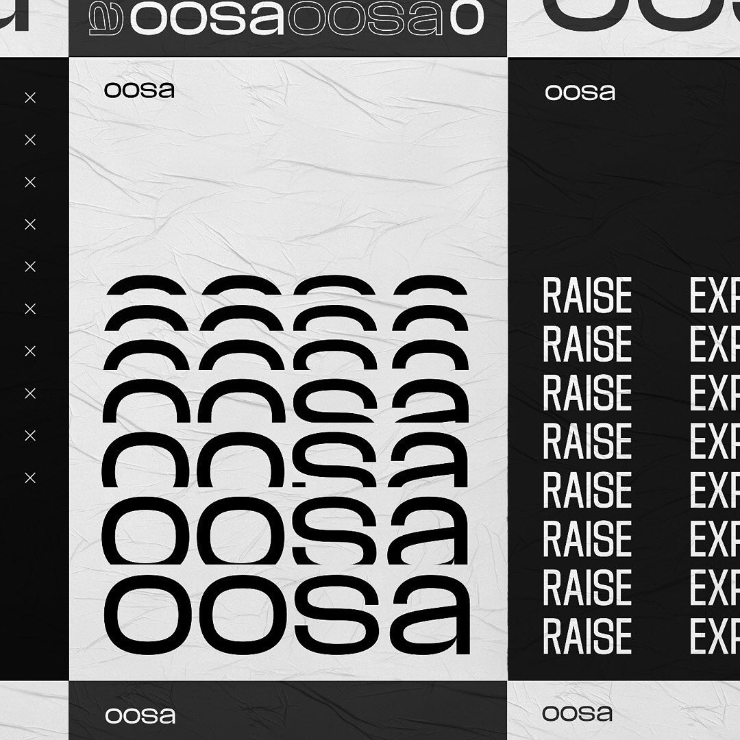
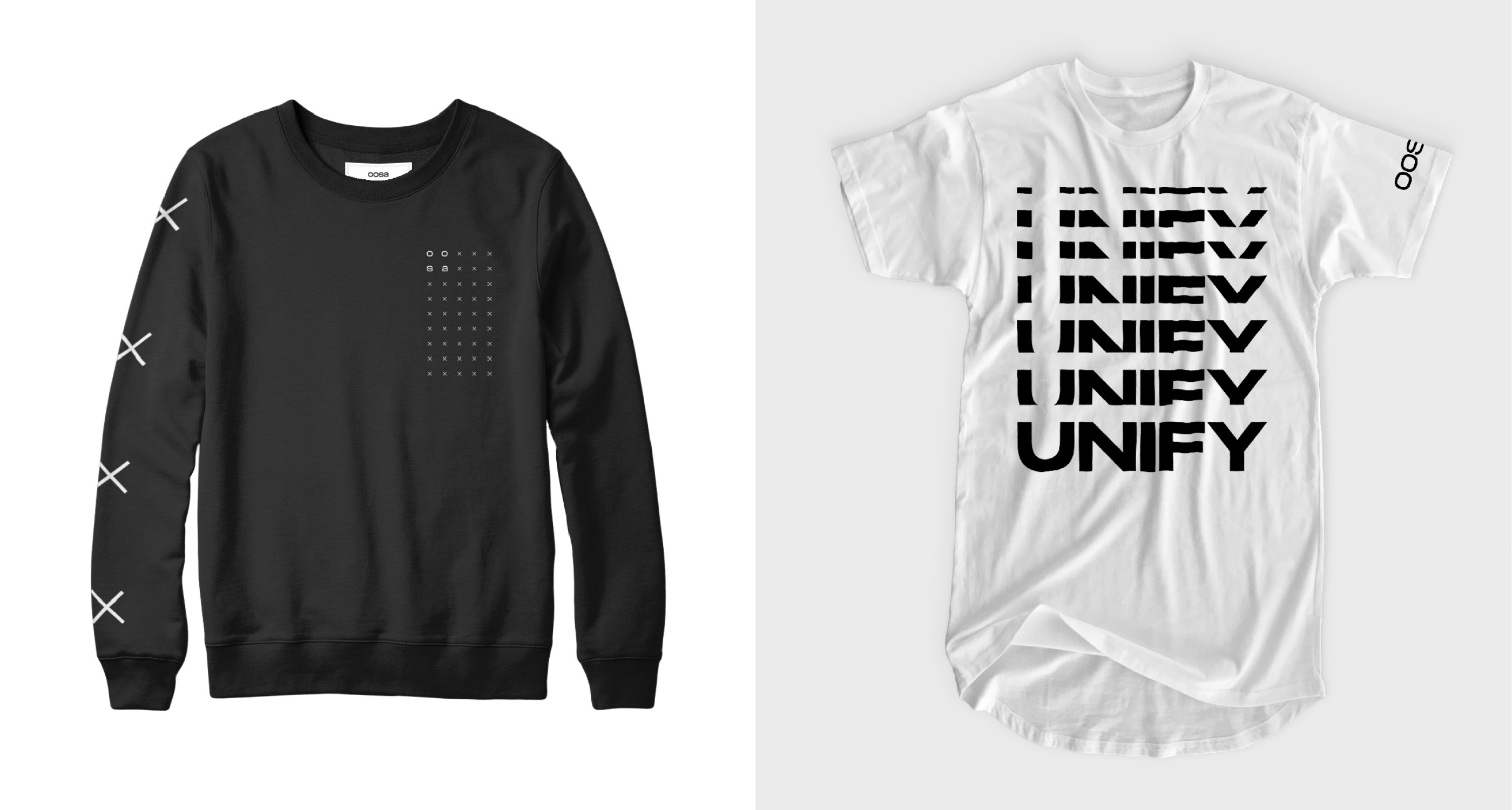
The concept and visuality was developed by a team of players, strategists and designers in the run-up to the 2019 Women’s World Cup in France, which they eventually won. The central element of the branding is the chant famously staged by the team at the start of each game: OOSA, OOSA, OOSA-AHH.
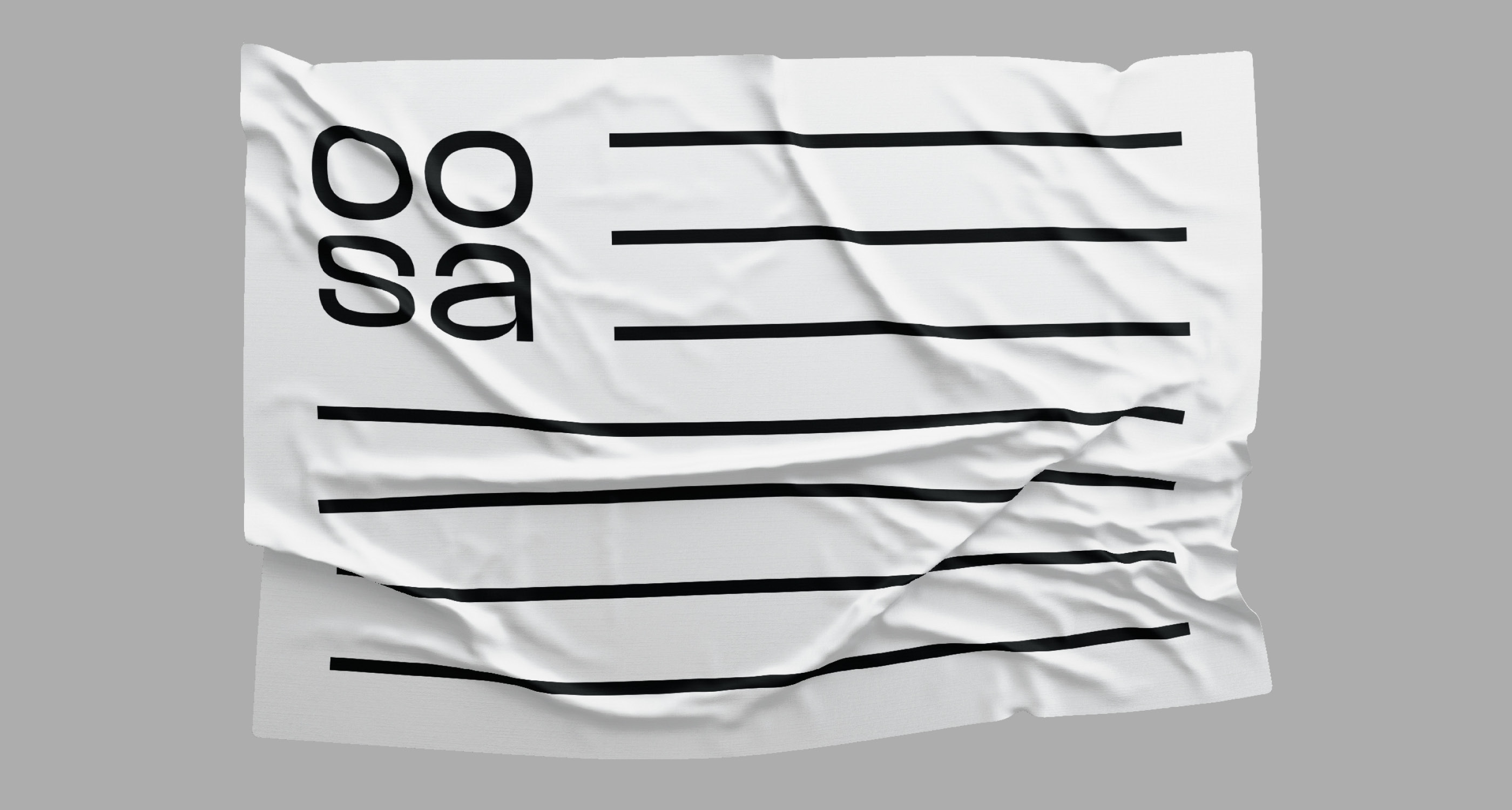
The design is unconventional in that it fully relies on black-and-white. This way, it marks a clear difference to what you see elsewhere in sports communication, and it avoids that certain cheesiness that might occur with saturated colors. Instead it intelligently picks up on established visual topics like the waving flag but infuses it with a stark graphic language in which stars are replaced by crosses, and stripes are translated into black lines.
Most of the artwork reflects on the dynamics inherent to sports. Where the medium is still, the graphic design will emulate motion, for instance through the repetition of a word, thus pointing back to the rhythm of the OOSA chant.
Two typefaces are in use here that could hardly be more opposed in style. On one hand we have Respira Black, a contemporary blackletter designed by Lucas Sharp. It sends its underground indy waves in few and well-chosen spots. On the other hand we see the more sober and rational Media Sans in a variety of cuts from condensed to extended, designed by Production Type’s Jean-Baptiste Levée. Media Sans is a self-confident display typeface with squarish curves that will certainly make its voice heard.
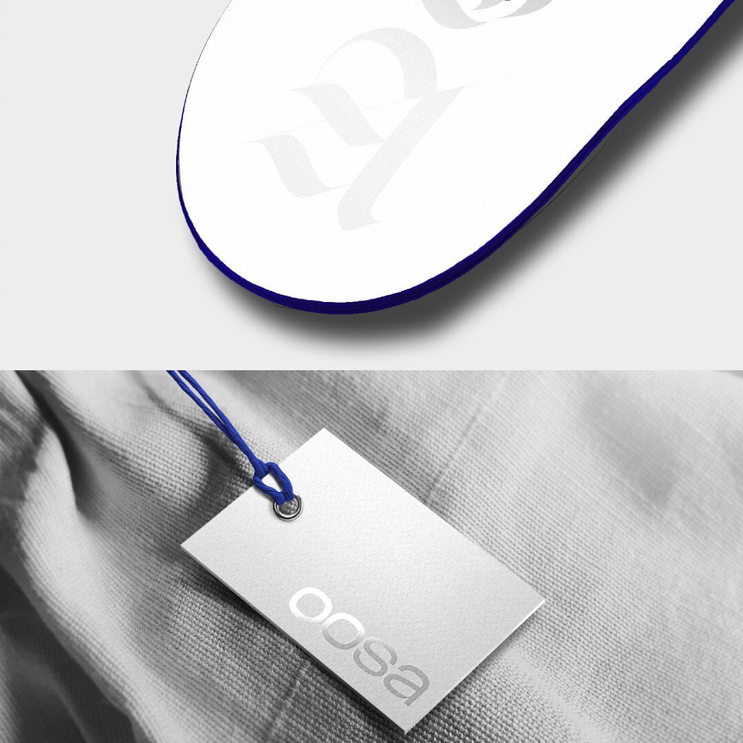
Throughout the visuals it is predominantly used in all caps, but interestingly the main act of the campaign, the OOSA logo, is set in all lowercase. Yet another refreshing choice that makes this design stand out from the big bulk of sports marketing.