
Kerning Conference, Faenza (I), 2–3 May 2013
Contributed by Florian Hardwig on Apr 26th, 2013. Artwork published in
.
Source: www.kerning.it License: All Rights Reserved.
Posted as part of a little survey about websites for conferences on typography and graphic design – how do these specialist events present themselves typographically, in 2013?
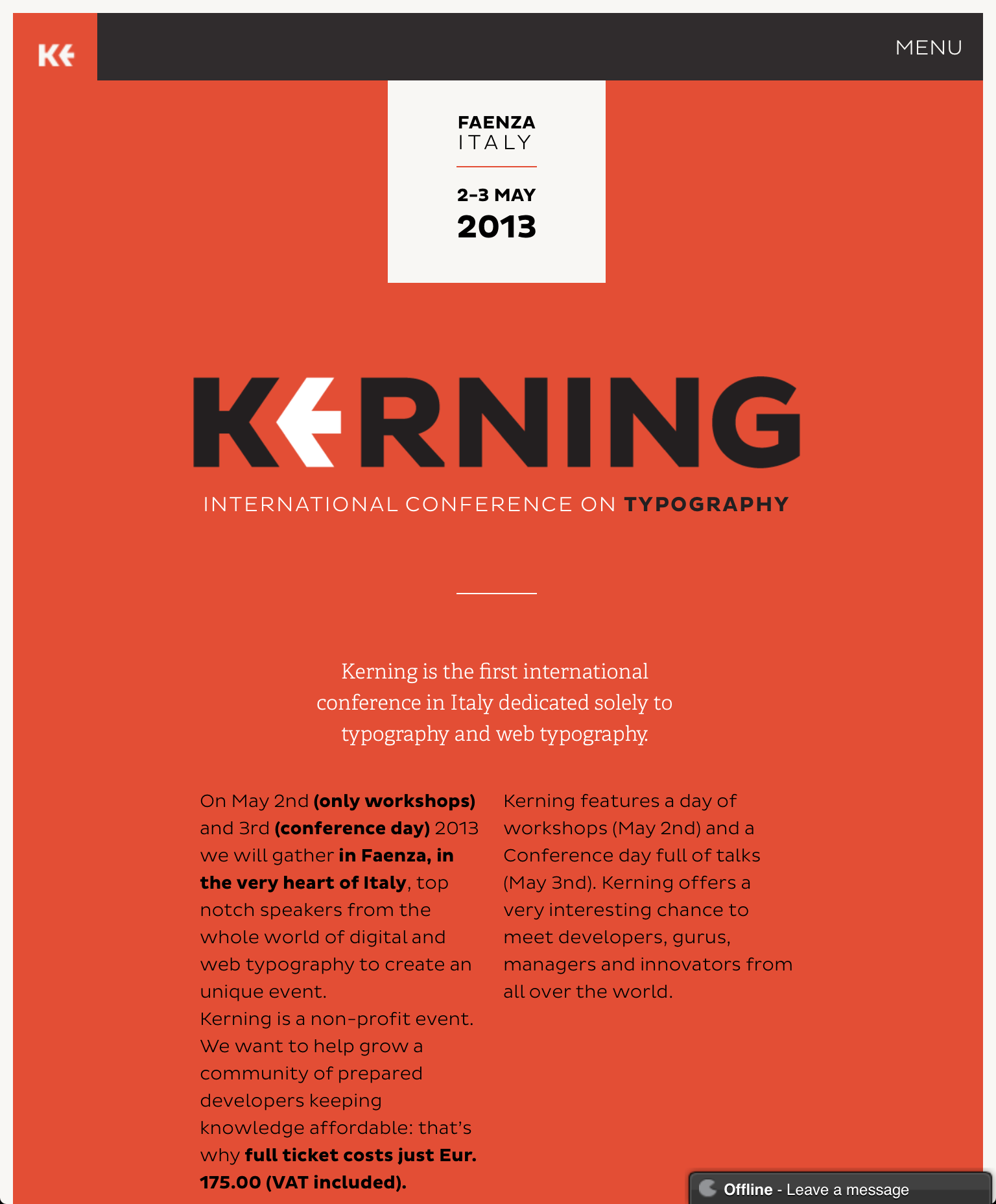
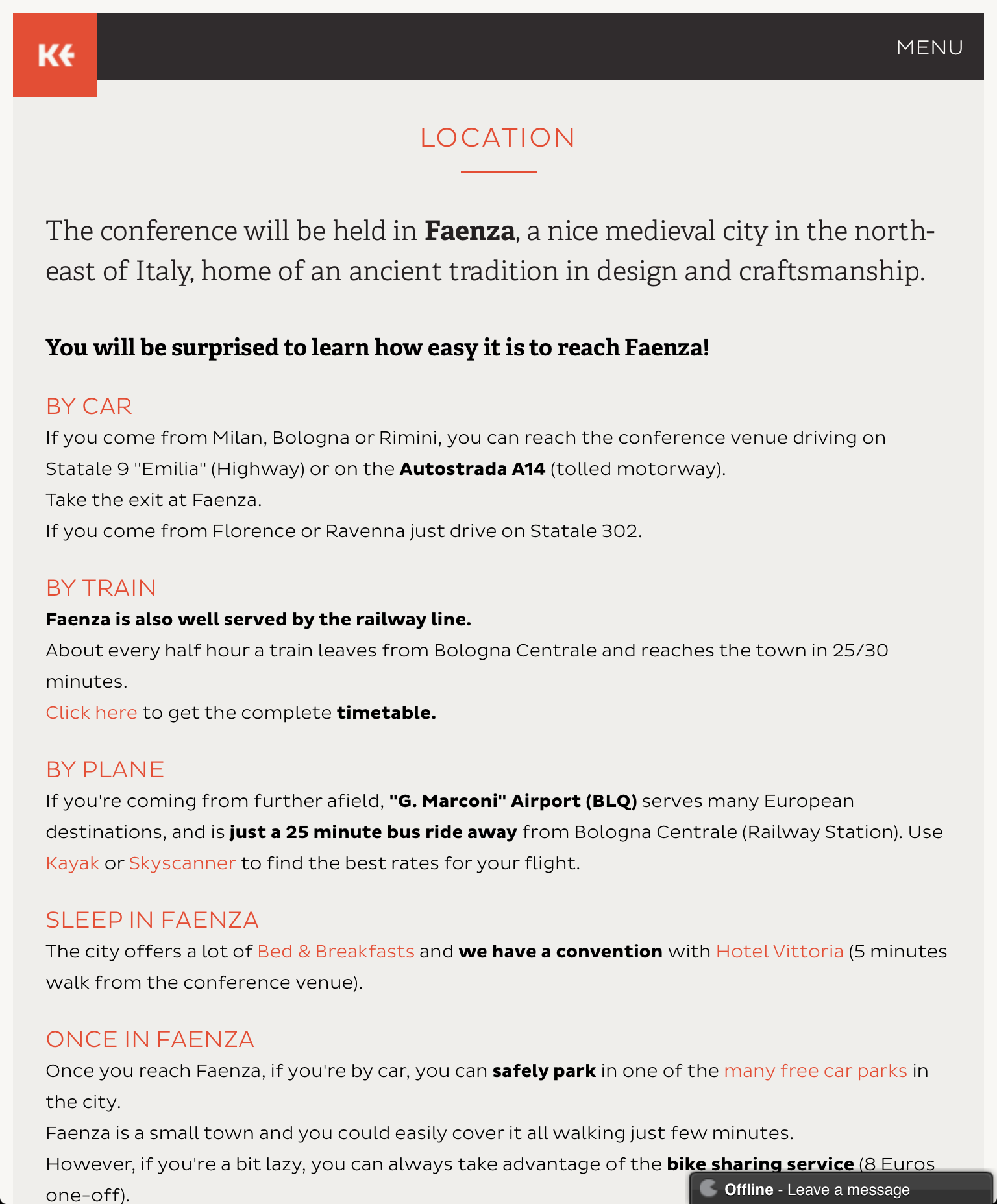
The Kerning website is strongly branded in red and black and a contrasty pair of fresh typefaces: the wide Pluto Sans (sometimes a little light) and the seriffed Adelle (sometimes quite heavy). The layout is responsive. The feedback thingy on the bottom with its gradient speech bubble quickly gets annoying and almost ruins the experience.
Webfonts: ✓ (4 styles via Typekit)
Designer credits: ✗
Typeface credits: ✗
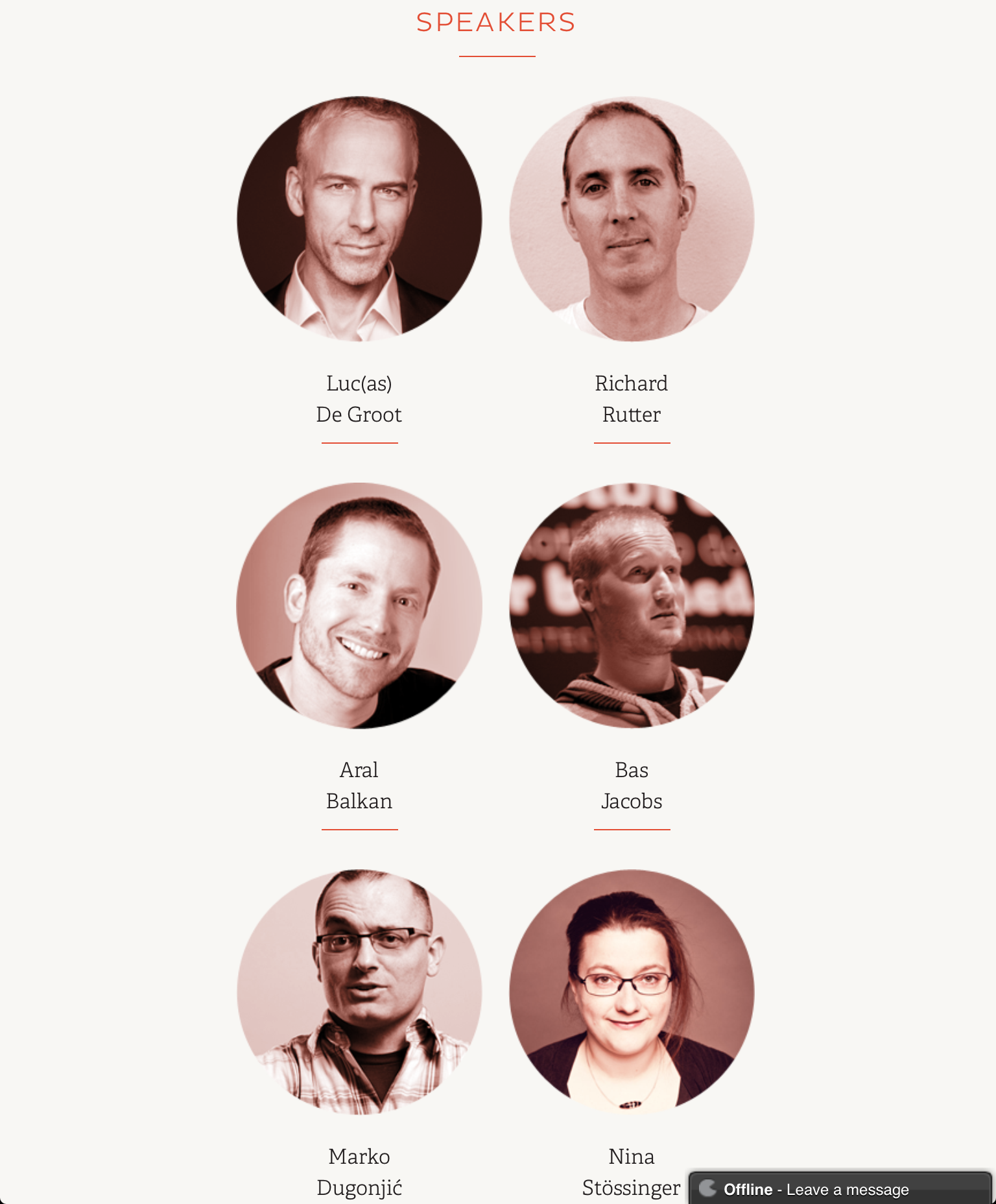
Source: www.kerning.it License: All Rights Reserved.
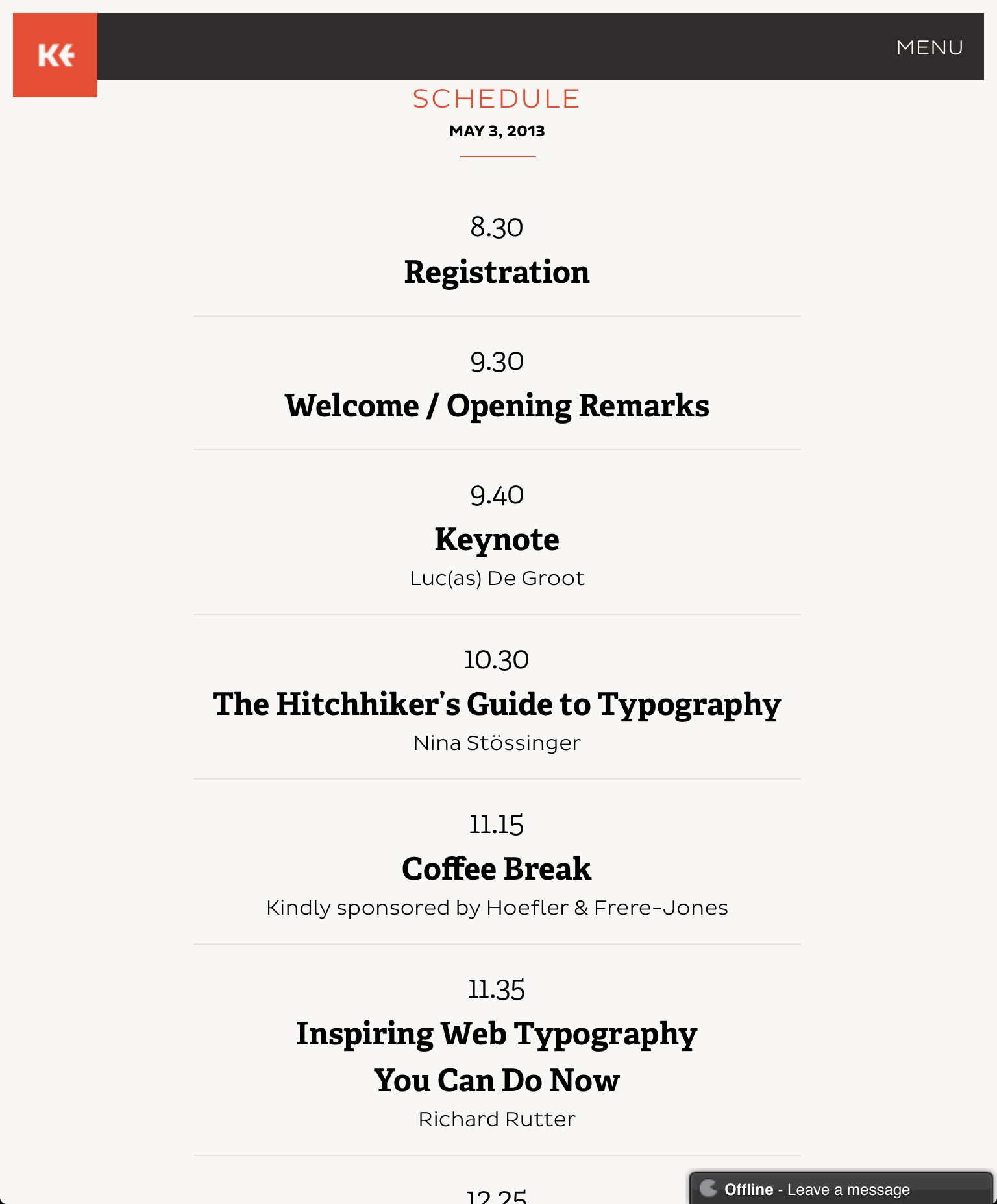
Source: www.kerning.it License: All Rights Reserved.
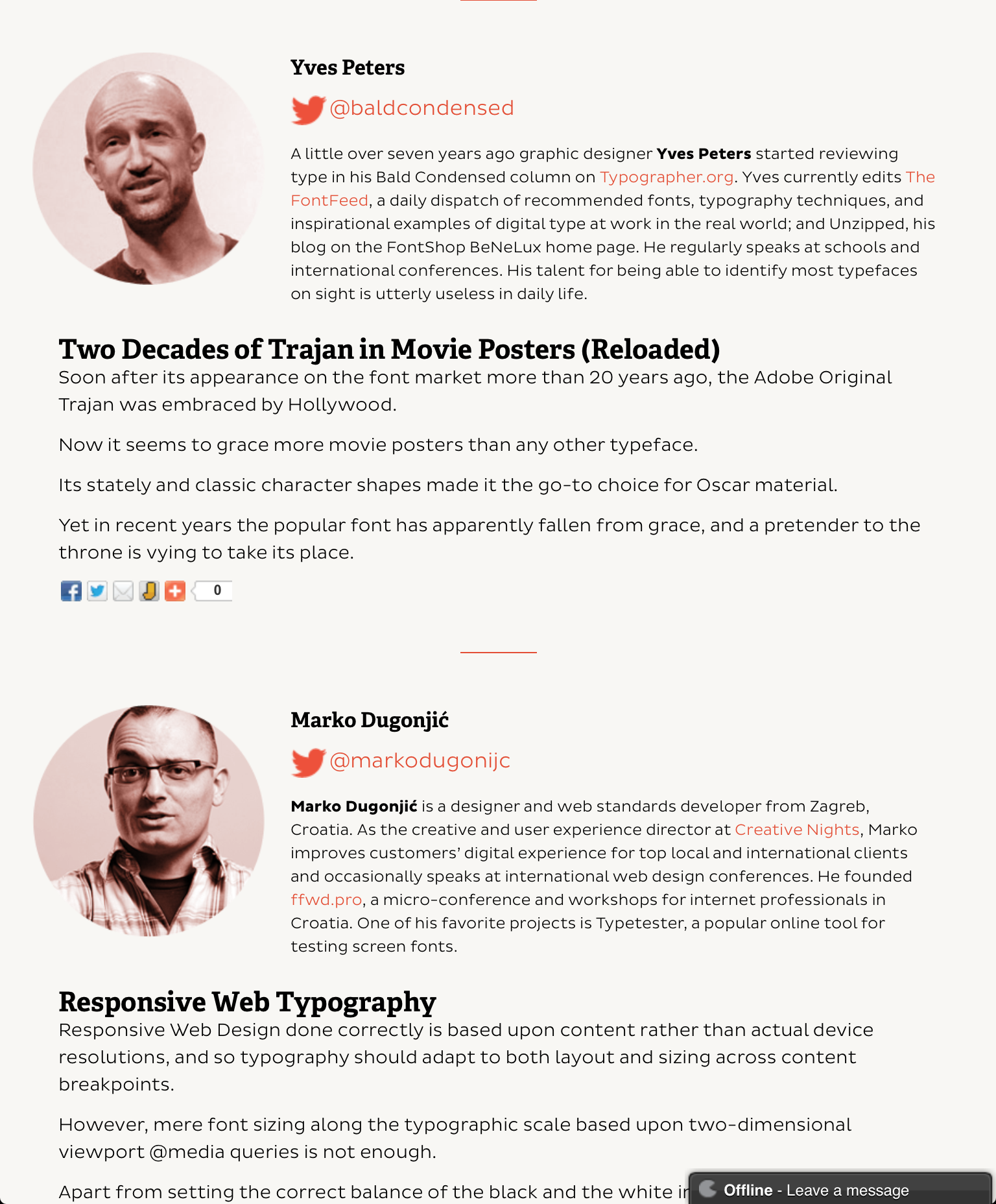
Source: www.kerning.it License: All Rights Reserved.
Source: www.kerning.it License: All Rights Reserved.


3 Comments on “Kerning Conference, Faenza (I), 2–3 May 2013”
Credits: Brand Identity by Enrico Stradaioli, web design by Nicolò Volpato, HTML by Matteo Balocco
Thanks, Matteo. Added.
Yeah! Thank you! However we removed “the feedback thingy on the bottom”. :D