
A Rendezvous in Averoigne by Clark Ashton Smith (Arkham House, 1988)
Fantasy and science fiction books often represent a refuge for novelty typefaces, both for contempary ones and such of yesteryear. The first edition of this collection of short stories by Clark Ashton Smith is no exception.
The painterly face with pronounced horizontal contrast was issued in 1898 by the Berlin-based Berthold foundry and its subsidiary Bauer & Co in Stuttgart. Initially named Artistic, the spelling was soon changed to Artistik after the 1902 reform. It was probably the fact that Ludwig Petzendorfer included this anonymous design in his Schriftenatlas, Neue Folge (1903–1905) which gave Artistik a second lease on life. Sometime in the 1970s, Letraset rediscovered the Art Nouveau cracker, and issued an adaptation for dry transfer lettering in their Letragraphica range.
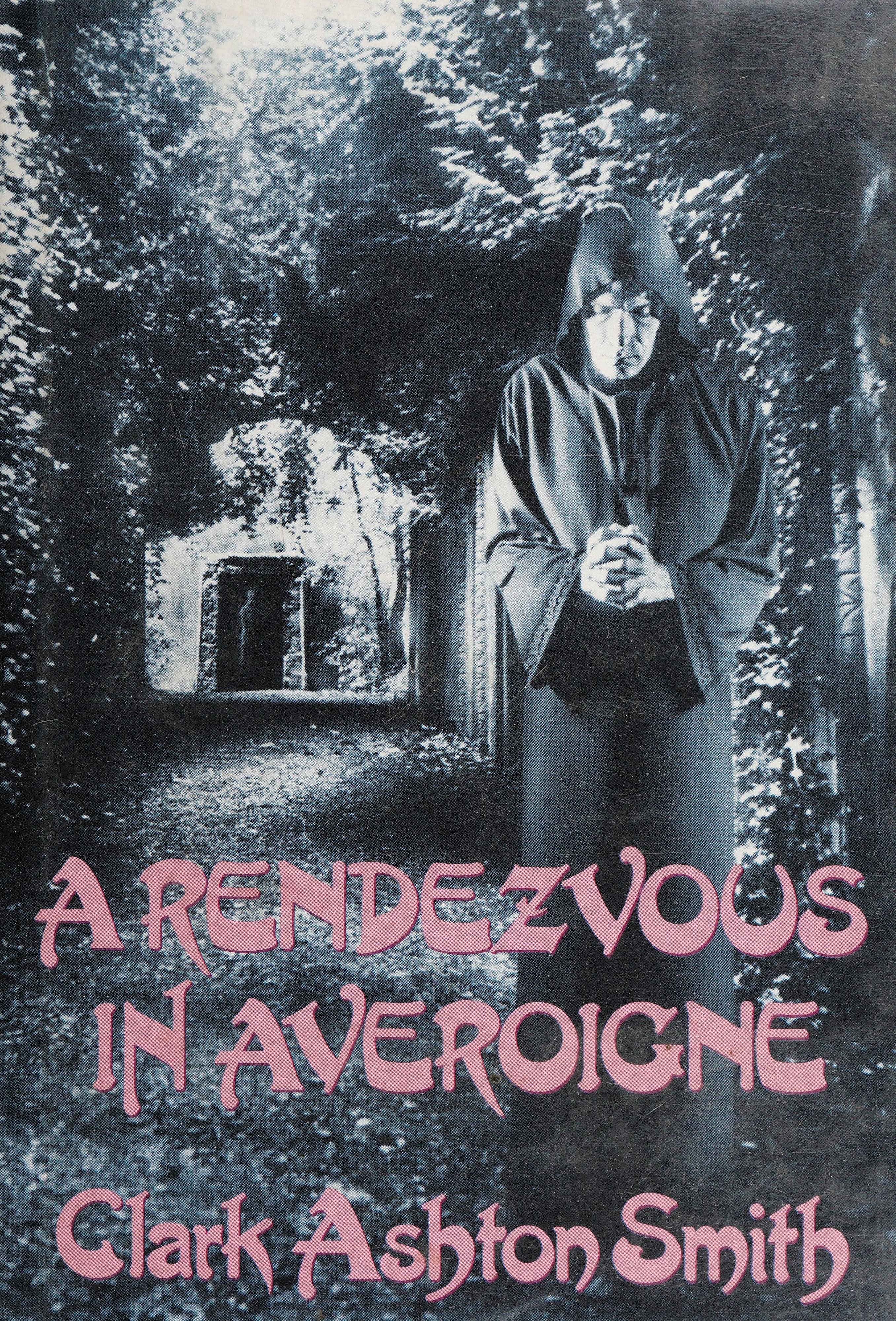
Artistik is used for all text on the jacket (even for the ISBN). It also features for the title page as well as for headings and drop caps in the interior. The text typeface is much more sober: It’s Jan Tschichold’s Sabon. A Rendezvous in Averoigne was published by Arkham House, Sauk City, in 1988, with an introduction by Ray Bradbury.

The book jacket was designed by Jeffrey K. Potter.

Title page. The title and the names on the typographic frontispiece are set in all caps, which is unbecoming for this typeface, at least with no extra letterspacing.

Contents and introduction.

Chapter title and drop cap in Artistik, with subchapter heading and running title in Sabon caps.


")

")


")


1 Comment on “A Rendezvous in Averoigne by Clark Ashton Smith (Arkham House, 1988)”
“Aufrichtigste Glückwünsche zum Neuen Jahre” (“Most sincere congratulations on the New Year”). Here’s how Bauer & Compagnie advertised Artistic in January 1899. Note the ch ligatures which, unlike the many alternates, didn’t make it into the Letraset version. One could assume that the typeface isn’t made for all-caps use. When it’s done as demonstrated by the foundry – with small caps (from a smaller size) and more letterspacing than on the book jacket, it can work out well.
Letraset credited the design to “Bauer”, which is misleading: The Bauer foundry (German: Bauersche Gießerei) in Frankfurt is not the same company as Bauer & Co. Still better than Fonts.com: They claim Artistik was designed at the Monotype Studio, with “foundry: unknown”.