
Roma by Massimo Siragusa
Contributed by Luca Pitoni on Jun 18th, 2021. Artwork published in
.
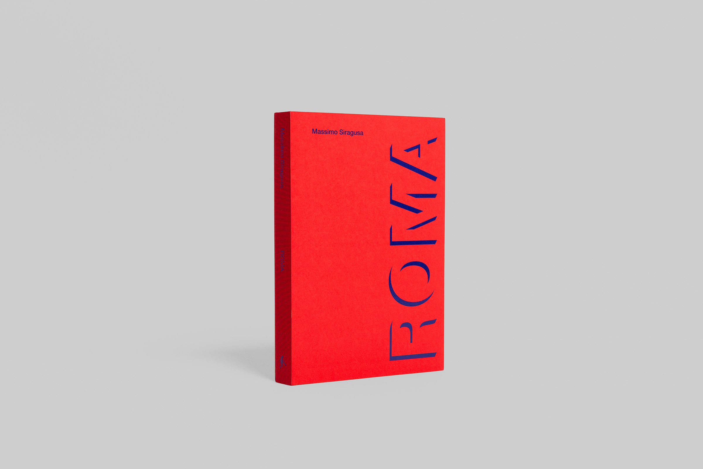
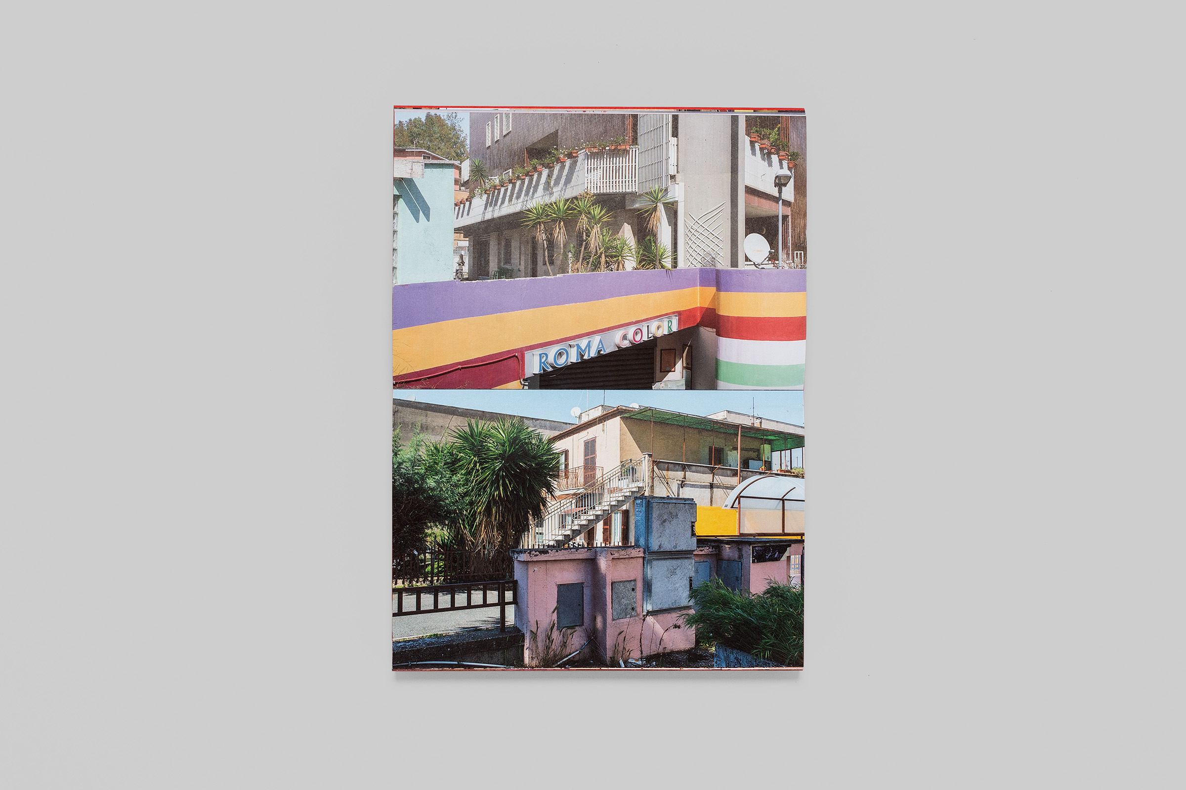
An extensive documentation of the small ugliness of the suburbs of Rome that add up to create a seamless visual noise. A “brick book”, which conveys this overabundance and visual violence. A brick where is predominant the red color in contrast and vibration with the electric blue recreating the visual energy of the photographs.
Massimo Siragusa’s photographs are accompanied by an unpublished screenplay by Ugo Gregoretti about building speculation. The book is designed by Tomo Tomo with all text set in Neue Helvetica, the most common and unaware used typeface in the city’s chaotic signs.
The book was published by Edizioni Postcart at the occasion of an exhibition of Siragusa’s photo series at the Museo di Roma in Trastevere.


")


")


