
Cobel is a restaurant and butcher shop from Catarroja (Valencia), and very famous both in the municipality itself and in its surroundings. This establishment was born in 1989 as a butcher and later generations turned it into a hybrid of restaurant and delicatessen that offers exquisite quality meat.
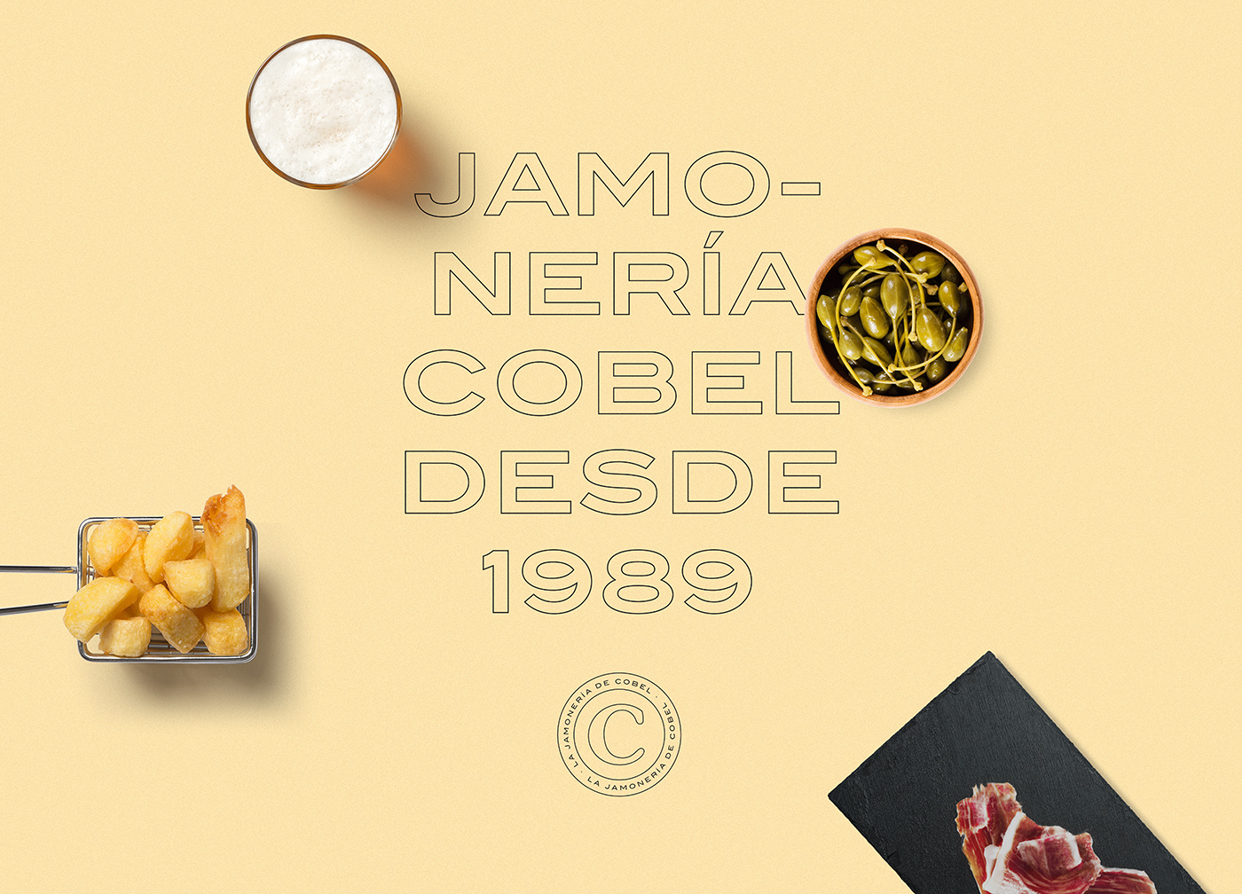
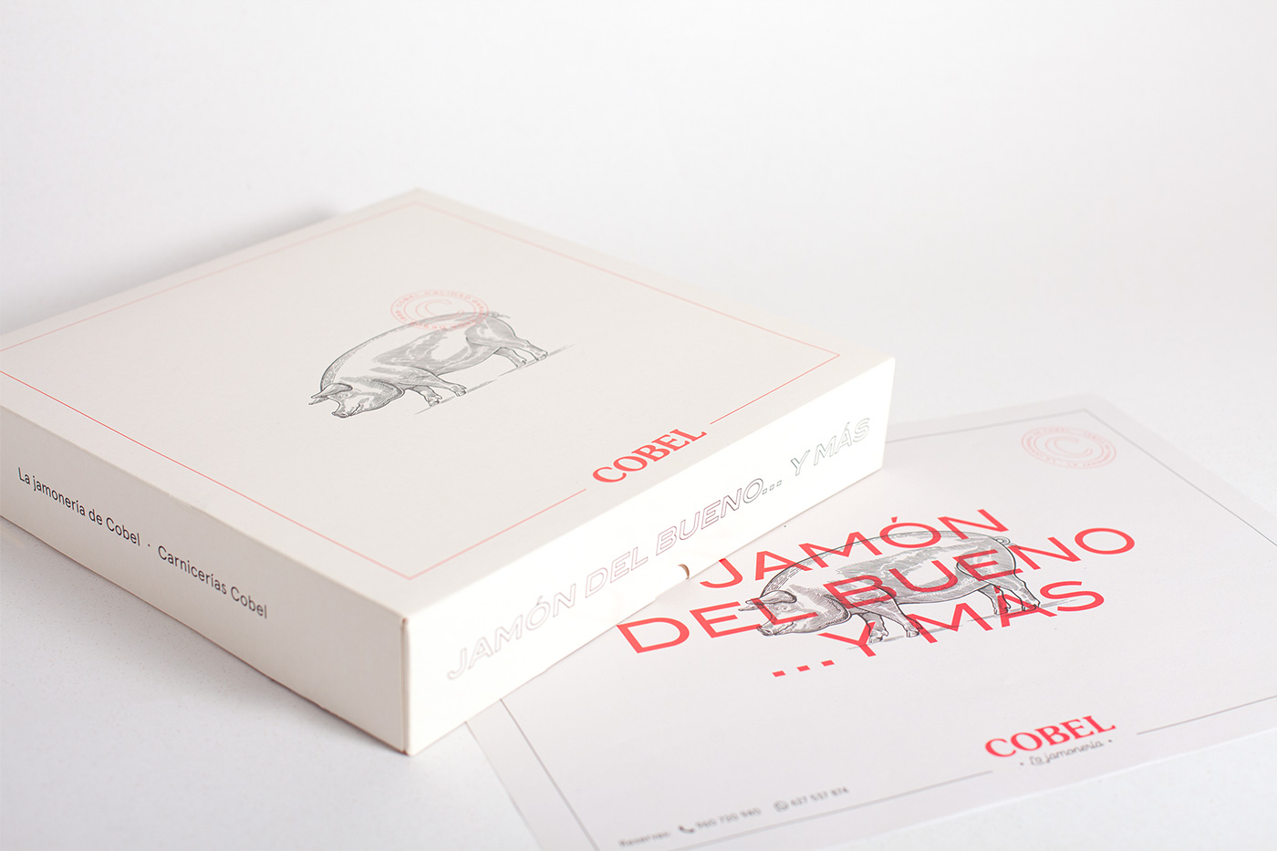
In 2019, Cobel asked us to renew the design of its brand identity to pay tribute to its 30-year history. Therefore, the first thing we did for them was a new logo design and an alternative version with the letter C that became a quality seal for any of their supports. In addition, we applied this new image to the restaurant’s corporate stationery – such as business cards – and to the packaging of its products: commercial bags, packages, food paper, trays and boxes for delivery and take away.
We also adapted this graphic to staff uniforms, from branded T-shirts to embroidered aprons and work caps. And we also designed all the corporate elements for the restaurant: napkins, placemats, coasters … As for the menu design, the Cobel menu changes regularly, as its offer of lunches, dinners and meals is adapted to seasonal products. So they needed a versatile design that they could independently modify and print when needed. For this reason, we at Pixelarte selected a corporate typeface, differentiating headings from text bodies, so that they themselves could easily edit it according to their needs.
Seeing the scope that a project of this calibre could have, we suggested the client to adapt the new corporate image also to the establishment, helping them in the choice of materials and in the design and production of the interior and exterior signage. The idea fascinated them and they trusted us for the intervention in their interior design. Thus, we took care of covering the exterior facade, crystals and the banner of the local, using corporate vinyl. As for the interior lettering, we decorated the walls with both the logo and a pig die-cut in a rough iron plate, and we vinyled the bar with a slate texture to be able to write on it in the traditional way. Lastly, we made an ad hoc illustration design with a hyper-realistic watercolor technique for all the local signage, with gastronomic motifs that emulated the naturalness and freshness of its products.
Comparing before and after is a joy for the eyes… and the palate!


 TV show titles")


")


")


