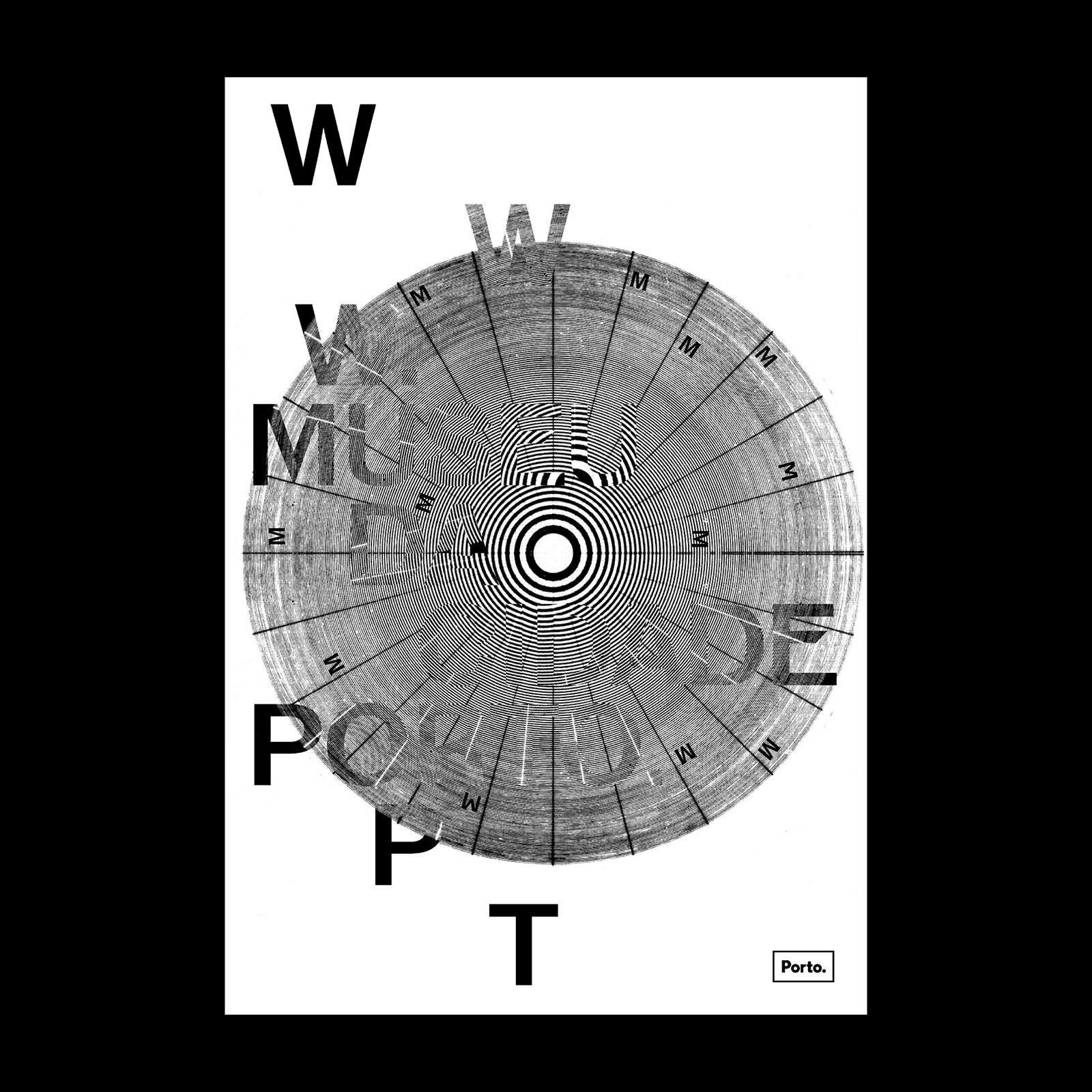
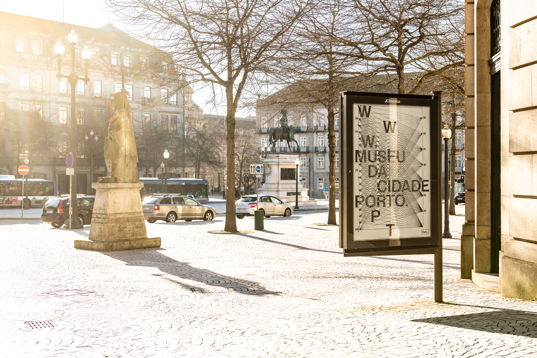
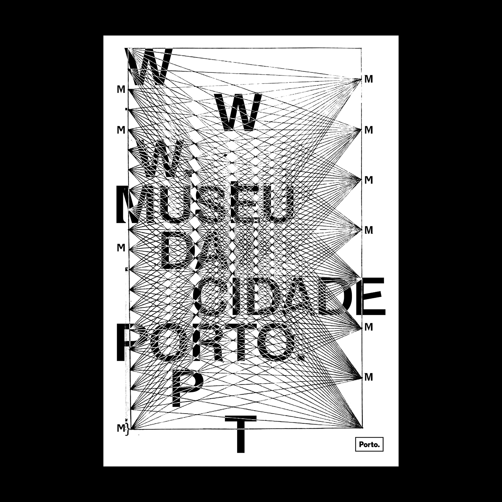
Museu da Cidade Porto URL poster series
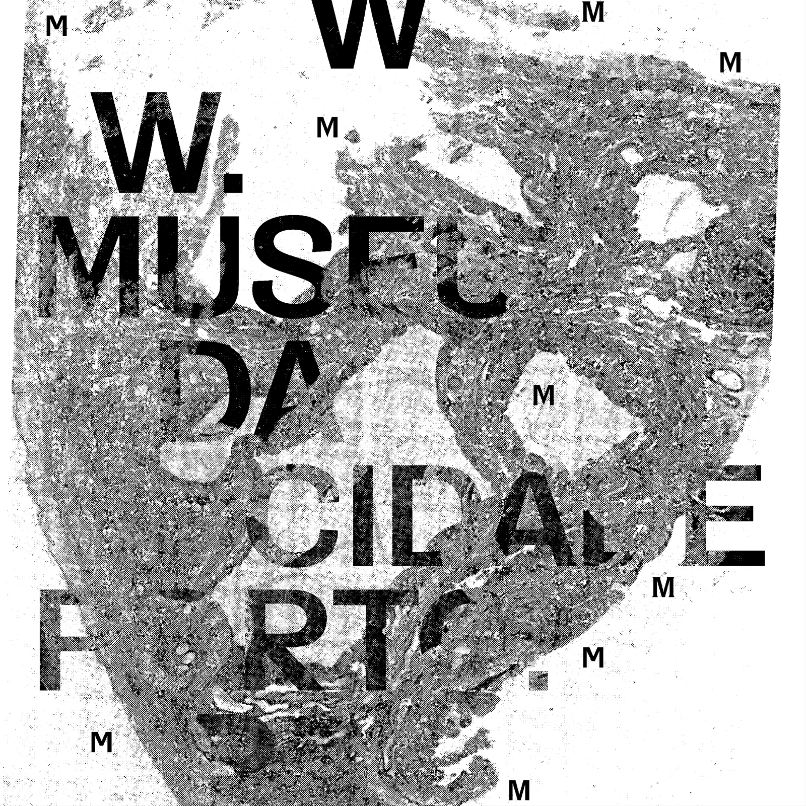
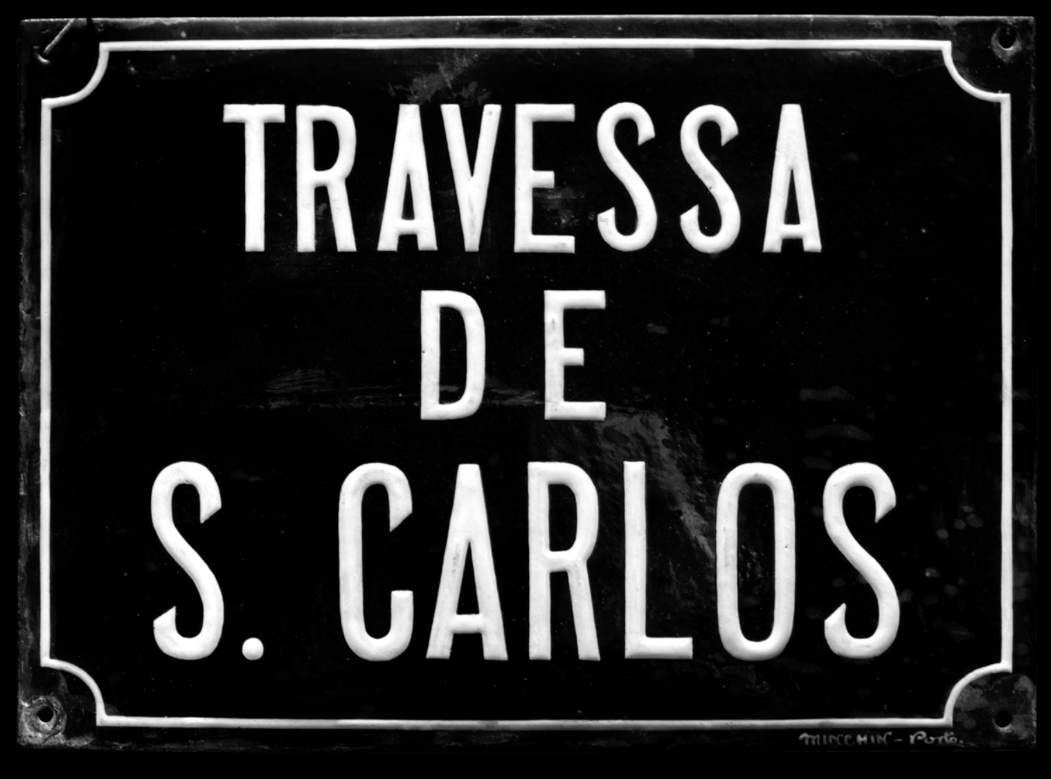
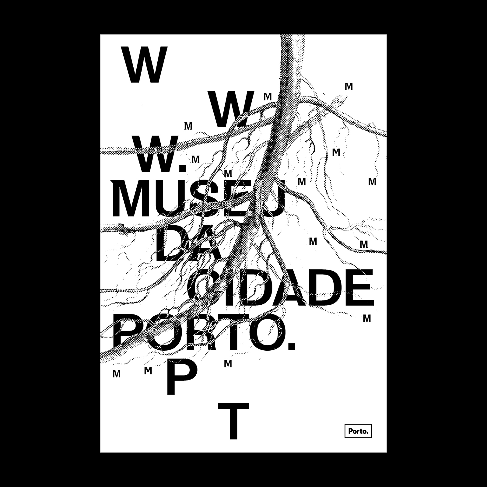
For the design of the new identity of Museu da Cidade (Porto City Museum), R2 Design commisoned a customized version of Salmanazar (205TF) by Juliette Collin. The personalized glyphs (including M, C, A, E, R, S) are inspired by the nameplates of the streets of Porto.
Here are more details about the project given by Museu da Cidade (February–March 2020 newsletter) in an article entitled “Anatomy of a new identity”:
The City Museum’s morphology, which expands across different axes through the urban grid, resembles a rhizome. In botanical terms, a rhizome is a type of stem that expands horizontally, usually underground, although it may also develop aerial sections. Multiple and heterogeneous, randomly developing, the rhizome is a powerful living metaphor, that has often been adopted in the field of the sciences of human thought.
Inspired by this configuration, which originates from the world of plants, and then graphically applying it to a sheet of paper, inspired by visual and sound poetry, in particular the calligram tradition, R2 Design, the studio which designed the City Museum’s new visual identity, has reinvented the museum’s image, freeing it from the determinism of a logo-brand, and making it liquid and dynamic, in a movement of perpetual transformation.
Exploring a logic of affective recognition of the space and the experience of the city of Porto, R2 Design has linked the typographic dimension of the museum’’s new identity to toponymic plates from different historical periods, redesigning the Salmanazar typeface, created by the type designer, Juliette Collin.