
The Best Of Mario Lanza album art
Source: www.flickr.com Uploaded to Flickr by Bart Solenthaler and tagged with “columna”. License: All Rights Reserved.
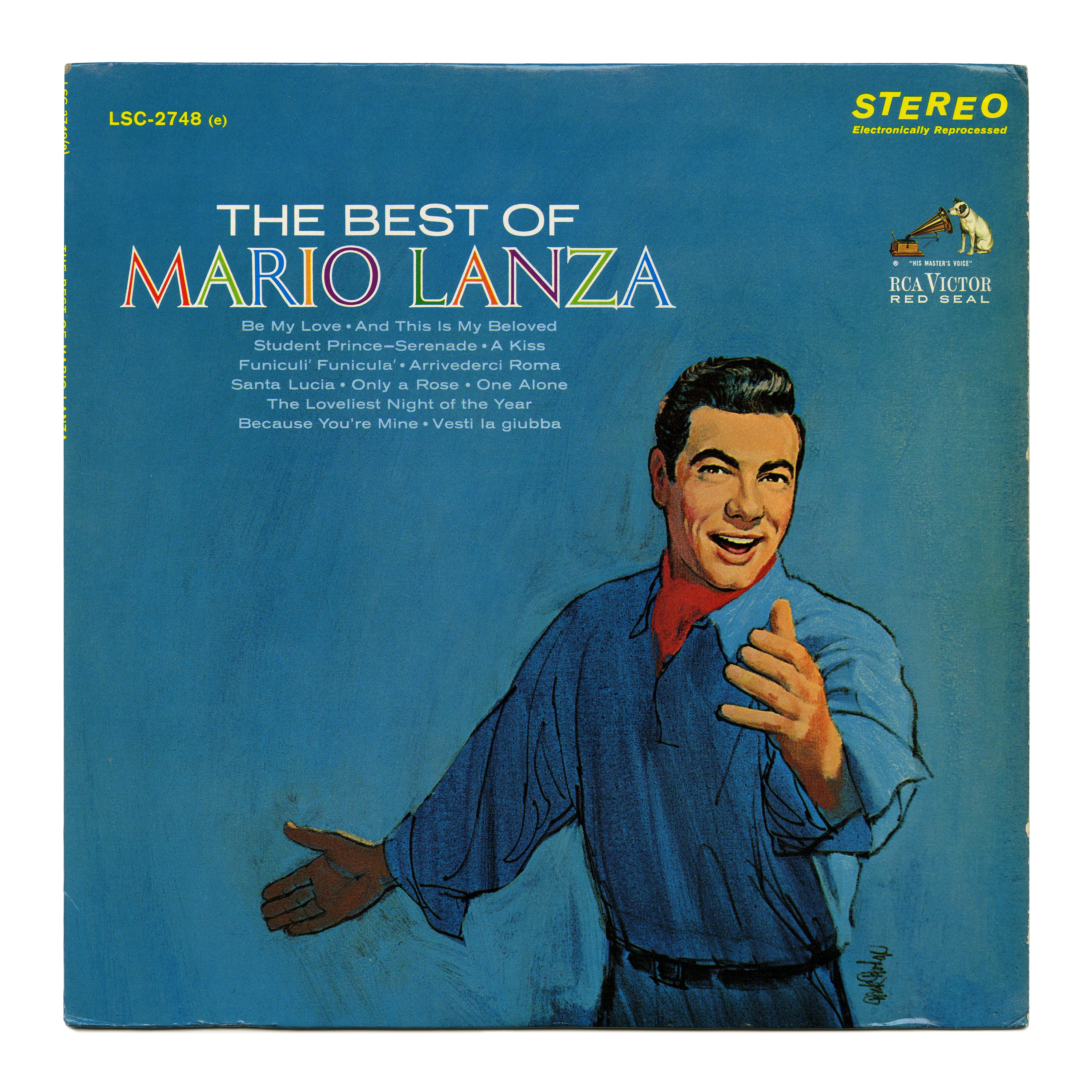
Columna filled in alternating colors, for the cover of a best-of compilation of songs by Mario Lanza (1921–1959), released on RCA Victor’s Red Seal label in 1964. “The Best Of” and the song names are set in Akzidenz-Grotesk breit, better known in the U.S. as Standard Extended.


")


1 Comment on “The Best Of Mario Lanza album art”
This Use features Columna’s M with splayed legs, the long-legged R, and the N with top-left serif. Compare to the Charles Magnante album cover from around the same time, which has the alternate forms for all three of these letters (see glyph set):