
Le vin en un coup d’œil

Le vin en un coup d’œil (“Wine in one glance”) is a book published by the French publishing house First éditions, specialized in lifestyle and personal development. This book is a guide to wine and how to recognize it. It covers the vocabulary proper to enology and answers the question of what makes a grape variety special in regard to the regions where it was cultivated. In short, a beginner’s guide for anyone who feels lost whenever they have to chose between a wine and another.
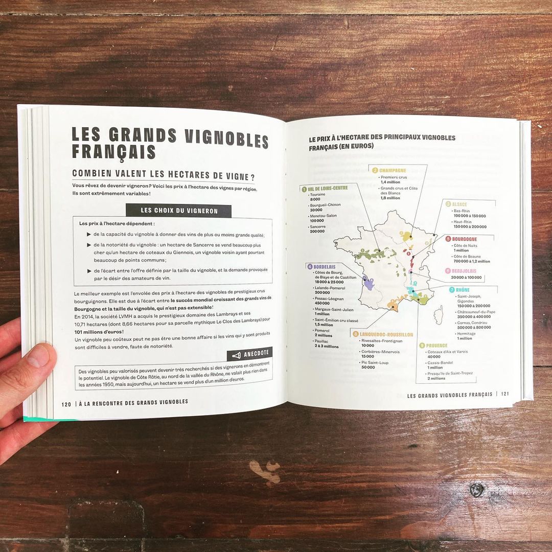
The book was designed by Atelier AAAAA, who approached the publication with a didactic style, in order to make the information legible and comprehensible. In doing so, the book can be considered a kind of encyclopedia. Each spread deals with another aspect of wine, so each of them has an individual design, depending on whether it needed to show a map, pictograms, or diagrams. This diversity in the layout makes each page recognizable and helps the reader to remember the information once associated to a visual memory. It also gives rhythm to a book that can be read straight from beginning to end, or by picking different chapters that one wants to develop more.
The homogeneity of the book relies on the use of Stratos from Production Type for titles and other display purposes, and Grotesque 6 from A is for for text. Stratos, used in Extrabold for spread titles, gives a punch to the layout; it is then used to categorize each part, and does a good job in setting limits (especially here with a wide letter spacing). Grotesque 6 counterbalances the rather abrupt aspect of Stratos, which is inspired by Victorian-era wood type (reinforced in some details like the capital N that looks like a radical assemblage of three blocks). The roundness of Grotesque 6 and its floral details – the curls we find on the lowercase r and y, for example – make it a pleasurable typeface that echoes the entanglements of grapes while keeping its readability.


")


