
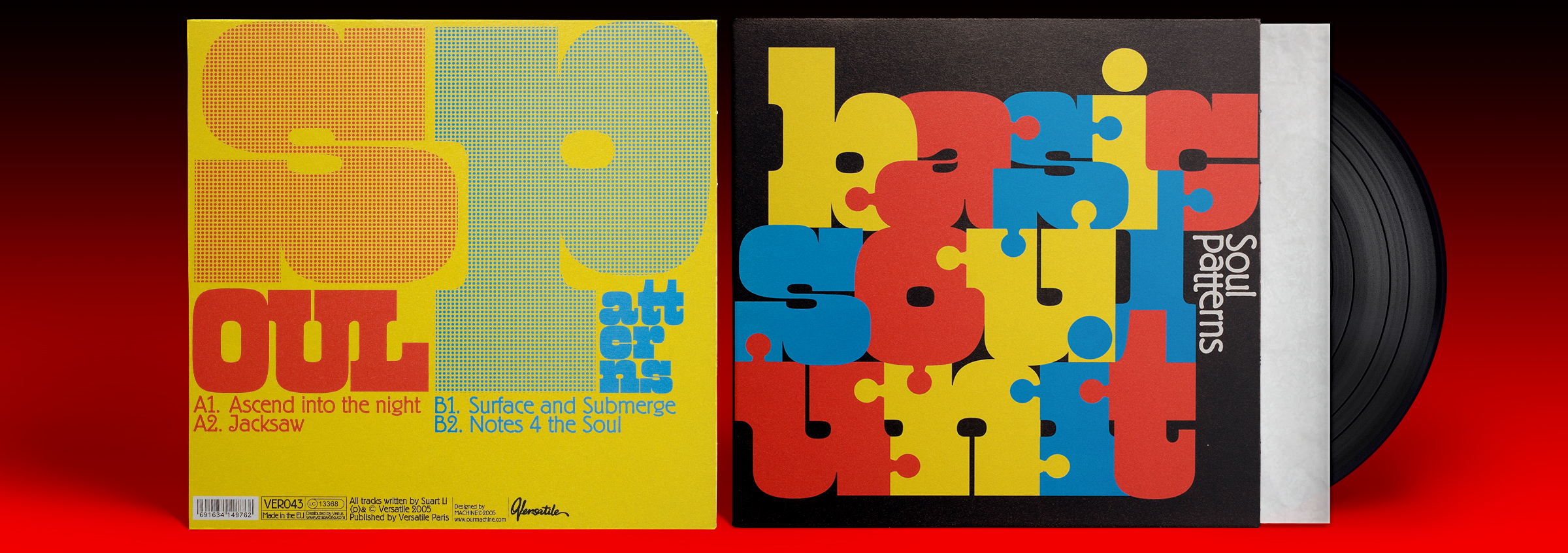
Basic Soul Unit – Soul Patterns EP
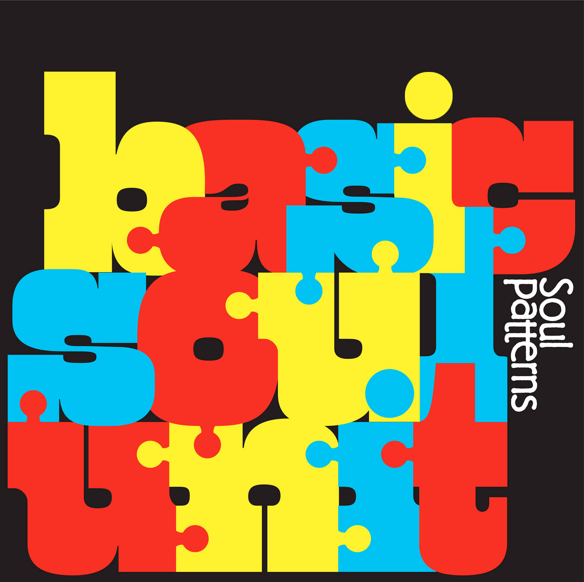
West Barnum, Dave West’s extreme take on the French Clarendon, was originally drawn for Photo-Lettering in the mid-1960s. In 2005, Machine made ingenious use of its compact graphic lettershapes for the cover of Soul Patterns, an EP by Canadian deep house and techno producer Basic Soul Unit: tightly spaced and amended with tabs and blanks, they are transformed into pieces of a typographic jigsaw puzzle. The name becomes one big logotype, with interlocking lowercase letters in alternating primary colors. Barnum Block’s square dots were replaced with a smaller round ones, which are a better match for the knobs and the rounded counterforms.
For the title, Machine chose Berliner Grotesk, the lightweight cousin of Berthold Block, with the letters of the second word aligned to the cap line. Berliner Grotesk is also used for the track list on the back.


")


")


