
Panos Gavalas and Ria Kourti – I want to talk about my pain album art
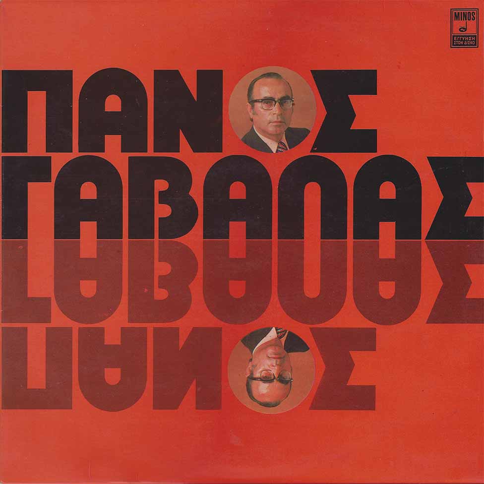
This is the cover of Panos Gavalas and Ria Kourti’s folk record θέλω να πώ τον πόνο μου (with added archaic accents) which translates to “I want to talk about my pain”, released in 1975 by Minos Records.
The single stroke, extra bold, open-ended letters e.g the B indicate that the Greek letterforms are inspired by one of the geometric “Bauhaus” typefaces such as Burko, Blippo, or ITC Bauhaus which were all designed in the late 1960s to mid-1970s. The most likely candidate is Pump Bold (Letraset, 1970): It’s the only one to feature the same proportions for B and A. The rather circular O is replaced by the singer’s photograph. The N, as I have noticed in various DIY font extensions for the Greek language, maintains its edgy form, in order to not be confused with the Λ, which most of the times is the letter that designers experiment more with.
Typography is the absolute protagonist of the artwork, taking up almost all the available space. The reflection of the singer’s name creates interesting-looking, almost abstract long forms in the middle, which can be contrasted to the typeface’s otherwise circular appearance.

The back cover typography features Pascal and Helvetica, see comments. “Μίνως Μάτσας & Υιός α.ε.” (“Minos Matsas & Son”) uses a Greek version of Cooper Black Italic.


")


")


1 Comment on “Panos Gavalas and Ria Kourti – I want to talk about my pain album art”
Hey Maria, thanks so much for extending our humble but growing collection of DIY language extensions! Very cool to see how Greek designers responded to the neglect by Latin-centric type manufacturers: “If they don’t offer the latest styles for my script, well – I just make my own then!”
The typefaces on the back are Pascal Greek and (Mecanorma’s) Helvetica Medium Greek. Both are shown as two of 23 styles in the Greek section of Mecanorma’s Graphic Book 14 from 1988. For comparison: This catalog shows some 610 different styles for Latin typography. The manufacturer of dry transfer lettering sheets didn’t even bother to show the Greek faces with names: The former is labeled as “G18“ (G is for Greek, 18 is Pascal’s catalog number), the latter as “G22”.
I don’t know if Pascal Greek was designed by José Mendoza y Almeida himself, but it’s certainly possible. The monograph edited by Martin Majoor & Sébastien Morlighem and published by Ypsilon Éditeur in 2010 shows linocuts by Mendoza, documenting his interest in Greek letterforms.