
Jazz Guys poster series
Contributed by Luke Jarvis on Jun 27th, 2021. Artwork published in
.

Photo: Luke Jarvis. License: All Rights Reserved.
A little lockdown project, attempting to learn about some of the most iconic jazz musicians whilst also doodling. For the type I settled on a combination of Parabole Display and Atlas Grotesk [not Atlas Grotesk, see comments], adding Lyon.
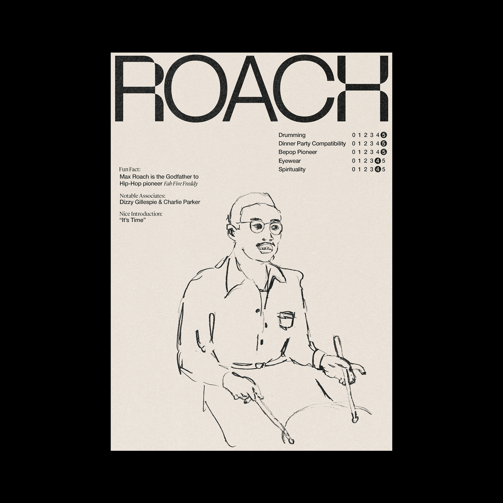
Photo: Luke Jarvis. License: All Rights Reserved.

Photo: Luke Jarvis. License: All Rights Reserved.

Photo: Luke Jarvis. License: All Rights Reserved.

Photo: Luke Jarvis. License: All Rights Reserved.


2 Comments on “Jazz Guys poster series”
Are you sure that’s Atlas Grotesk? At least from what I can see in the title type, it doesn’t look like it. What is the typeface used in the headline?
Good eye, Kevin – thanks for catching this!
Neither the sans mixed with Parabole in the names nor the one used for the smaller text is Atlas Grotesk. Luke, can you double check and let us know which font you used?