
The Serpent (2021) TV series
The Serpent is a TV mini series co-produced by Netflix and BBC One. Launched in April 2021, it tells “the twisting, real-life story of Charles Sobhraj, a murderer, thief and seductive master of disguise, who was a hidden darkness in the mid-70s on Asia’s hippie trail.” – IMDb
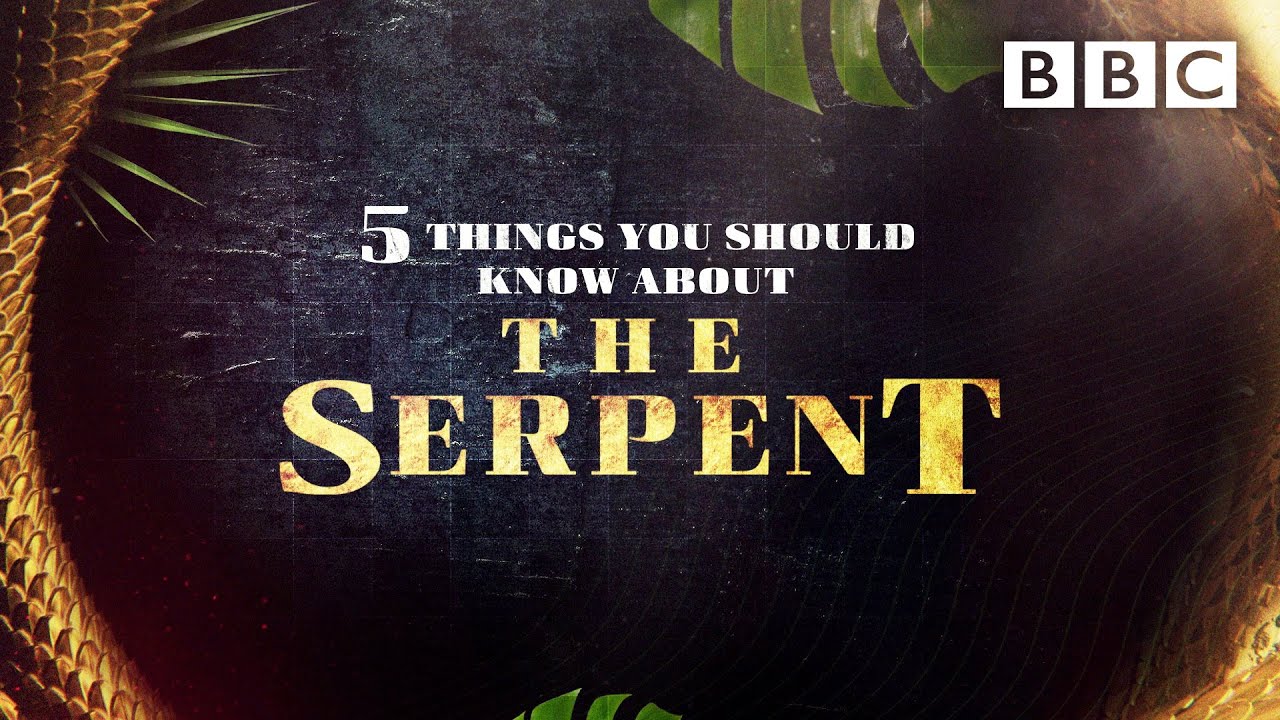
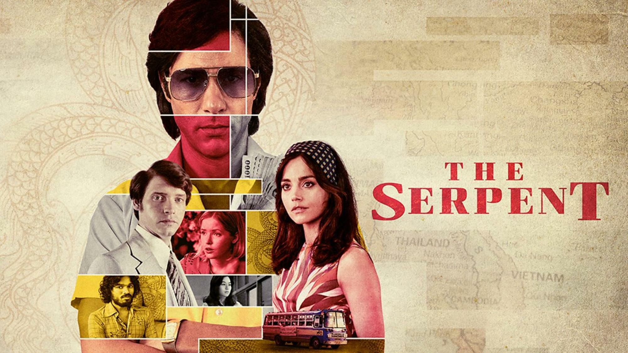
BBC One uses Curve Extra Bold (Fontador) for promotional graphics and the trailer, in all caps. The title is shown with enlarged first and last letters. The series logo used by Netflix is based on Shenzhen Industrial (Device), with an S that was modified to look more snake-like.

Title card from BBC One’s trailer, in Curve Extra Bold.


Netfllix poster with the logo based on Shenzhen Industrial. “What does it take to catch a killer?” is set in all-caps Olympia. The smaller bits are in Netflix Sans.

Logo in the Netflix trailer.


")

 trailer, Rolling Thunder Pictures (1999)")


")


")


![<cite>Prawdziwe wyobrażenie trojga dzieci </cite>[...], Second Edition Project](https://assets.fontsinuse.com/use-media/115147/thumb/5eeb50be/@2x/jpeg/Ada%20Pawlikowska%201.webp "<cite>Prawdziwe wyobrażenie trojga dzieci </cite>[...], Second Edition Project")

