
Felt
Felt is a collaborative mapmaking tool that seeks to make it easier to create and edit maps. They recently launched with a distinctive brand by designer Adam Ho, who also designed and developed their website.
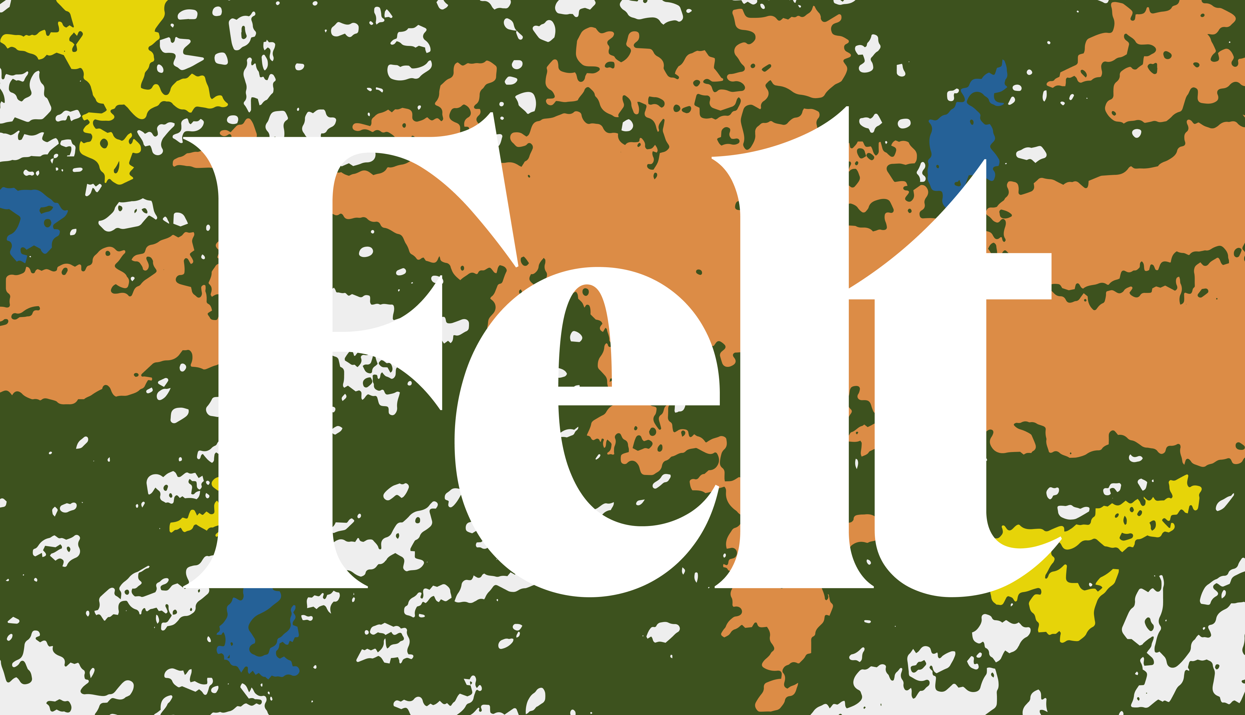
The logo is massive, taking up a huge amount of real estate on the website’s homepage. Ho used Roslindale Display Condensed Black as the basis for the logo, tweaking the spacing and letter t to produce a pleasing parallel curve between the last two letters.
GT Alpina is the main headline typeface, which is also set quite large. Ho opportunistically switches between centered and left-aligned lockups to create a dynamic flow as one scrolls down the webpage.
Atlas Grotesk is used for supporting text, but also gets to shine in display. An excellent choice if for no other reason than the LTypI-adjacent thrill of seeing Atlas used on a digital atlas.
The brand eschews traditional map coloring, opting for an olive green background punctuated by blotchy shapes in peach, blue, and yellow. These recall the irregular forms that landmasses create on a map, simulating jagged coastlines and complex archipelagos.
See an animated presentation of the identity in a tweet by Adam Ho.


")


")


")


