
Eighth Day
Eighth Day is a skin care brand launched in 2009. Founded by Dr. Antony Nakhla, Eighth Day finds its roots in the doctor’s research in dermatology and how the human skin can heal and regenerate itself – following a study on post-surgery skin cancer patients, burn victims, and patients with chronic wounds. Based on the the healing properties of amniotic and placental tissues, the only two products of the brand aim most of all at having a healthy skin, rather than making all its so called imperfections disappear.
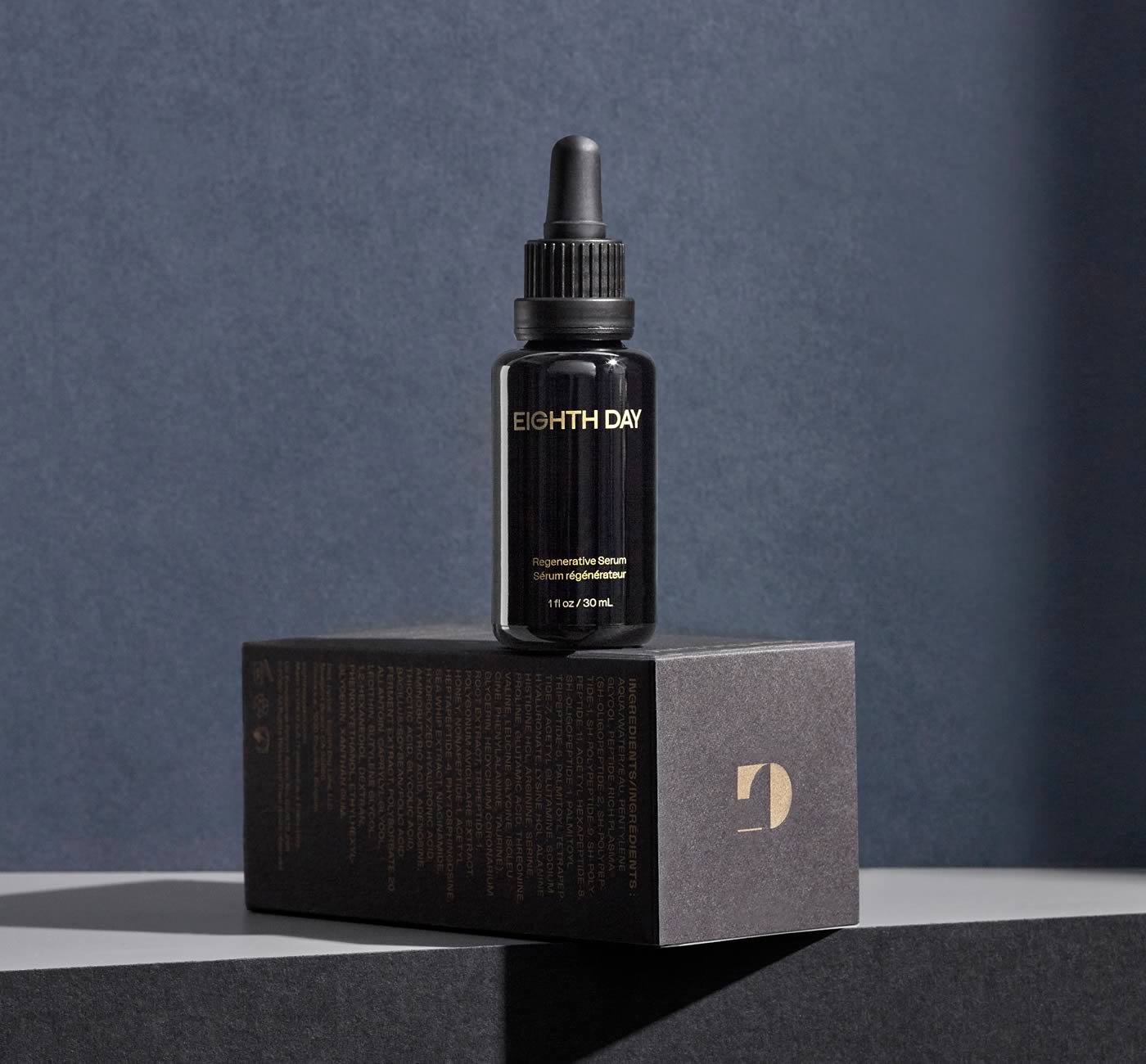
The designers from Underline Studio were commissioned to work on the rebrand of Eighth Day in 2021. Not only did they change the visual identity, they also moved the brand’s position from a classical, cosmetics oriented speech, to a more scientific and health-focused discourse. In a time where society advocates for a more inclusive representation of beauty standards, this strategical shift permits to stay on the market and broaden the brand’s target. The design of the packaging and bottles reflects this change of position: the sober black flasks imprinted in gold still have a luxurious aspect (which is justified regarding the price of the products, around 200$ for 15 ml), but the sobriety of the typographic uses remind us more of medicine than beauty products.
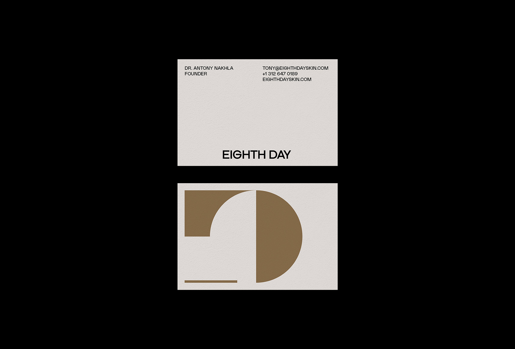
The brand’s logotype is set in Dr from Production Type, which is already a way to anchor the brand in the scientific field: the design of Dr was initially made for a lab specialized in prosthetics, and that’s why you’ll find some parts of the letters that appear to be placed on the letter’s body in an artificial way. Dr is paired with La Nord by Raoul Gottschling for all other communications supports: its similarity to Dr when set in caps makes it a natural declination of the logotype, and at the same time, the specificity of its loose lowercase makes it very identifiable in itself. In the end, type and photography are the two main factors of the success of this contemporary rebrand.


")


")


