
Sloi Clothing

Two young designers from Moscow, Yulia and Anatoly, started fashion brand Sloi Clothing in which they confess their love to our planet. In their work they capture fascinating places that draw interest from historical and ecological points of view. They use satellite images of the Earth as the main material, printing them on t-shirts, hoodies and leggings.
Each piece of clothing not only shows beautiful corners of our Earth but also tells stories about river drainage, forest fires, and the impact of global warming on transport connection.
To support the brand Yulia and Anatoly also printed posters and published a poetic, very thoroughly designed longread about Antarctica (Russian only).
Zangezi is used throughout the identity adding drama to the beautiful, highly detailed satellite images. Its spiky character complements the crispy images of Antarctica on screen and completely changes when printed on textile. Zangezi Sans is used as the complementary typeface. On the website the small texts of the infographics are not too easy to read, but our planet isn’t having a good time either.
The Sloi Instagram account is very worth following — it’s as informative as it is beautiful.


The website is beautiful too

Antarctica longread
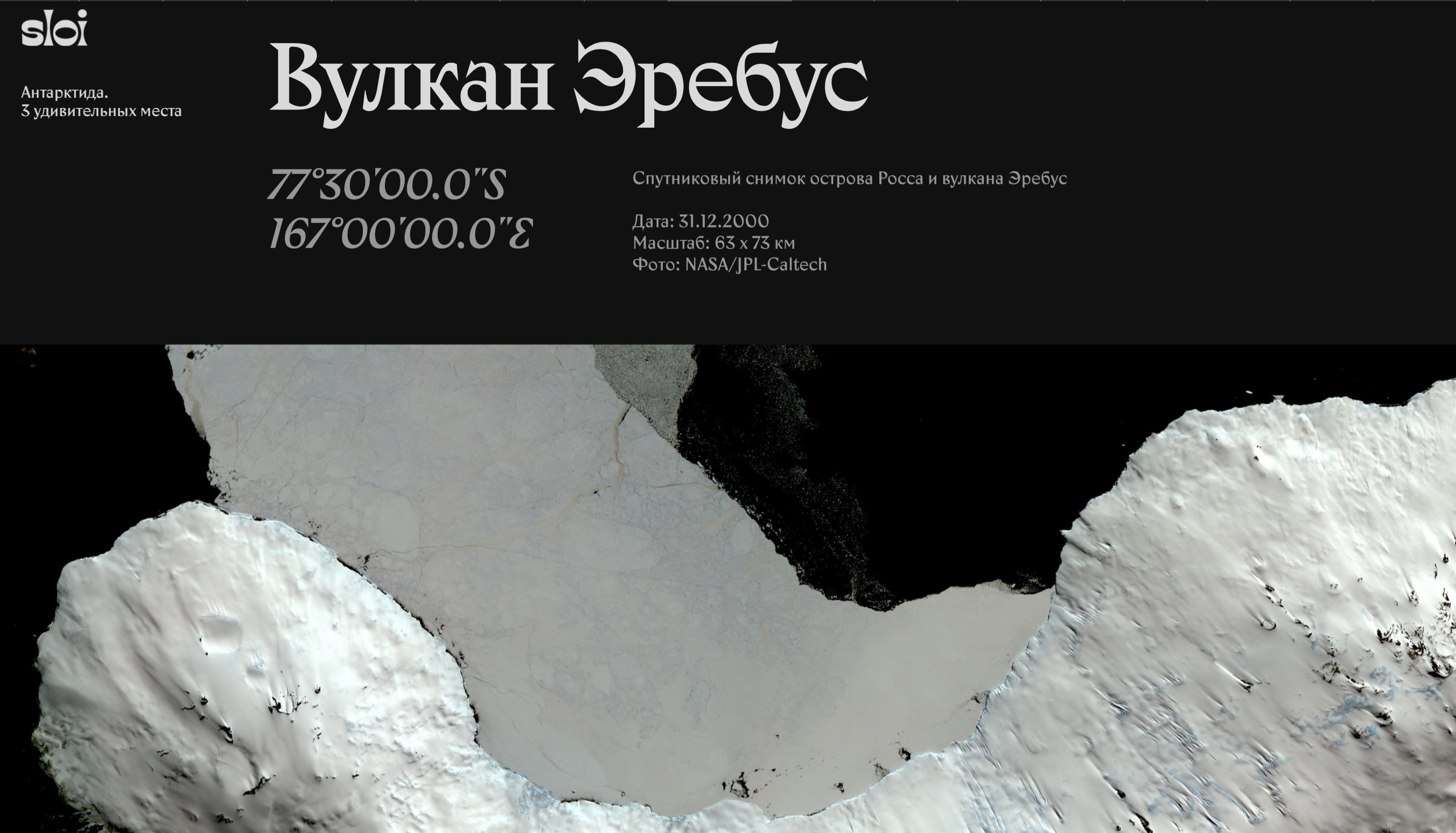
Antarctica longread


")


6 Comments on “Sloi Clothing”
The logo for sloi is custom typography modelled after Tan Type (aka Novia Jonatan)'s Kindred. The letters (for ex. s and l) may be different than the original face.
Hm, I’m not convinced. Shown below is the Sloi logo. Tan Kindred is in the same ballpark, but none of its glyphs is a match. There are several candidates from the recent wave of horizontal-contrast typefaces with concave stems that come at least equally close, like Maruder, Kish, Hatchet Display, or Psychonaut. I don’t know if the logo is based on an existing typeface or entirely drawn from scratch.
Psychonaut it is, Florian.
Closer, but no cigar. Apart from the s, the curvature of the stems and the counter in o are off. Also, Psychonaut was released in 2021, whereas the Sloi logo launched already in 2020, if my understanding is correct.
Maybe Yulia and Anatoly will chime in and clarify whether the logo started with a font or not.
Hello, everyone!
A friend of mine has drawn my attention to your discussion. Thanks, Anya!
The logo is drawn entirely from scratch and the Sloi itself was launched in June 2019.
Thanks for confirming, Anatoly. Спасибо!