
The Way of Peace by William Trevelyan Browne

The front cover of The Way of Peace, featuring Skjald and Jenson Old Style.
The Way of Peace by William Trevelyan Browne, published by the Wynkoop Hallenbeck Crawford Co. in 1905. It’s apparently a fictional book about kings, rulers, and peace.
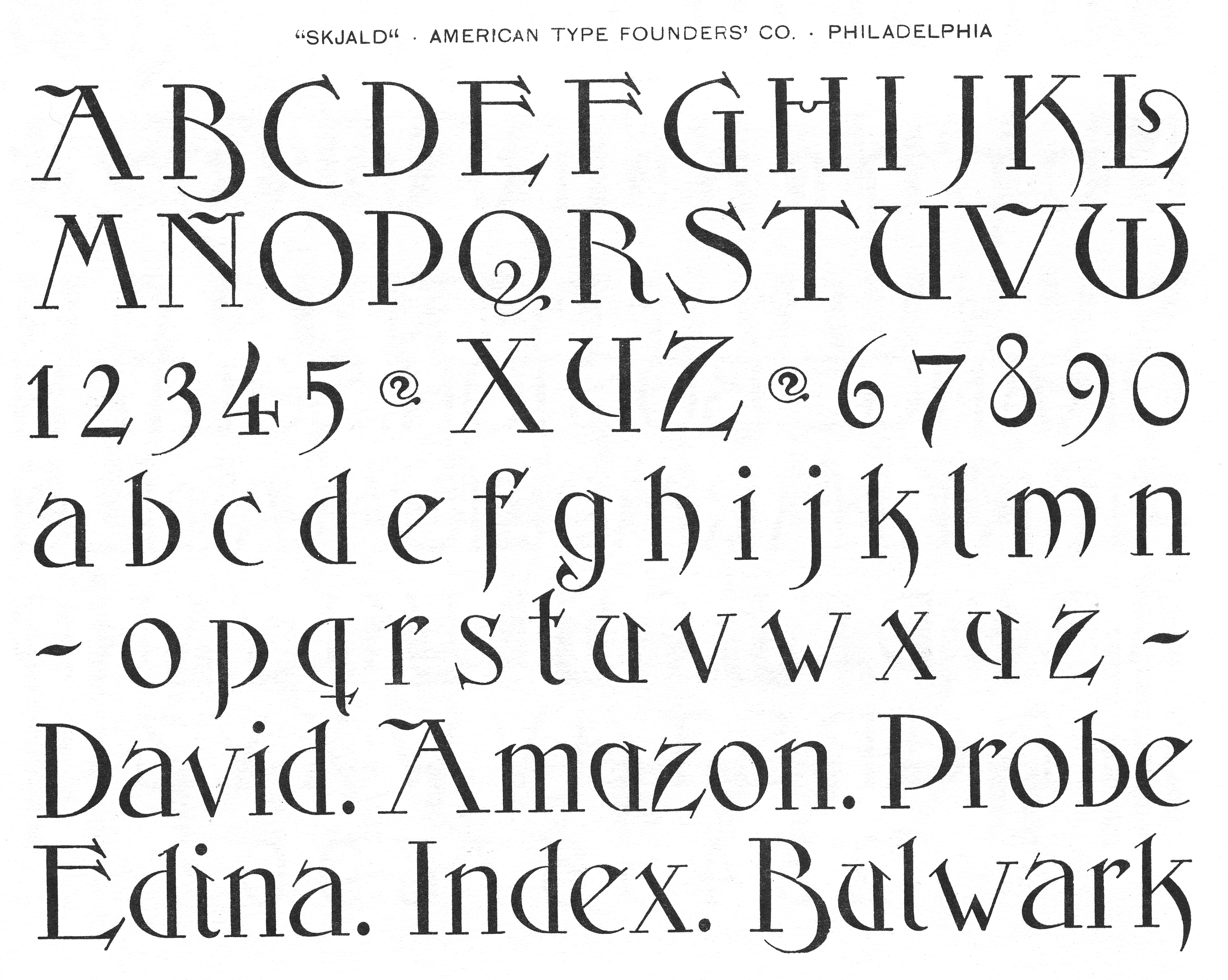
The title of the book is set in Skjald (1890) by John F. Cumming (1852–1940). The digital Skjald by Monotype features a more conventional W, but as you can see in the American Type Founders’ Co. specimen, the rounded W that is used in the title is original.
The mention of the author is set in Jenson Old Style (1893) by Joseph W. Phinney (1848–1934).
The publisher’s name and publishing date are set in another typeface, which I have not been able to identify. A lighter weight of the same typeface was used for the title on the contents page.
The chapter listing on the contents page is set in Linotype’s Old Style No. 1, which is also used as the text typeface.

The title page of The Way of Peace, featuring Skjald, Jenson Old Style, and an unidentified typeface.

The contents page of The Way of Peace, featuring an unidentified typeface for the heading, and Old Style No. 1 (c. 1860) for the chapter listing.

The first page of chapter 1 of The Way of Peace, featuring Old Style No. 1 (c. 1860) for the heading and body text.


4 Comments on “The Way of Peace by William Trevelyan Browne”
Monotype’s digital Skjald originated at Agfa, before there was OpenType. The font includes the round W (and other original glyphs), but not as stylistic alternate: it is rather accessible by typing the fraction ¾, or also the Greek character pi (π). ¯\_(ツ)_/¯
Curious they didn’t make the round W the default.
Having looked at the character set now, do you know what the deal is with that tilde?
That thing was part of the original metal font, too. Shown below is a detail from ATF’s Collective Specimen Book (1895/96), scan courtesy of David M. MacMillan.
It’s apparently a decorative piece that can be used as border element, or to mark a chapter ending, etc. No connection to the tilde other than that’s the codepoint assigned to the glyph. The other dingbat shown in the 60 point line – some sort of curly bullet or separator – isn’t included in the digital version.
Typothetae is the name of the all-caps version that came first. Once a lowercase was added, the foundry renamed the design to Skjald – but continued to offer the all-caps Typothetae, too.
Fascinating! It would be neat to see a digitization of that smaller optical cut used in ‘Typothetae Series’.
It is looking a little muddy though—not quite optimized for that size. I guess Skjald only shines in display format, and is arguably too outdated to expect someone to do more with it—although I have been getting enamored with these 1900s typefaces lately. Time will tell.