Trijntje Oosterhuis – Wrecks We Adore album art and singles
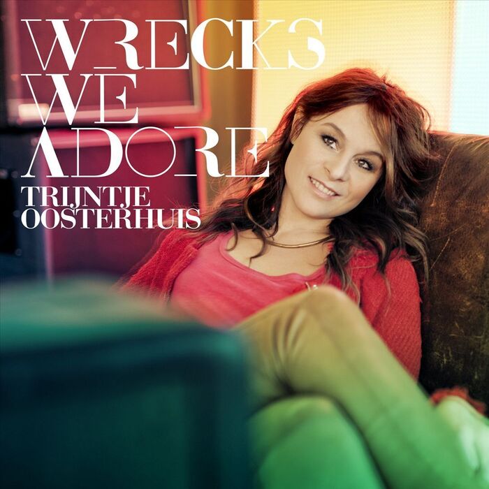
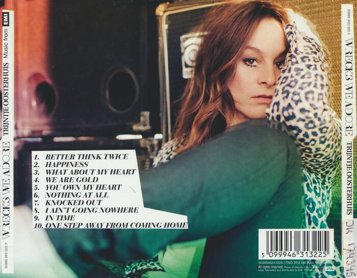
Talk about wrecking the type. On the cover of Trijntje Oosterhuis’s 2012 album Wrecks We Adore the text has been made by wrecking a Bodoni (Bitstream’s Bauer Bodoni looks close).
Disturbingly, the letterforms for “Wrecks We Adore” have been modified by removing strokes (R and E), reducing strokes from thick to thin (W, K, and D), eliminating contrast (O), and clipping rectangles out (S). A similar treatment is used for the singles from this album too.
I only came here for the TJ kern in “TRIJNTJE”.
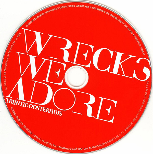
Source: www.discogs.com License: All Rights Reserved.
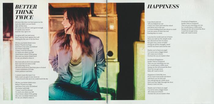
Detail from the CD booklet. The lyrics are set in Utopia.
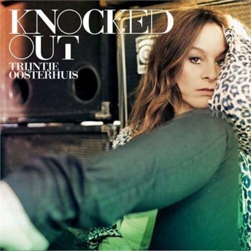
Source: www.discogs.com License: All Rights Reserved.
“Knocked Out” single
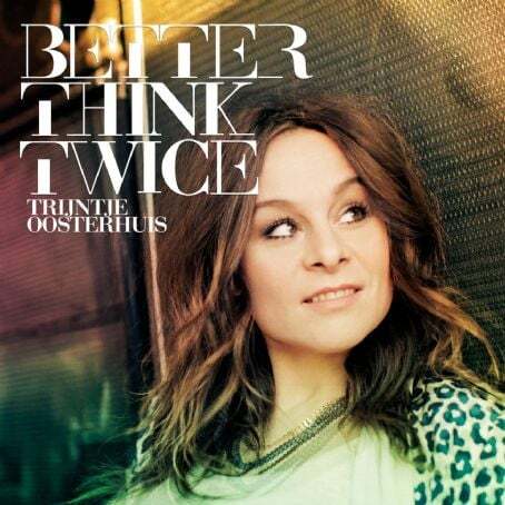
Source: www.discogs.com License: All Rights Reserved.
“Better Think Twice” single
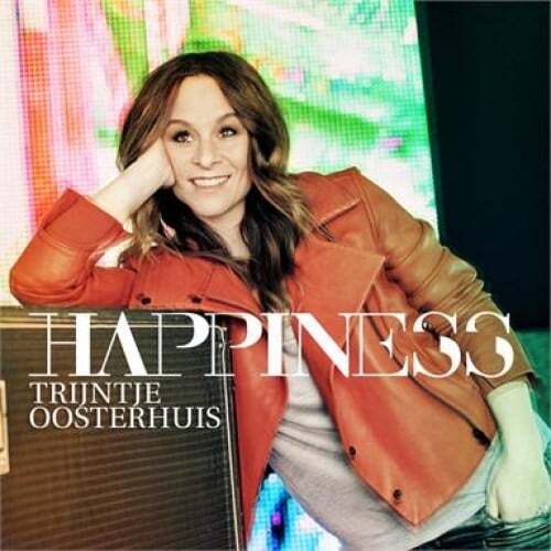
Source: www.discogs.com License: All Rights Reserved.
“Happiness” single
Formats
- Album Art (3423)
Topics
- Music (5173)
Designers/Agencies
- Chris Kühlen (1)
Tagged with
- all caps (5958)
- Trijntje Oosterhuis (2)
- modified typeface (1465)
- reversed type on an image (1017)
- compact discs (CDs) (341)
- CD labels (20)
- album records (2172)
- EMI Records (59)
- single records (814)
- series (926)
- back covers (1664)
- track listings (934)
- all caps italics (404)
- album booklets (49)
- lyrics (147)
Artwork location
- Netherlands (941)

