
Gottstein Architects visual identity
Gottstein Architects is a Dublin-based studio interested in creating architecture that’s sustainable and socially responsible. We were commissioned to redesign their brand identity.
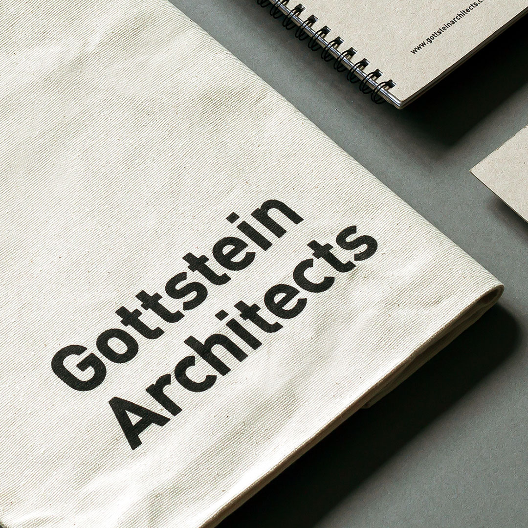
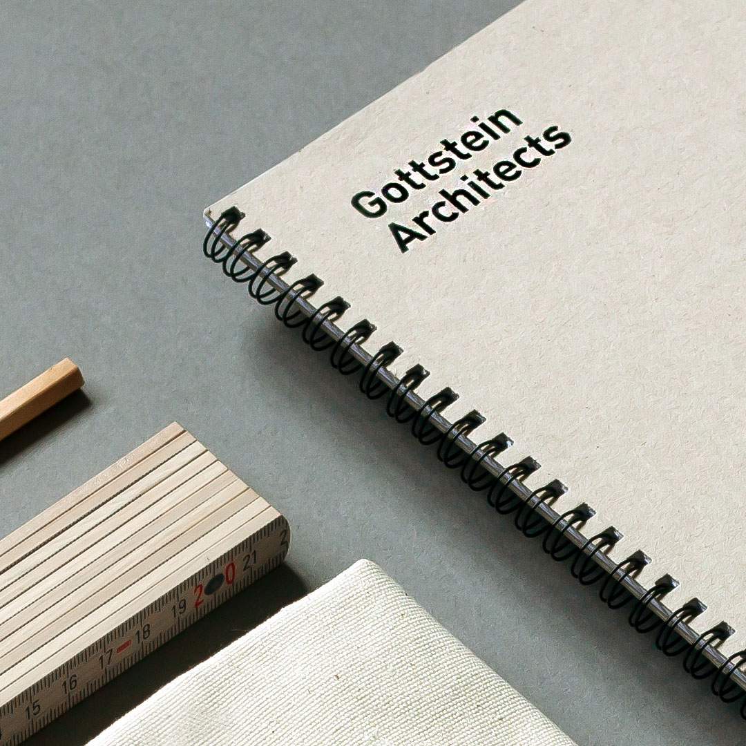
The original wordmark was set in FF DIN, right-aligned; it used two different type sizes. The client was keen to keep the same typeface to retain a measure of brand recognition, so we simplified the mark by setting the type flush right, in one size and with tightened spacing.
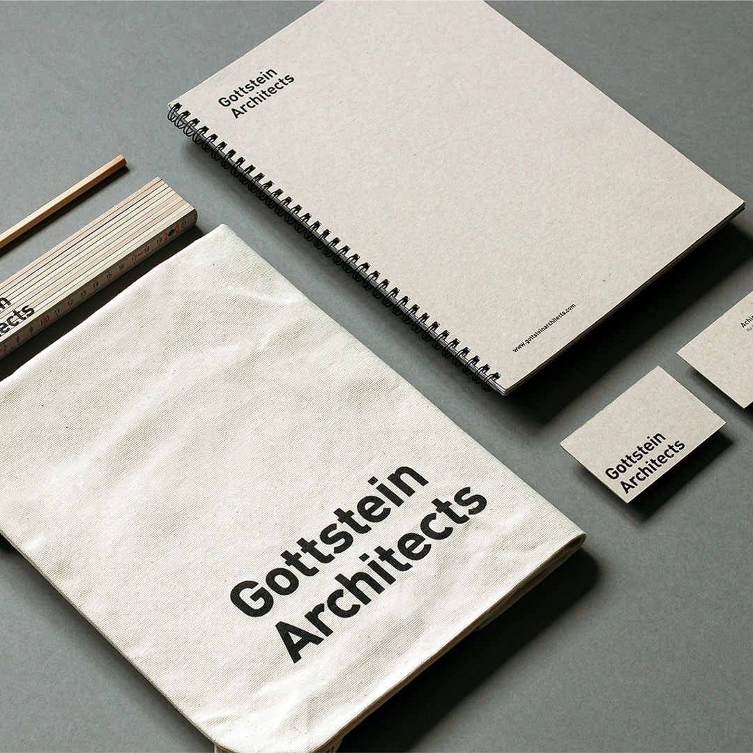
We recently put together a welcome pack for Gottstein’s new clients. This included an A4 report cover, business cards, tote bags and metre stick, all with the new wordmark applied. The recycled stock and natural materials reflect the studio’s use of low-carbon materials and their ambition to minimise waste.


")


")


