
Thompson Twins logo 1982–

My first exposure to Aldo Novarese’s superfuturistic typeface, Stop, was probably as an eight-year-old kid going through my older brother’s stuff and finding a Thompson Twins cassette. The synthpop band used the typeface on the cover for its single, “Lies” (1982), and it became a logo from that point on, appearing on promotional material, other singles, and the next three full-length releases: Quick Step & Side Kick (1983), Into the Gap (1984), and Here’s to Future Days (1985).
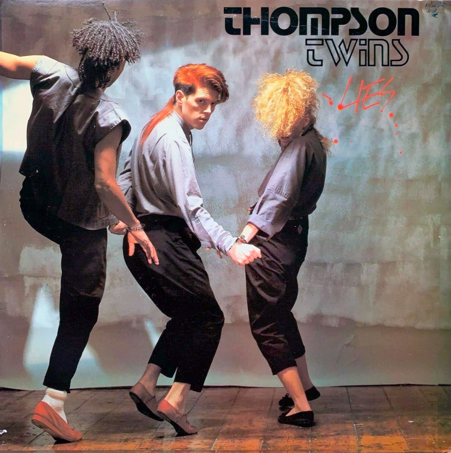
Lies EP (1982). No design credit.

Watching EP (1983). “Cover design by Satori with ideas from Alannah.”

Quick Step & Side Kick LP (1982). Design: Satori. Art Direction: David Shortt.

Into the Gap LP (1984). Art Direction: Alannah Currie, Nick Marchant. Design: Satori.
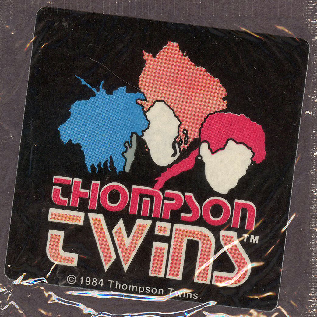
Cap’n Crunch Rock ’n’ Roll Sticker, 1984.

Tom Bailey’s official website in 2021.
The three-headed logo was abandoned for album covers after percussionist Joe Leeway left the group in 1986 (making the illustration no longer relevant), but the typographic “Thompson Twins” continued to appear in merch and other material, including lead singer Tom Bailey’s current brand as of 2016.
It’s not clear who designed the logo. Band member Alannah Currie is an artist and was credited as a designer or art director on various Thompson Twins albums, but not Lies, where the logo first appeared.


Tom Bailey plays a Prophet-5 synthesizer in the music video for the song, “Doctor Doctor”.
Stop was a popular typeface throughout the 1970s and 1980s, especially for anything “high tech”, so it’s not a surprise it was adopted by a band that leaned on electronic elements. But perhaps there was a direct influence: Tom Bailey played a Prophet-5, the iconic synthesizer manufactured by Sequential Circuits, a company whose logo was also set in Stop.
The typeface also appears in the artwork of other electronic musicians of the era, including Herbie Hancock – Flood album art and Tokyo Science – Tokyo Science album art.


")


