
“Happy New Year 1982” ident, WPIX

A festively multicolored use of Neo Prisma from forty years ago, for New Year’s Eve 1981. The ident was shown by WPIX, or Channel 11, a then independent local TV station from New York. Their “11 Alive” logo shown underneath was introduced in 1976. Via @80snewsscreens.
Neo Prisma was drawn by Nicola Russo in the early 1970s. The graphic designer from Italy successfully submitted his all-caps multiline design to a contest organized by Mecanorma to source new typefaces. In 1972, the French competitor to Letraset released it as one of their first originals, and produced sheets with rubdown type in at least four sizes; in 48, 60, 72, and 84 pt. While Russo’s design was initially listed as Neo Prisma and shown in Mecanorma catalogs next to ITC Neon, the word order was later reversed: now named Prisma Neo, it was sorted together with its ancestor Prisma, Rudolf Koch’s original multiline typeface from 1930.

Initially produced as standard black letters only, Neo Prisma was later also offered in a white version. This A3 sheet of dry transfer letters shows the glyph set – including the alternate K – in a size of 84 pt, or 23.5 mm.
Neo Prisma’s letterforms are constructed from straights and curves with three to five lines. Glyphs that would grow too crowded with that many lines within the common cap height simply get clipped, see for example B and S – or the 2 in the use shown above. (A similarly trimmed S can be found in Stop, designed by Russo’s fellow countryman Aldo Novarese around the same time.) Many of Neo Prisma’s glyphs are rather compact and blocky, and straight-sided letters add up to maze-like patterns. Others like those with diagonals introduce more whitespace. In combination, this can lead to rhythmic patterns when the letter sequence is favorable – as in “HAPPY NEW YEAR”.
Multiline typefaces were all the rage in the early 1970s: Mecanorma alone carried Black Line, Dubbeldik, Pinto Inline, Stilus, Stack, Spiral, and Zelek, in addition to Prisma, Neon, and Neo Prisma. These were soon followed by Aki Lines, Full Strokes, Duo – as well as another design by Russo: his second release is the all-lowercase Gemma, which is basically Neo Prisma’s lowercase with the center gap filled in.
An image of the original artwork for Neo Prisma (with the lowercase that became Gemma) can be seen in the online archives of Aiap, the Italian association of visual communication design. In 2000, Dan X. Solo made a digitization that is included on the CD that comes with 24 Moderne Display Fonts by Dover Publications.
Originally from Trentino, Nicola Russo started his own studio in Padua (Padova) in 1967 and is active to this day. Over his career, he developed over 200 brands and logos, for companies, organizations and individuals, and also worked on stamps and created countless illustrations and advertising campaigns. In 2014, a retrospective titled Una vita a colori was shown at the LaRinascente gallery in Padua.
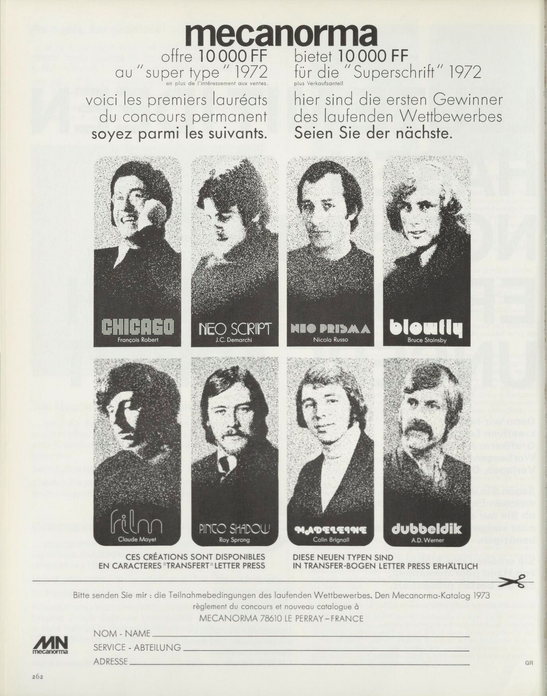
Bilingual ad (French and German) by Mecanorma in Graphis vol. 162 from 1972/1973, advertising their permanent contest by showing the first winners – including Nicola Russo and his Neo Prisma. The “Super Type” 1972 could win a prize of 10,000 Francs (then roughly equivalent to USD 2,000), plus royalties.
The other featured faces are Chicago (François Robert), Neo Script (J.C. Demarchi), Blowfly Black (Bruce Stainsby), Film (Claude Mayet), Pinto Shadow (Roy Sprong), Madeleine (Colin Brignall), and Dubbeldik (Ad Werner).


” German single cover")


 movie posters")

 movie poster for NonStop Entertainment")


")


 movie poster")


4 Comments on ““Happy New Year 1982” ident, WPIX”
An excellent find, Florian — Frohes Neues Jahr!
Thank you, Chris. All the best for 2022 for you, too!
If you dig Neo Prisma, stay tuned. We’ll be posting a couple more designs with this (almost) forgotten 1970s face today.
One of the best and most iconic uses of Neo Prisma (for me, at least) is on the cover of the 1975 edition of the Mecanorma catalog. I’ve had my copy since I was in college studying graphic design. I’ll post it here soon.
Thank you, Mark. The Mecanorma catalog cover can be seen here: