
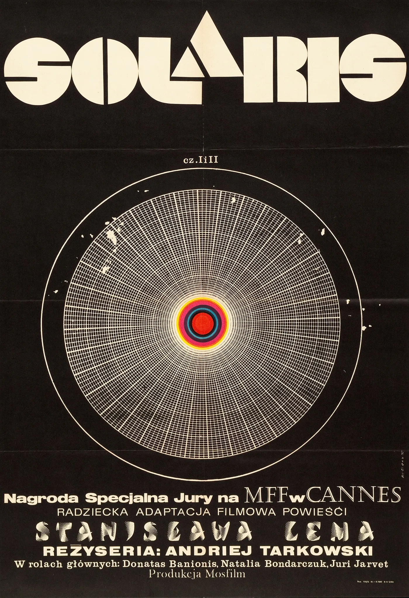
Solaris (1972) Polish movie poster

Polish movie poster for Soviet sci-fi art film Solaris (1972), designed by Andrzej Bertrandt. The film title “Solaris” is set in Disco (with a custom A). “Stanisław Lem”, the author of the 1961 novel from which the film is based, is set in Calypso. The director’s name, “Andrei Tarkovsky”, is set in Helvetica Black Extended. Castellar is used for “MFF” and “Cannes”. Additional fonts include Univers 53 Extended, Clarendon Medium, and Baskerville Old Face Regular.
From Wikipedia, regarding the film’s plot and accolades:
The plot centers on a space station orbiting the fictional planet Solaris, where a scientific mission has stalled because the skeleton crew of three scientists have fallen into emotional crises.
Solaris won the Grand Prix Spécial du Jury at the 1972 Cannes Film Festival and was nominated for the Palme d’Or. It received extremely positive reviews from critics. It is often cited as one of the greatest science fiction films in the history of cinema.


")


4 Comments on “Solaris (1972) Polish movie poster”
Nice addition, Curtis!
Helvetica breitfett, or extra bold extended, is the only Helvetica member with a downward-pointing nose in r. According to Indra Kupferschmid, it originated at Haas as Normal-Grotesk breitfett, which was a reworking of their Akzidenz-Grotesk breitfett (see Aurora-Grotesk V) and eventually got integrated into the Helvetica series – with an alternate compact form for r.
The letterforms on the poster don’t quite match Helvetica breitfett, though, see especially the J with the angled terminal. Chances are this is based on / reproduced from Normal-Grotesk breitfett by Haas. Indra showed me a specimen for this typeface where the J has a horizontal terminal for all sizes except for the 28 pt cut: there, the angled form from their older Akzidenz-Grotesk has survived (or rather was overlooked), at least for a while.
I’m not sold on the Univers 53 ID: in that typeface, M is much wider and C has a larger aperture. I don’t have a better suggestion to offer right now. Could be a mix, or a manually drawn interpretation.
Never thought about that logo being Disco! Sam’s Myth did a wonderful tribute for the Criterion Collection!
Thanks, Florian. I had a difficult time finding a Helvetica with that downward r, but did find it in a few Helvetica clones, so I suspected it must exist. Thanks for researching and confirming.
Regarding Univers, perhaps the m and c were substituted due some limitation at the time?
Garrison, that’s a wonderful reference! Hadn’t seen it before.
Curtis, yes, I would think so. The unruly spacing and alignment as well as the time, place and format suggest that we’re looking at the result of lots of cutting and pasting. Many letterforms indeed appear to be taken from Univers 53. It’s possibly some dry transfer version – both Letraset and Mecanorma carried that style. I can imagine that the M was added from a similar but narrower style (Univers 55?), and that the C is an O that was opened up manually. The diacritics are custom additions, too. Quite charming, if you ask me.