
The Cooperage, Albuquerque
Contributed by Kevin Glasgow on Apr 23rd, 2022.
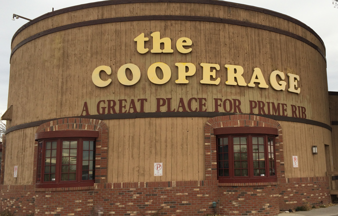
Photo: Kevin Glasgow. License: All Rights Reserved.
A victim of the Covid-19 pandemic, the now closed Cooperage was an Albuquerque fixture for over 40 years. The distinctive barrel-inspired architecture marked it as local landmark. Naturally, Cooper Black was used in the eatery’s word mark.
The sign on the outside is loosely modeled after Cooper Black, and in some details like R and G a bit closer to Pabst Extra Bold. Other applications make direct use of Cooper Black. The typeface used for the slogan (“A Great Place for Prime Rib”) is unidentified – Plantin Bold Condensed comes close.

Photo: Kevin Glasgow. License: All Rights Reserved.

Photo: Kevin Glasgow. License: All Rights Reserved.


")


")


