
The Matrix (1999) movie posters
Contributed by Patrick Concannon on Sep 1st, 2022. Artwork published in
.

Source: movieposters.ha.com License: All Rights Reserved.
Double Sided US Advance One Sheet
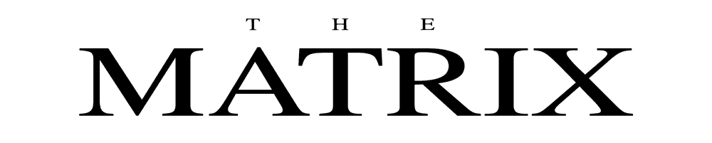
The posters for the 1999 science-fiction action film The Matrix were designed by Concept Arts.
The film’s logo is based on Times, creatively sliced and rearranged with added horizontal lines to appear as if it has been corrupted by computer glitch. The billing, release date, and digital rain are set in OCR-A, a standardized, monospaced font designed for optical character recognition on electronic devices. The credit block is set in Bee, a popular choice for the condensed credits required on movie posters.
License: All Rights Reserved.
Times letterforms, resized and compared to the logo for the film.

Source: movieposters.ha.com License: All Rights Reserved.
The US Advance Subway Two Sheet poster also features the same imagery and type in an alternate layout.


</span>")


2 Comments on “The Matrix (1999) movie posters”
The logo was designed by Tim Girvin (source)

Patrick, thanks for contributing a post about these iconic posters – a much welcome and overdue addition!
Christian, great to know the name of the logo designer! Credit added. Girvin has written about the work for Matrix on his blog.
The differences between Times (Linotype) and Times New Roman (Monotype) are minute, certainly in the basic roman caps. But Patrick is right: unlike the text in The Illustrator 10 Wow! Book suggests, Girvin began with Times, not Times New Roman. In the latter, the counter of R has a sharp corner at the top left, and the serifs are a tad flatter.
There are various fonts that are based on Girvin’s logo and extend the design to a full alphabet. Miltown (Apostrophic Labs, 2000) is probably the most successful attempt.