
Grand Theft Auto III (Sony PlayStation 2)
Artwork for GTA III
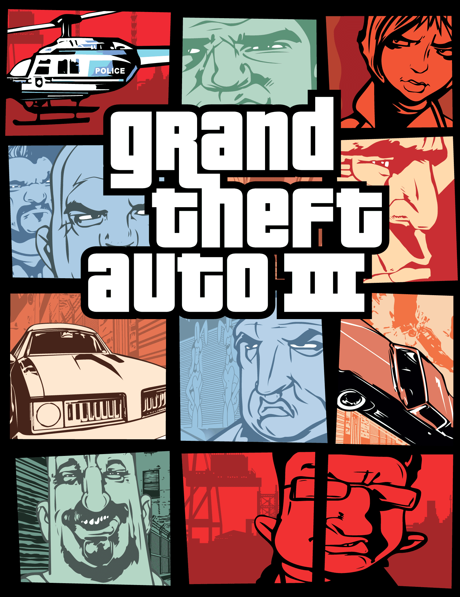
Cover design with illustration by Stephen Bliss for the 2001 action-adventure video game Grand Theft Auto III developed by DMA Design and published by Rockstar Games for the Sony PlayStation 2.
The game’s title is set in Pricedown, with some slight modifications made to create the Roman numerals. At the time, Pricedown’s designer, Ray Larabie, worked for Rockstar Toronto, in a different studio from where this artwork was created. Larabie even had worked on the GTA series, and created all the cars and level art for GTA: London 1969 in 1999. At night, he was churning out free fonts. One of them was Pricedown, inspired by the type used by the TV show The Price is Right. The designer of the GTA III logo was unaware that the font they had chosen was made by someone who worked for them. This choice of type has become the series’ trademark titling, with every subsequent GTA game utilizing it. Additional text is set in Bank Gothic.
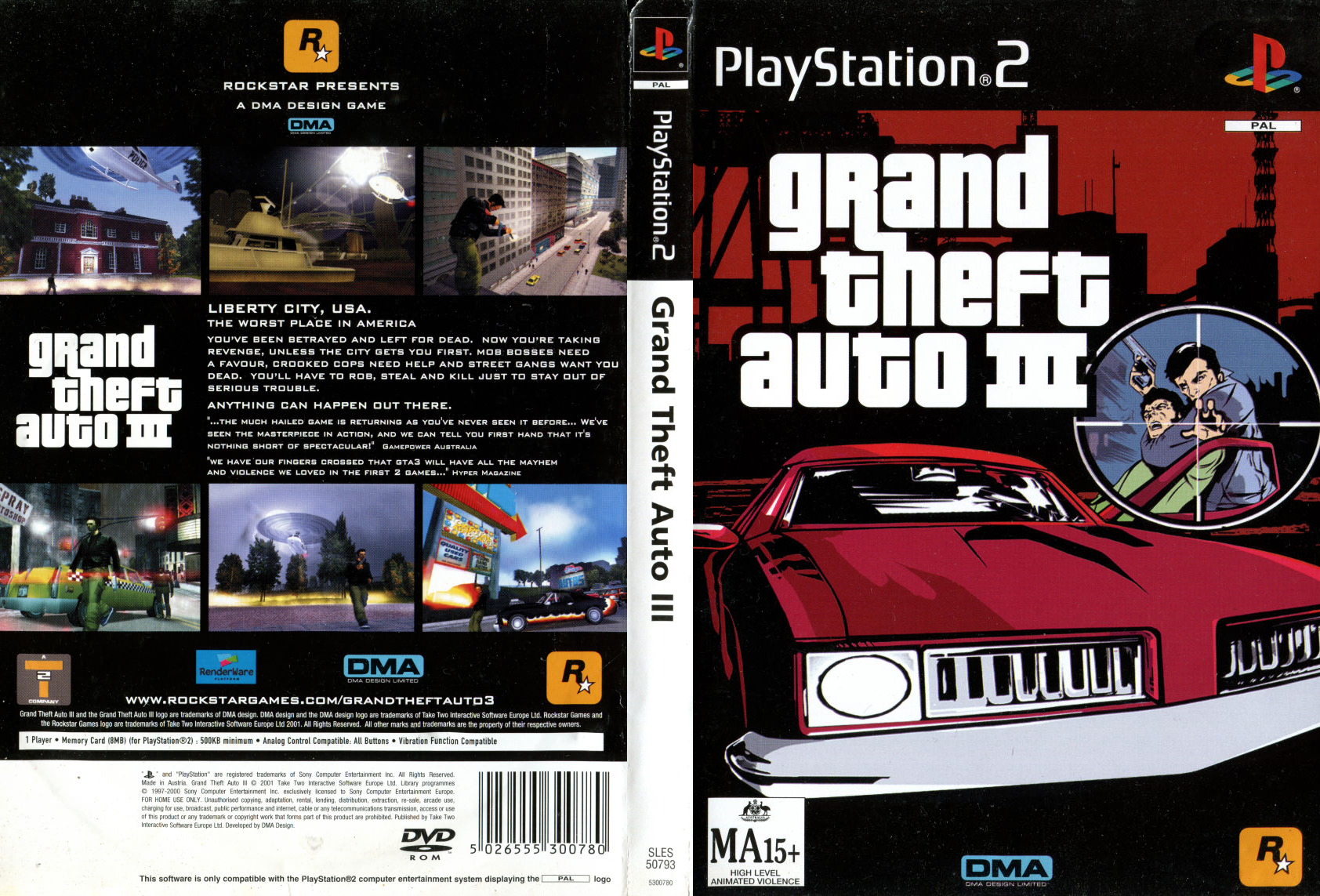
Alternate cover designs are used for the PS2 releases in North America, the United Kingdom and Australia. For the European release, the game’s title is abbreviated to GTA III and accompanied with the same cover illustration as the UK release, except for the German edition which uses an alternate design.
The original North American cover was intended to be the same as the UK cover, however, sensitivity regarding the tragic events of 9/11 led to the creation of a remixed cover design for its release. This new cover design is said to have been inspired by the title sequence of 1968’s The Thomas Crown Affair, and a Flash intro video included on the game’s original promotional website supports this notion.
Outside of North America, Frutiger is used for the game’s title on the spine of the sleeve, as was the case for most PS2 releases in PAL regions.
The in-game graphics use Pricedown, too, with a customized numeral 1: a flag and a base were added, for less ambiguity. Pricedown here is paired with Arial.
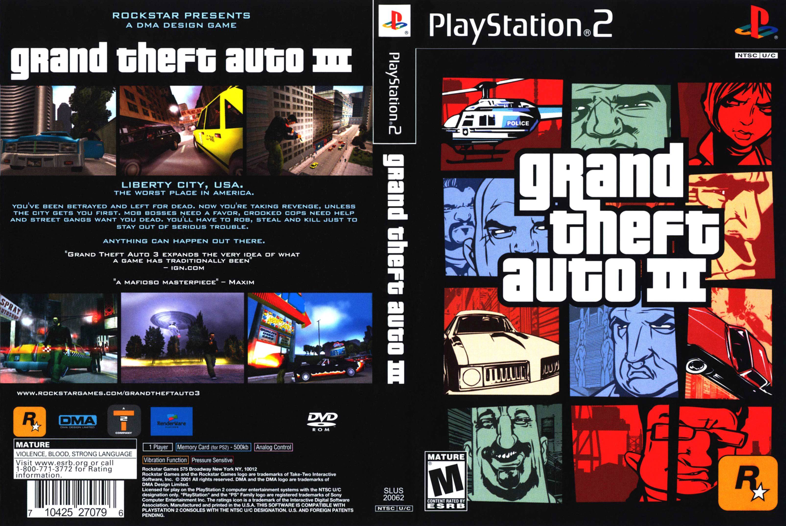
Full view of sleeve for the North American PS2 release. The game's title is set in Pricedown, with additional text set in Bank Gothic.
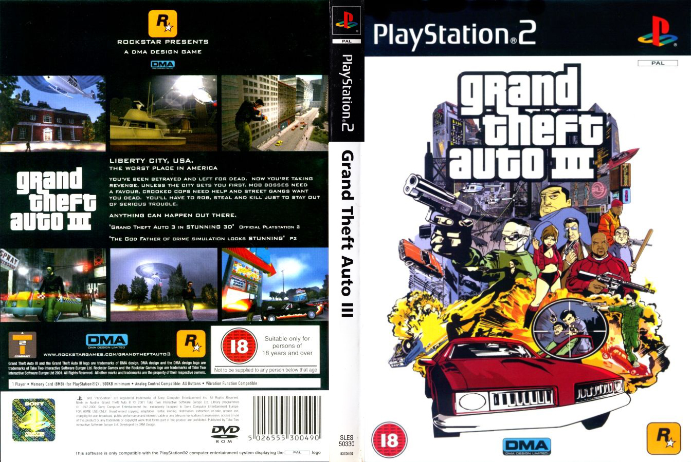
Full view of sleeve for the UK PS2 release. The game’s title is set in Pricedown, with additional text set in Bank Gothic. Frutiger is used for the game's title on the spine of the sleeve.
Full view of sleeve for the Australian PS2 release. The game's title is set in Pricedown, with additional text set in Bank Gothic. Frutiger is used for the game's title on the spine of the sleeve. The cover illustration is a tighter crop of the UK release set against a new dark red skyline.

Front cover of German PS2 release. The game’s title is abbreviated to GTA III but still set in Pricedown. Most other European releases feature the abbreviated title but the same cover illustration as the UK release. This release features an alternate design incorporating elements from both the North American and UK covers.
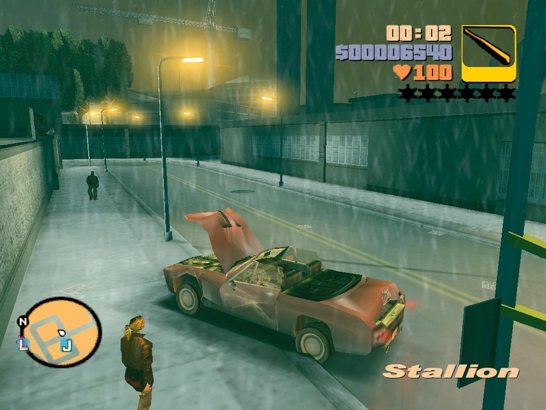
The in-game graphics use Pricedown, too, with a customized numeral 1: a flag and a base were added, for less ambiguity.
Pricedown is paired with Arial.


")


")


")


2 Comments on “Grand Theft Auto III (Sony PlayStation 2)”
Thanks a lot for documenting this iconic use of Pricedown, Patrick!
In 2021, Benjamin Kaczynski and Chris Halstenberg at FH Potsdam made a video about the use of Pricedown for GTA, including an interview with Larabie.
As you have mentioned in the article, Rockstar Games continued to use Pricedown for all subsequent versions of the GTA series. Shown below are a couple of images, that illustrate that, compiled by my colleague Matthijs.
See also Red Dead Redemption for another game by Rockstar which likewise uses a font by Raymond Larabie, in this case his Chinese Rocks: