Rudolf Stingel monograph
This monograph presents the works of artist Rudolf Stingel through images and texts. Edited by Udo Kittelmann, it was published in 2019 by Hatje Cantz on the occasion of an exhibition at Fondation Beyeler:
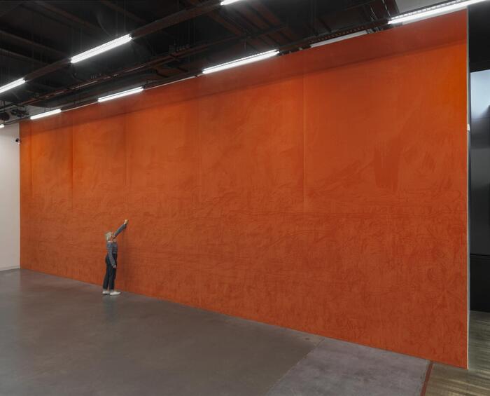
Starting with his exploration of classic visual themes, Rudolf Stingel has developed a wealth of motifs. Besides various series of abstract and photo-realist paintings, he makes large-format works out of Styrofoam, paintings cast in metal, and spaces covered in carpeting or acoustic tiles that viewers can touch or walk through. In his first European museum exhibition, the Fondation Beyeler is presenting Stingel’s most important series of works from all phases of his career. The companion catalogue has been conceived as an artist’s book and unfolds the visual variety and diversity of Stingel’s art. Contrasting photographs of individual works and views of exhibitions point out new associations, allowing a completely refreshing perspective of his oeuvre.
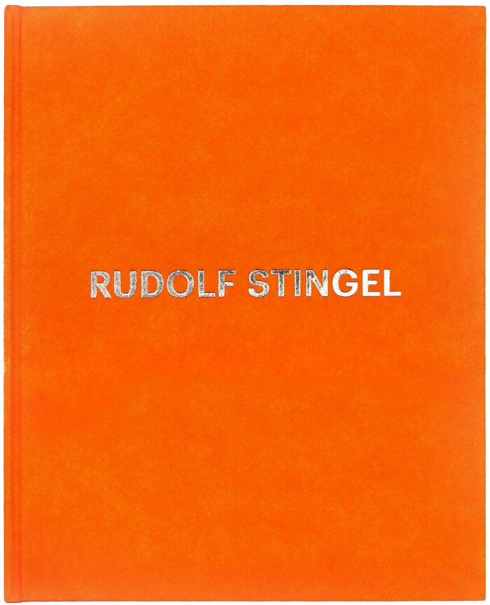
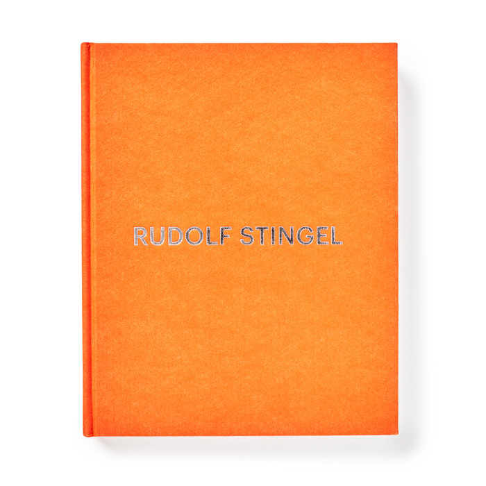
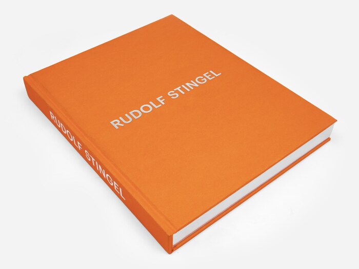
The typography chosen by designer Christoph Radl is minimalist and uncluttered, with a simple typeface – Graphik – and clear spacing. This minimalist typography also reflects the aesthetic of the artist who advocates a certain simplicity in his work, in particular in the way he exhibits them: Stingel would often use entire rooms to display a painting in the center only, as in this cover where his name occupies all the space with a minimalism in the choice of characters and the location in the centre.
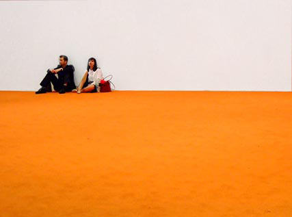
The background in fluorescent orange is a direct reference to Stingel’s 1989 book Instructions, in which he explains explicitly how to reproduce his works and how to paint like him. This approach marked the beginning of his career. Later, when he started to exhibit, he used this orange cover again. At the Venice Biennale 1993 he did not exhibit any paintings but simply covered the floor with the same fluorescent orange. He would do it again in different ways in other museums. The silver texture also evokes Stingel’s works which often use chrome and metallic textures.
Formats
- Books (5434)
Topics
- Art (3842)
Designers/Agencies
- Christoph Radl (1)
Tagged with
- Fondation Beyeler (1)
- Rudolf Stingel (1)
- artist’s books (89)
- monographs (223)
- exhibition catalogs (675)
- Udo Kittelmann (1)
- Hatje Cantz (17)
- hardcovers (1080)
- book covers (4804)
- orange (401)
- metallic foil (311)
- silver (135)
- foil stamping (142)
- all caps (5975)
- minimalist (498)
- book spines (1227)
- book interiors (2890)
- captions (380)

