
HQ
HQ Toronto, at 790 Bay St., is a welcoming, sex-positive, shame-free, stigma-free, and bully-free space where cis guys into guys and all trans and non-binary people can receive integrated, person-centred health services. Its team first approached design studio Frontier to help name the space, which led to a comprehensive visual identity, launch collateral, and wayfinding system.
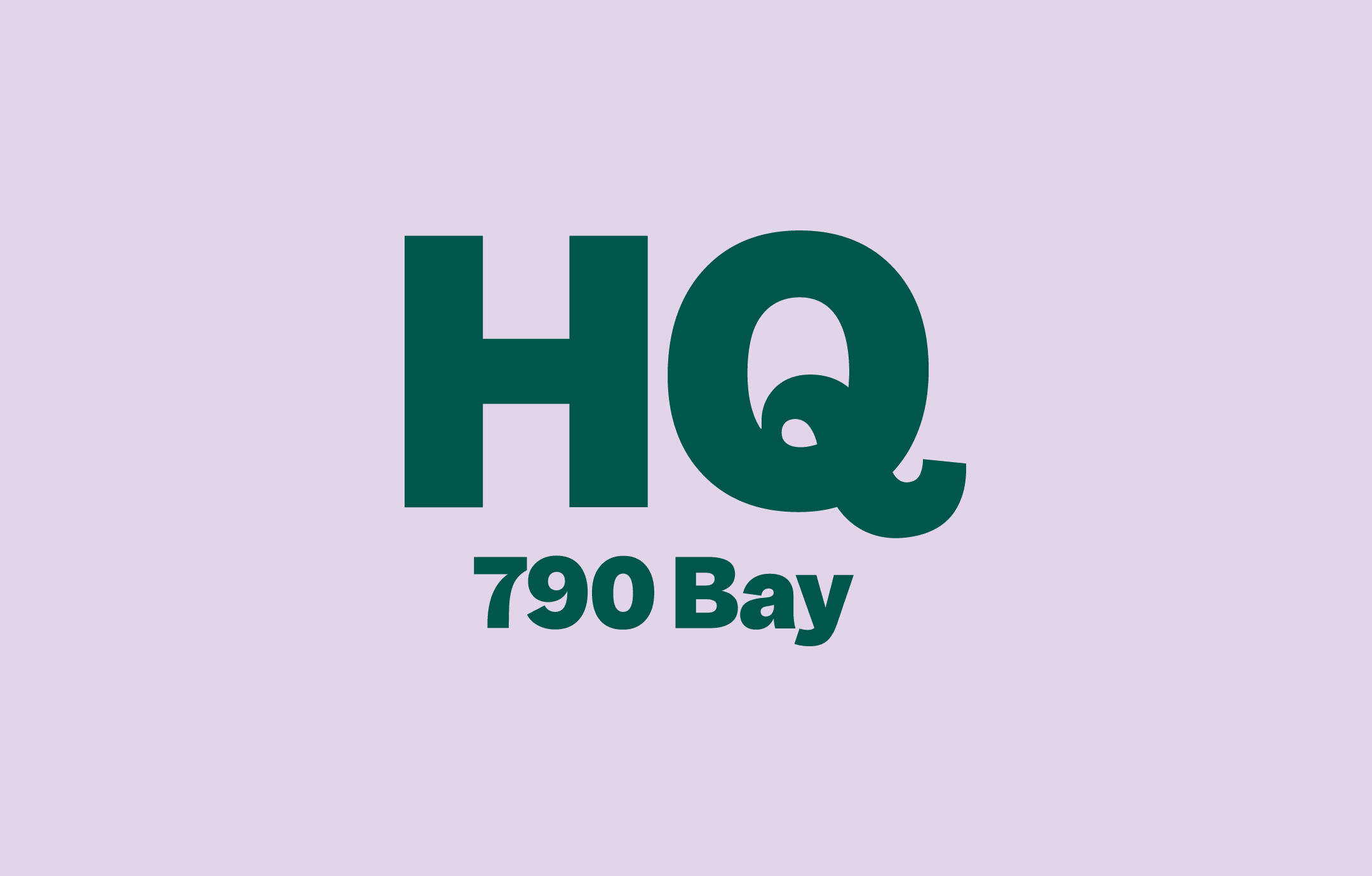
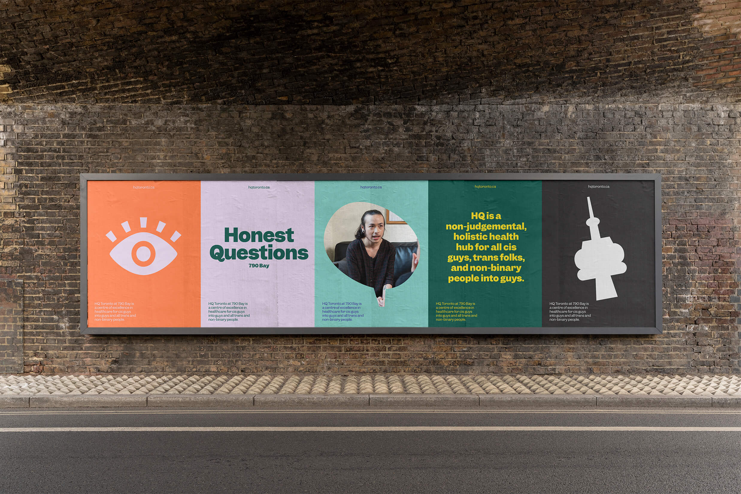
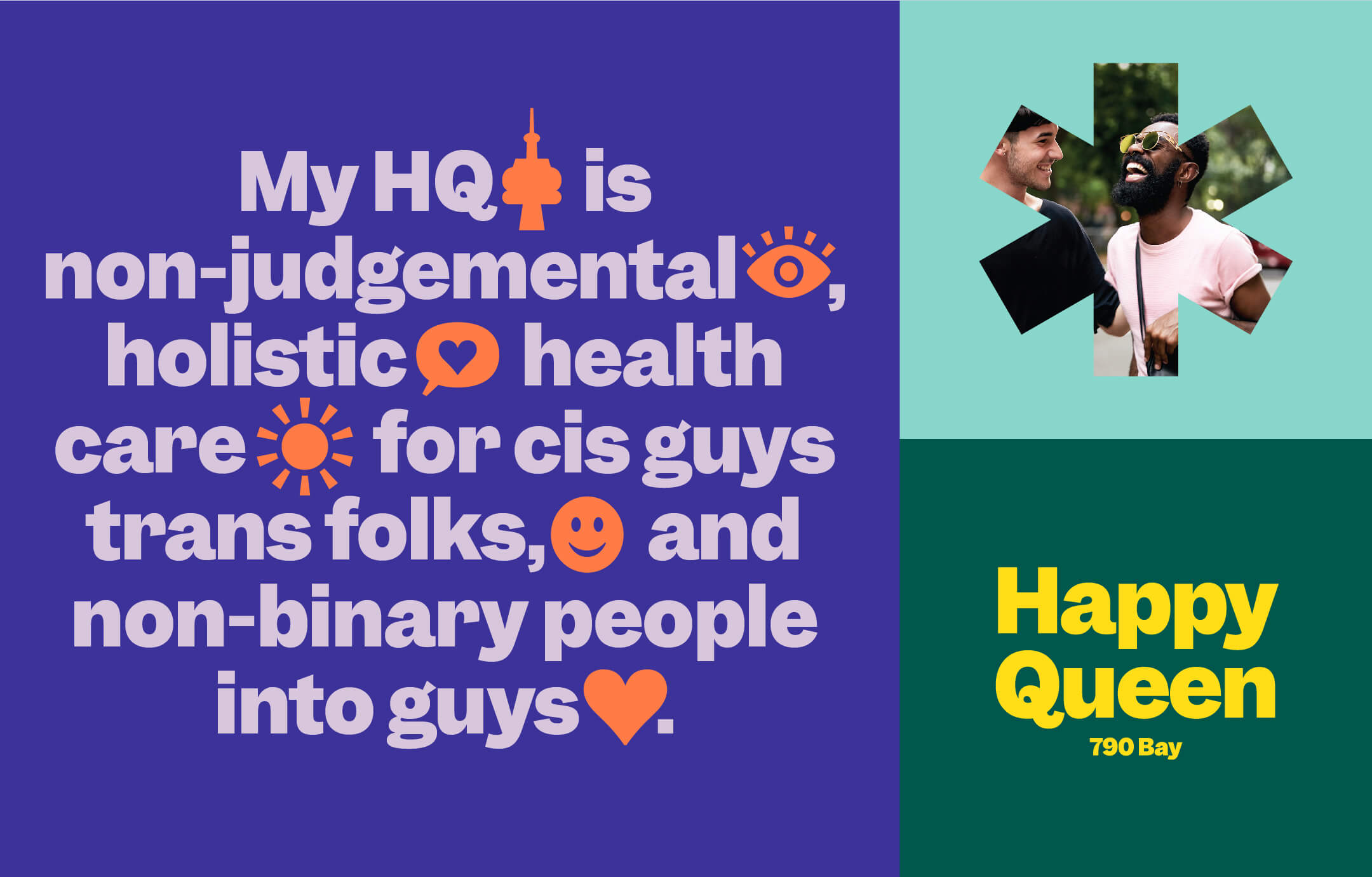
Providing physical-, sexual-, and mental-health services as well as community programs, this forward-thinking integrated health hub needed a name that is memorable yet open-ended enough to be infused with meaning by its communities. The brevity and immediate association with “headquarters” provides instant impact. But “headquarters” appears nowhere in the branding; instead, the letters are repurposed for phrases – happy queens, helpful questions, high-speed queues – that communicate the range of services and experiences associated with the space. HQ the name, like HQ the venue, becomes what its communities make of it.
The type- and icon-focused visual identity expands upon this notion of diverse definitions, emphasizing how language relates to identity and empowerment and giving the organization an ability to express different messages. The brand uses one typeface: Garnett, a contemporary grotesk from Sharp Type with slight eccentricities that create a warm and conversational tone that matches HQ’s approach to health services.
Because HQ is a physical place, a magnet for community members who might feel they aren’t understood elsewhere, we included the address in the logo. If the accompanying message resonates with them, anyone who encounters the logo will know where to visit. The address likewise creates a built-in system to accommodate HQ’s future growth.
We also created thirteen icons as an extension of the visual identity and to aid people who have difficulty reading. These icons, whose forms and details are inspired by Garnett, represent not only services but also key emotions and ideas associated with the space.


")

")


")


")


")


