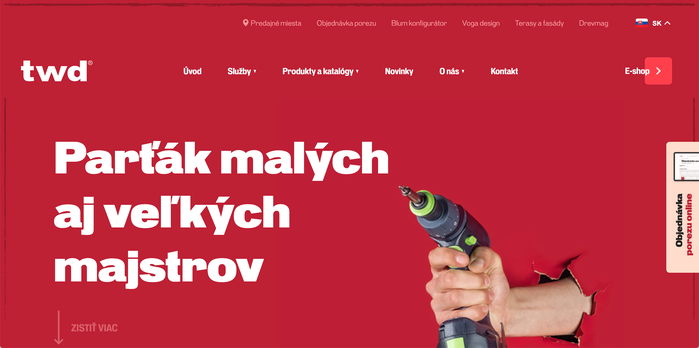
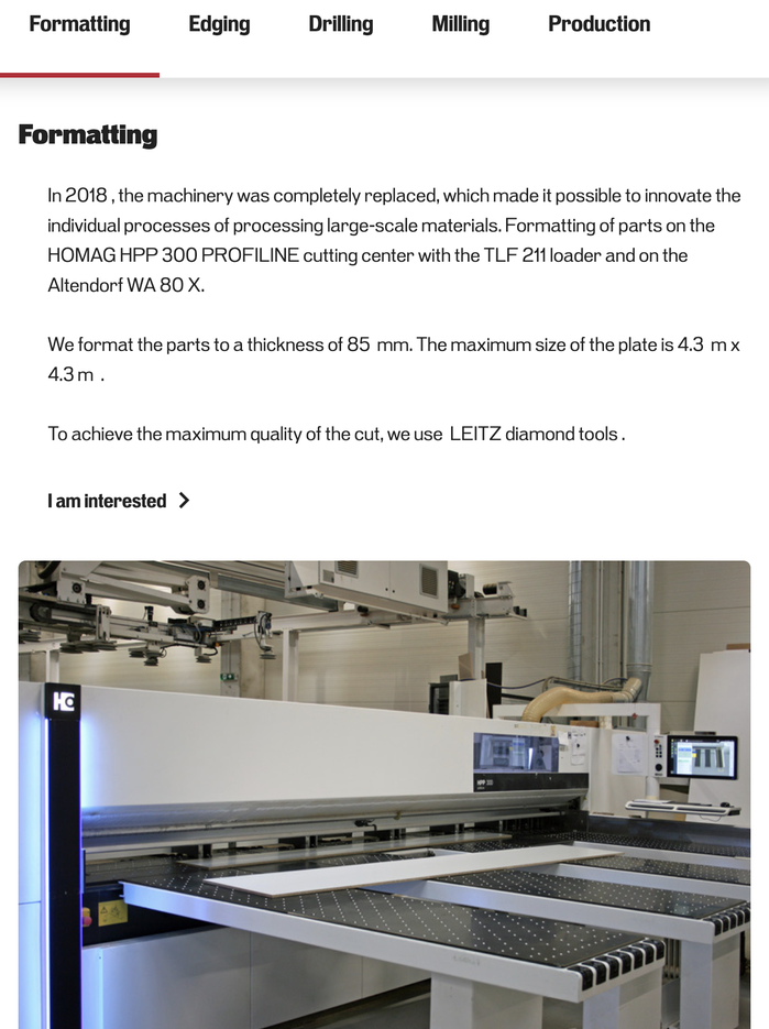
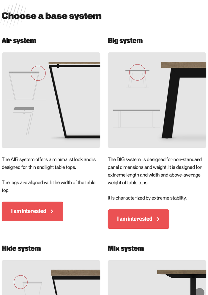
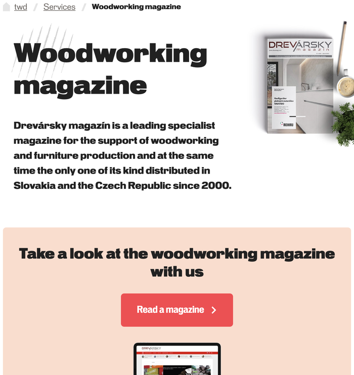
twd is a hardware retailer based in Slovakia, supplying quality tools, furniture, windows and doors to both large and small craftsmen. twd uses Pennypacker Black for their largest headlines, Extra Bold for subheads, and Regular and Bold for body copy. Their main navigation makes good use of the narrower Pennypacker Condensed styles in Bold, as well and their buttons and in-page navigation to jump to lower sections.
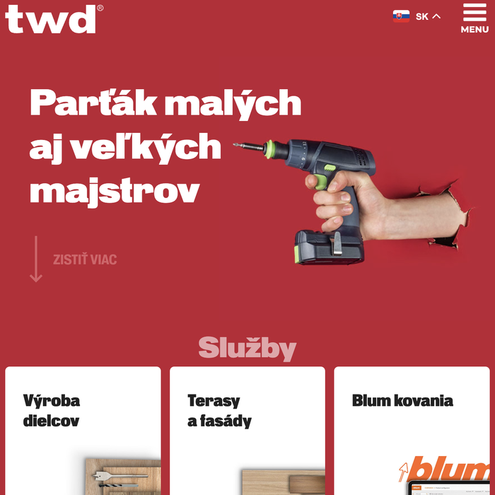
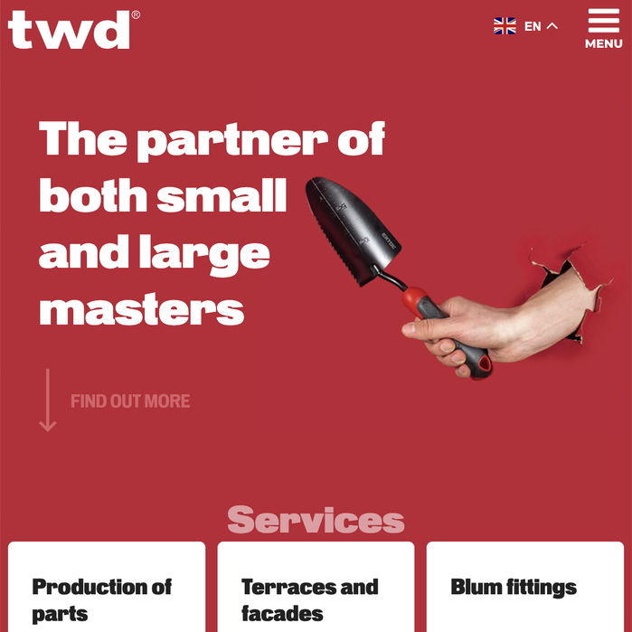
Pennypacker is, at its core, a super utilitarian industrial grotesk, making it a perfect choice for twd, by creative studio Vizua. Pennypacker’s system of weights and widths was designed to have enough options, with enough contrast, so that this one typeface family could be used for an entire identity design. It’s wonderful to see a design system like twd’s which makes use of the range of weights and widths in Pennypacker. twd’s typography feels confident and strong through its use of Pennypacker’s Black weights in both large headlines and small subheads, contrasting them with the much lighter Regular weight body copy. A key factor that makes this work is the ample use of white space, leaving room for the Black weight text to breathe.
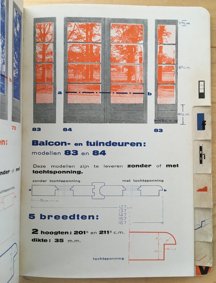
Page from Bruynzeel’s 1930s catalog designed by Piet Zwart, using Annonce and Kaart-Antieke
This design overall brings to mind one of my favorite references for Pennypacker, the carpentry factory catalog for Bruynzeel’s fabrieken Zaandam designed by Piet Zwart in the 1930s, shown to me by Stephen Coles at the Letterform Archive. Despite the catalog’s super utilitarian and potentially boring subject matter, selling items like doors and flooring, Zwart’s design is dynamic, strong, clearly understandable, and beautiful. The boldest text in the catalog uses Annonce, which comes from the same lineage as Pennypacker, contrasted with a much lighter body typeface, Kaart-Antieke. Again, a large part of what makes the super heavy type work at small sizes is the strategic use of ample whitespace. See Zwart’s design in this post about the Bruynzeel catalog. I liked this catalog so much that we were considering directly referencing it for the marketing materials of Pennypacker. But now I’m even happier that, instead of us making a fake use of Pennypacker selling industrial material, twd is using the range of Pennypacker styles to sell actual industrial materials and tools, in a strong design system that uses many things I love about Zwart’s design.


Formats
- Web (4542)
- Branding/Identity (6674)
Topics
- Retail/Shopping (897)
Designers/Agencies
- Vizua (1)
Tagged with
- hardware (43)
- retailers (28)
- tools (23)
- furniture (181)
- windows (191)
- doors/gates (39)
- websites (2544)
- multilingual (1960)
- Slovak (language) (31)
- English (language) (1814)
- identities (1632)
- one typeface family (1470)
- multiple widths (453)
- multiple weights (352)
- red (715)
- reversed type (2921)
- diacritics (137)
- arrows (608)
- menus (UI) (358)
- buttons (UI) (126)
Artwork location
- Slovakia (47)
- Banská Bystrica (1)


