
4× Netherlands–Russia
Contributed by TypeTogether on Apr 2nd, 2014. Artwork published in
.
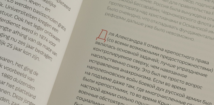
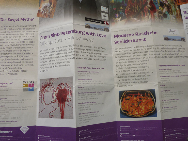
Designer Nynke Tiekstra (ColtsfootMedia, Rotterdam) has chosen Tom Grace’s typeface Iskra for the exhibition 4× Netherlands–Russia. The exhibition has been organised by the University of Groningen and the Centre for Russian Studies as part of the cultural manifestations to celebrate the Netherlands–Russia year in 2013. It shows the dialogue between Russia and the Netherlands from four different angles: travel, science, cartography and history.
Iskra, both Latin and Cyrillic, is used throughout the catalogue, promotional material and panel information, in titling sizes as well as in small text settings. According to the designer the typeface has been chosen to “lighten up the darkness of the subject. With style and respect.”


")


")


