Queens Theatre Contributed by Shiva Nallaperumal on Nov 21st, 2014. Artwork published in 2014. Source: new.pentagram.com Pentagram. License: All Rights Reserved. 
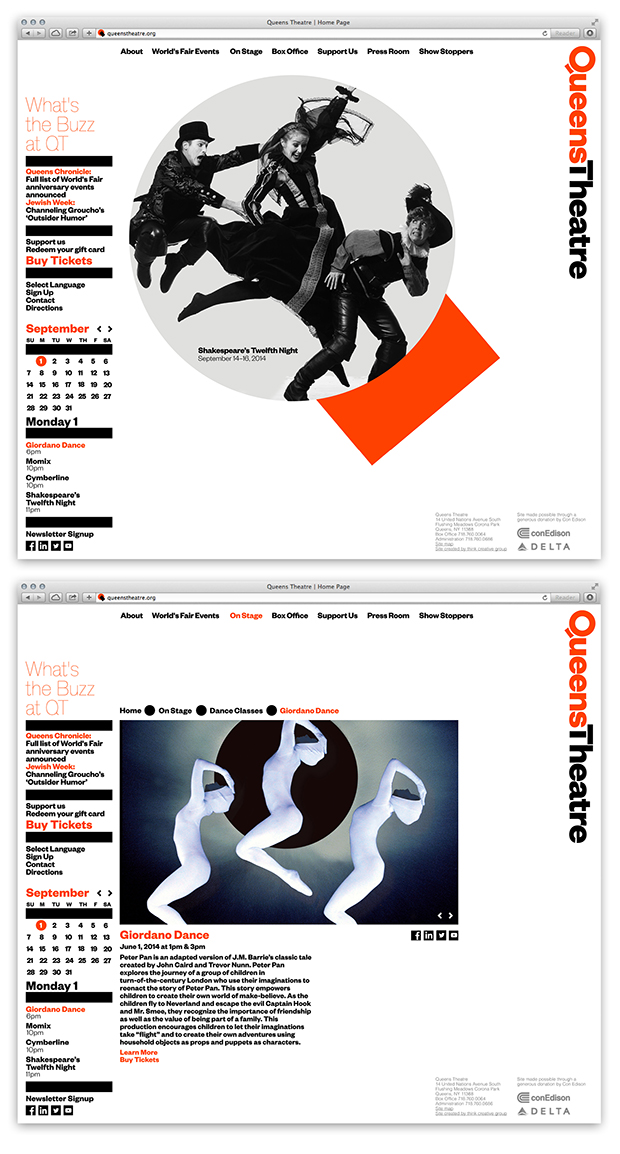
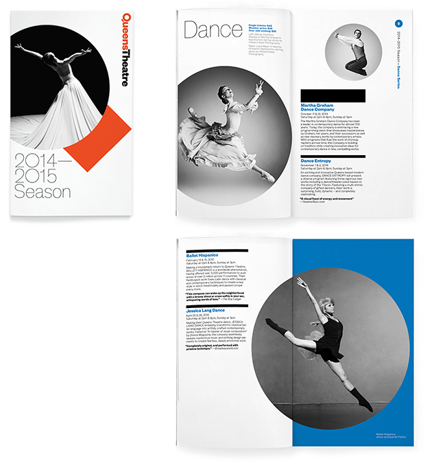
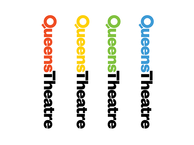
Paula Scher’s new dynamic identity for the Queens Theatre is exquisitely modern. It uses Klim’s Founders Grotesk as the primary family and a subtly modified version of Optimo’s Theinhardt for secondary text. The subtle modification of the ‘T’ in Theatre to match the ‘Q’ in Queens is a brilliant touch at bringing the identity to perfection. Source: new.pentagram.com Pentagram. License: All Rights Reserved. Source: new.pentagram.com Pentagram. License: All Rights Reserved. Source: new.pentagram.com Pentagram. License: All Rights Reserved. Source: new.pentagram.com Pentagram. License: All Rights Reserved. Source: new.pentagram.com Pentagram. License: All Rights Reserved. Source: new.pentagram.com Pentagram. License: All Rights Reserved. Source: new.pentagram.com Pentagram. License: All Rights Reserved. Source: new.pentagram.com Pentagram. License: All Rights Reserved. Typefaces Formats Advertising (1442) Branding/Identity (4915) Posters/Flyers (3614) Booklets/Pamphlets (1511) Topics Performing Arts (599) Designers/Agencies Pentagram (93) Paula Scher (15) Ludwig Janoff (1) Rory Simms (2) Tagged withtheater (227)dynamic identity (1)modified typeface (1180)logos (2774)negative space (29)CamelCase (58) Artwork location United States (6555) New York City (1753) In Sets [1] (Ivan Ilic) (171) UWUWB (Liselle Ewing) (76) Favorites (Liselle Ewing) (54) Business - "Business (Liselle Ewing) (33) Entertainment Business (Liselle Ewing) (55) Clean (Liselle Ewing) (24) ALL (Liselle Ewing) (5) Selection (Francisco Besa) (125) Designs by Women (Fonts In Use Staff) (1573) favorite (fei) (8) JKS (fei) (52) Title (Byeong Man Kim) (51) Post a comment Name Email – will not be published Website Your response Submit Comment More Founders Grotesk in use It Must Be Nice at the Bernard Shaw, Dublin2019Aidan MooreContributed by Max Phillips The Issue No. 1, “Speculating Systems”2016Daniel SeemayerContributed by Matthijs Sluiter rasmus und christin studio branding2017rasmus und christinContributed by rasmus und christin Sponsor More in Performing Arts Artes Vivas book collection2021Victoria CoplanCarolina GiovagnoliContributed by PampaType Team In Real Life newsprint / website2009Konst & TeknikContributed by (Harald) Peter Ström Contação de Histórias. Tradição, Poéticas e Interfaces2015Bloco GráficoContributed by Typotheque Staff Pick Het Bezoek poster, De Roovers & Muziektheater Transparant2018Tom HautekietContributed by Florian Hardwig Staff Pick More in Advertising “2 Tones for That Great Illusion!” page in Frederick’s of Hollywood catalogue 1972c. 1972Frederick's of HollywoodDorothy KahnContributed by Christopher Bentley Sotheby’s Summer Study Posterc. 2012Ascend StudioContributed by Ascend Studio El Último Intravenosa2017Cuántika StudioSebastian MartinezJuliana LópezContributed by Sebastian Martinez 7 Up branding (1976–79)1976Thomas MillerMorton Goldsholl AssociatesContributed by Stephen Coles Staff Pick More Fonts In Use Design Sweden2016Kod & FormRamiro OblitasParasolContributed by Florian Hardwig Staff Pick Nourished Journal, 1–32015Thomas WilliamsContributed by Jordan Parker Staff Pick Alpen Rose2019MuccaContributed by Sean O'Connor Staff Pick Fernando Vicente2014Conor & DavidConor NolanDavid WallContributed by Stephen Coles Staff Pick