
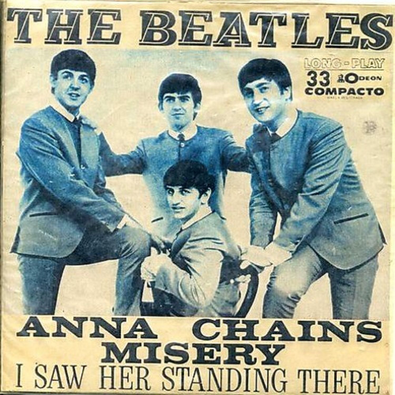
The Beatles – “Anna / “Chains” / “Misery” / “I Saw Her Standing There” Brazilian and Peruvian EP covers

In the 1930s, Italian type designer Alessandro Butti came up with a clever idea to create a new eye-catching display typeface. The best thing: it didn’t require a whole lot of effort to produce. For Landi Echo, he took the capitals of Landi tonda nera – which was Nebiolo’s name for Welt-Antiqua halbfett, a bold low-contrast slab serif originally from Ludwig & Mayer – and added oblique thin letterforms as an inline. The result is a scintillating motion effect.

Glyph set for Landi Echo, as shown in a Nebiolo specimen. Image courtesy of Jan Middendorp.
I suspect that this decorative variant was made by cutting right into the existing metal type. Such a time-saving approach was not unheard of – other examples from the 20th century include Lutetia Open and Romulus Open, both engraved by Paul Rädisch under the direction of Jan van Krimpen at Enschedé, or Chisel by Robert Harling, executed by punchcutter H. Karl Görner at Stephenson Blake. Combining upright and italic letterforms in a single glyph was a novelty, though. At least I’m not aware of any earlier examples. Landi Echo was first cast by Nebiolo in 1939.
Filmotype must have loved the concept. In 1955, they added a very similar design to the catalog of fonts available for their phototypesetting machine, sorted into the “Novelty” range. Compared to Landi Echo, Filmotype Quartet is heavier, allowing the inline caps to slant more. As far as I can tell, Quartet’s underlying letterforms aren’t derived from an existing typeface. Stymie, Memphis, and Beton are similar, but none comes particularly close. The unknown designer went further than Butti, and also did a lowercase.
In 1967, Quartet was picked to set “THE BEATLES” on the Brazilian and Peruvian covers of the EP better known as The Beatles (No. 1). The song titles are added in Volta Bold and Egizio Condensed.

Quartet (bottom) copies the concept of Landi Echo (top), but not the letterforms in all their details. Unlike Butti’s typeface, it has a lowercase. Both designs were digitized by Claude Pelletier, in 2011 and 2012, respectively. His fonts were used for setting this sample.

The same typographic design was used together with a different image for a Peruvian pressing.
Another version of unclear origin (apparently also from Brazil), again with a different photo


")


")


")

” / “What A Wonderful Thing Love Is” German single cover")


")
")


")


")


