Brandless
When they needed a neutral typeface for a brandless brand, the choice was obvious.

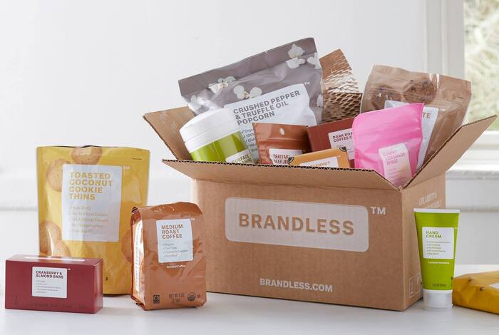
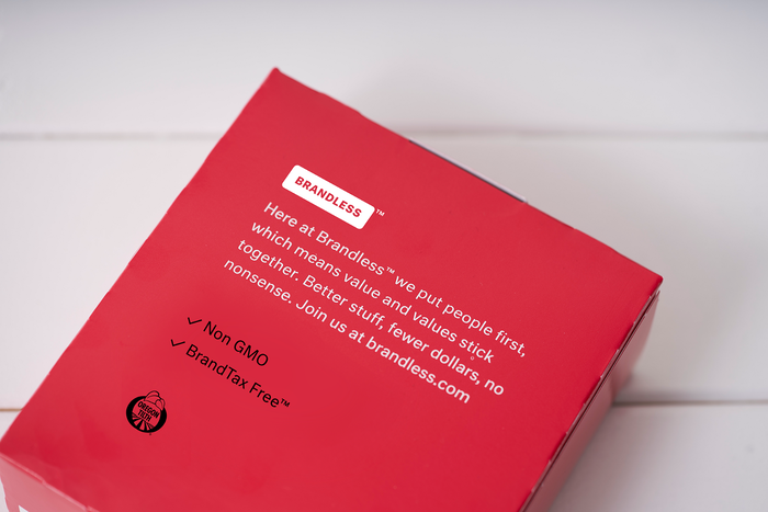
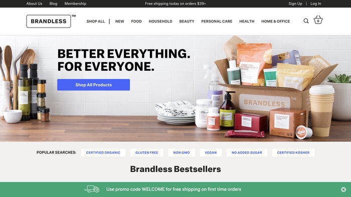
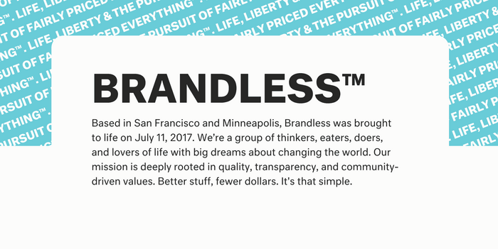
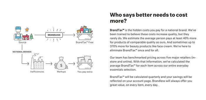
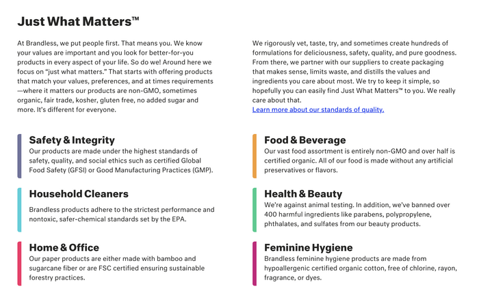
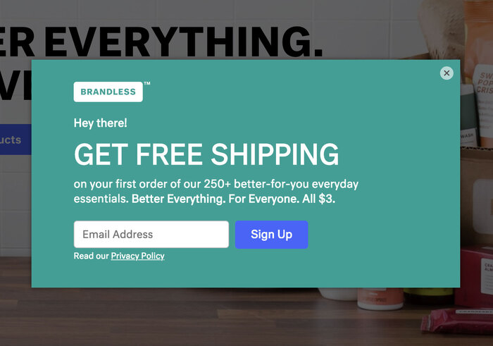
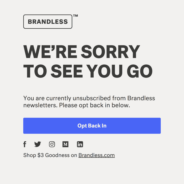
Launched in July 2017, Brandless is an online retailer offering grocery and household supplies exclusively under its own label, all for $3. The concept is simple, and so is the look. Still, even Brandless has a brand. The identity is based on solid colors, rounded rectangles, and minimal typography in a single typeface.
Neutral is obviously appropriate, not just for its name, but because it really was researched and engineered to be as neutral as possible, as elusive as that goal may be. Kai Bernau drew from a long list of comparisons and measurements to create the parameters from which the typeface was constructed. Its structure is essentially an “average” of typefaces from multiple sans-serif classifications. Neutral was originally designed in 2006 as part of his graduation project at the TypeMedia program [correction: of the graphic design BA, see comments] at KABK. It was extensively revised and reissued by Typotheque in 2014.
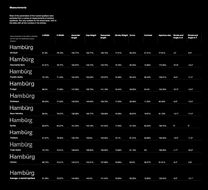
Measurements from a variety of Grotesque and Humanist sans serifs were the initial basis for Kai Bernau’s Neutral type design.
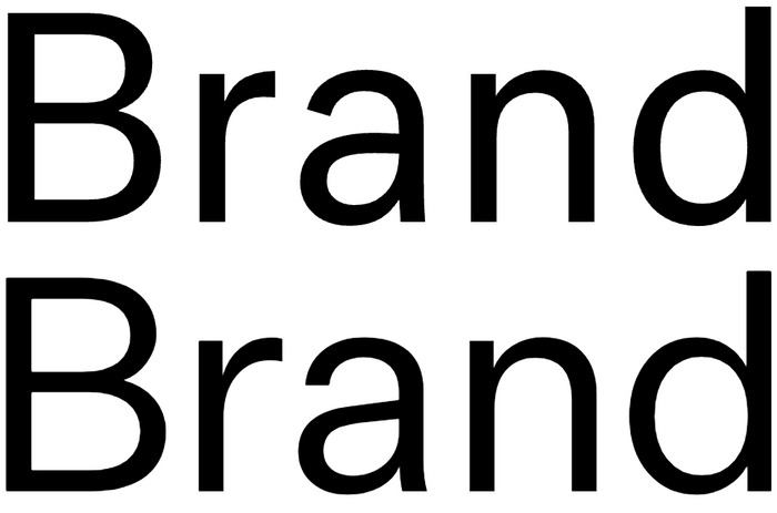
One key difference between Neutral (above) and Untitled Sans (below), is the stroke endings. Neutral’s are mostly angled. Untitled’s are mostly horizontal, in the Neo-Grotesque tradition.
The Brandless team might have chosen a different face with a similar idea: Kris Sowersby’s Untitled Sans, but it was released in March 2017, well after the Brandless identity project was underway. The design approach for Untitled Sans was very different than Neutral’s, but the result is unsurprisingly quite familiar, albeit closer to the rationalized modernist models of Helvetica and Univers due to its horizontal terminals. I think Neutral was the right choice here; its terminals (naturally perpendicular to the direction of the strokes) ultimately feel more brandless to me — plainer, less “designed”. Yet your perception may vary. Neutrality is inevitably in the eye of the beholder.



Formats
- Web (4546)
- Packaging (1985)
- Advertising (1781)
- Branding/Identity (6679)
Topics
- Food/Beverage (2559)
- Retail/Shopping (898)
Designers/Agencies
- Red Antler (7)
Tagged with
- simple (56)
- groceries (30)
- logos (3881)
- minimalist (498)
- online shopping (286)
- cosmetics (106)
- type in a box (603)
- round corners (204)
- type as pattern/ornament (172)
- type on an angle (1068)
- critique of use (83)
Artwork location
- United States (8319)
- San Francisco (296)
In Sets
- BQHA (Anton Goddard) (10)
- FYM (Anton Goddard) (19)
- TYPE (Dunya Ahmad) (362)















1 Comment on “Brandless”
Hi Stephen,
thanks for the nice write-up! Small correction, I designed Neutral (in its first incarnation) as the graduation work of the graphic design BA (also KABK). What came out of the master were the beginnings of Lyon.
Cheers,
K