
CADENA brand identity
Contributed by Alberto Lot on Dec 13th, 2018. Artwork published in
circa August 2018
.
Photo: Alberto Lot. License: All Rights Reserved.
CADENA is an acronym that stands for Characterizing And Disentangling Environment And Nature Aspects. It also means chain in Mexican. The Cadena project was born in Tucson, Arizona, and is developed at the University of Birmingham. This proposal is aimed at funding a postdoctoral position in astrophysics. The logo is a simple lettering that recalls a chain’s structure. I also developed the visual identity to support the communication material. I used Anti, a stylish grotesque that, thanks to its high readability and beautiful ink traps, was perfect for title and text use.

Photo: Alberto Lot. License: All Rights Reserved.

Photo: Alberto Lot. License: All Rights Reserved.
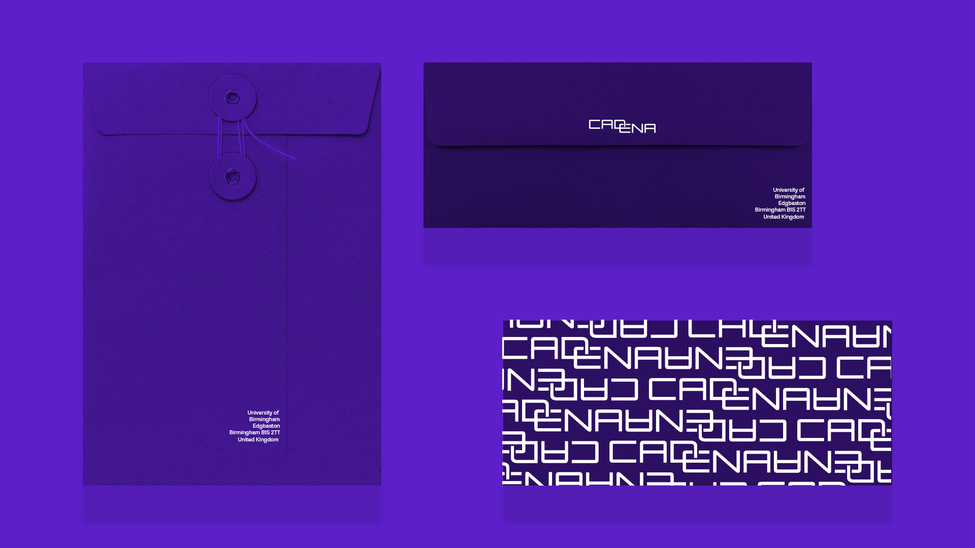
Photo: Alberto Lot. License: All Rights Reserved.

Photo: Alberto Lot. License: All Rights Reserved.


