
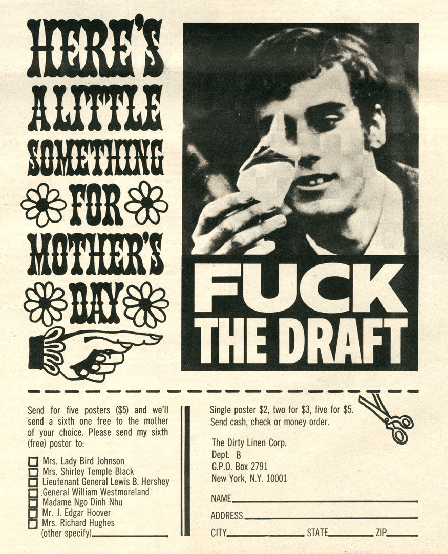
“Here’s a little something for Mother’s Day” ad
Background from the Victoria and Albert Museum:
Opposition to the Vietnam War was an issue that galvanised a generation of students and activists – many of whom turned to the medium of the poster to express their moral dissent from the war. ‘Fuck the Draft’, is perhaps the most iconic of all. Designed by student activist Kiyoshi Kuromiya, under the fictional name ‘Dirty Linen Corp’ the poster protests against the drafting of young men into the military to fight in the conflict with Vietnam. The drafting of men became a major catalyst for opposition to the Vietnam War, especially among college students for whom burning the draft card became a symbolic act of defiance.
The language Kuromiya used in the poster was designed to shock the establishment and resonates with the ways in which 1960s American youth culture sought to challenge authority through alternative politics, lifestyles, fashion and music. In 1968, Kuromiya distributed this poster via mail order. In the accompanying advert he described it as ‘the perfect gift for Mother’s Day’ and ‘Buy five and we’ll send a sixth one to the mother of your choice’ listing a number of options, including the White House. For this ad, Kuromiya was arrested by the FBI and charged with using the US postal service for inciting lewd and indecent materials. Later that year Kuromiya defied the authorities and handed out 2000 of the posters at the Democratic Convention in Chicago.
The message of the poster itself is delivered in plain sans-serif caps, in two widths. The letterforms are a tad too generic (and the sample too limited) to tell whether they are from a typeface, and if so, which one.
The text added for the ad is rendered in a very different style, chosen to go along with the Mother’s Day theme, complete with flowers and a cute manicule. The Tuscan with bulbous terminals is named Phanitalian Ornamented No 2, and was first shown as wood type by William Page in 1879. Headliner issued a phototype adaptation in 1964. Smaller copy is set in News Gothic (or Trade Gothic) Condensed.
See also “‘Fuck the Draft’: The amazing story of Kiyoshi” by Jason Schafer for Dangerous Minds (2015). You can read more about Kiyoshi Kuromiya in Roger Vaughan’s article “The Defiant Voices of S.D.S.” in LIFE (Oct. 1968) and also in a 2021 article by Maina Chen.
Via the People’s Graphic Design Archive

Full page of the Berkeley Barb issue from April 12, 1968 with the ad


")
