
El Ingenioso Don Quijote de la Mancha, No. 1
Contributed by Álex Galiano on Feb 13th, 2018. Artwork published in
.
License: All Rights Reserved.
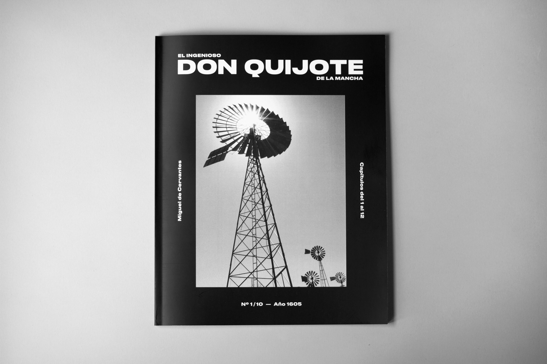
Don Quixote is very hard to read: it’s quite long, boring, old and it’s written in old Spanish. The intention of this magazine is to modernize Cervantes’ classic and make it attractive to younger publics, placing it out of context and using photography and typographic variations. The editorial concept and the art direction are based on the mental distortion and inconsistency of the main character. He maximizes or minimizes everything according to his own interests, seeing everything in black and white, just believing nothing but his delirious truth. To foster its reading, the complete novel would be divided into 12 issues; this is number 1.

License: All Rights Reserved.

License: All Rights Reserved.

License: All Rights Reserved.

License: All Rights Reserved.

Álex Galiano. License: All Rights Reserved.


")

")


")


")


")