
Aviation and space travel coin sets by Shell
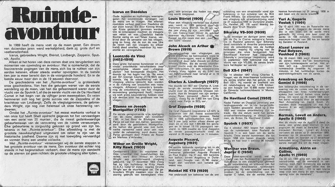
Several months after the successful Apollo 11 mission, Shell somehow belatedly jumped on the moon craze bandwagon and issued a series of coins commemorating milestones from the history of aviation and space travel. The motifs range from Icarus and Daedalus to Armstrong, Aldrin, and Collins. Gas station customers could obtain coins for every bigger purchase and collect them in designated cardboard holders.
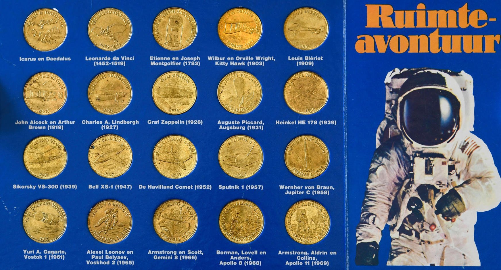
This post shows several of the card designs that varied from country to country. It’s interesting to see which typefaces were deemed appropriate for this topic. In the Netherlands, the series was named Ruimte-avontuur (“space adventure”). The chosen typeface is a condensed phototype version of Nubian (ATF). The fat 1920s Didone was probably chosen for its gravitas. Its rocket-like (dare I say phallic?) i might have played a role, too.
Ruimte-avontuur, The Netherlands, with Nubian

Leidse Courant, 25 March 1970. The same ad was published in other Dutch newspapers, too. In another ad from June 1970, the end of the campaign was announced. Missing coins could be purchased for 25ct apiece. The ads pairs Nubian with Helvetica.
In the UK, the series was named Man In Flight and used the quaint Goudy Bold for the display typography. Like in the Dutch version, Univers is used for smaller text. In South Africa, a set of 20 coins was available as Man in Flight / Lugpioniers, with the title presented in Peignot. With its unicase letterforms, this 1930s avant-garde face probably comes closest to our today’s notion of a “space font”.

Man in Flight, UK, featuring Goudy Bold. Like in South Africa, the coins here were silver-colored, not yellowish as in other countries, and there were only 16 of them, omitting Heinkel HE 178, Bell XS-1, Wernher von Braun’s Jupiter C, and the Gemini 8 spaceflight.

The UK album shows British aviation pioneers John Alcock and Arthur Brown on the back.

Man in Flight / Lugpioniers, South Africa. The title in English and Afrikaans is shown in outlined Peignot.
In France, the coins were presented by Shell-Berre under the title L’épopée de l’espace (“The epic of space”), in tightly spaced light caps derived from Adrian Frutiger’s Univers, with custom flat accents. Univers for traversing the universe, what’s not to like?

L’épopée de l’espace, France, with customized Univers

Description texts set in Helvetica. Printed in West Germany by te Neues + Co., Kempen.
The Finnish version was called Lentävä Maailma (“The Flying World”). The type choice – Max Caflisch’s Columna, a set of open Roman inscriptional caps – seems to be inspired more by the commemorative aspect and less by the space theme. In Germany, the designers of Die Eroberung des Himmels (“Conquest of the sky”) went with the fett Kursiv (bold italic) style of Trump-Mediäval – a striking display face for sure, but not exactly what I would have expected. The secondary typeface here is Helvetica.

Lentävä Maailma, Finland, in Columna.

The information on the back is set in Helvetica. Printed in England.

Die Eroberung des Himmels, Germany, starring Trump-Mediäval Kursiv fett
I’m surprised that none of the designs feature one of the popular typefaces that nowadays are associated with space travel and (late 1960s) futurism, like Amelia, Moore Computer, or Yagi Double. The coins themselves were made by the Danbury Mint and use Optima Bold in all caps.

A selection of coins from the collection of David W. Boitnott. See all coins on his Coin-n-Medal Collectors’ Asylum.
The depicted series were preceded by another set of promotional coins by Shell issued in the United States in 1969. Available in aluminium and bronze, Man In Space focused on the U.S. manned space missions. These coins are not included here.
")


")


")
")


