
The Great Train Robbery by Michael Crichton (Knopf; Cape, 1975)
![Book jacket (front), Albert A. Knopf edition [More info on ISFDB]](https://fiu-original.b-cdn.net/fontsinuse.com/use-images/144/144243/144243.jpeg?filename=682c9a_196574c0c37940da89f11cfb6fa3f6ba~mv2.jpg)
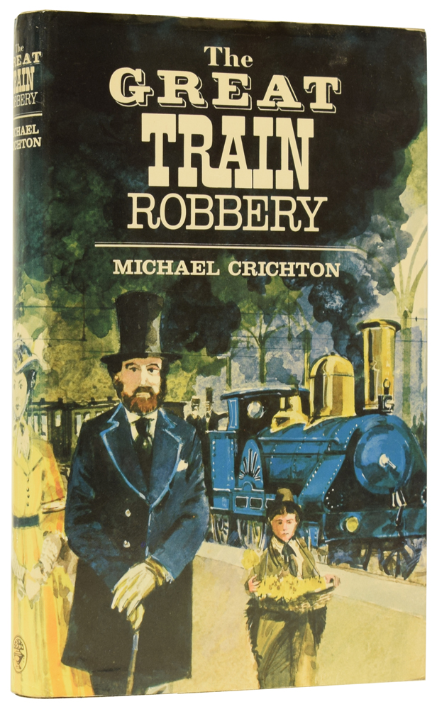
Book jacket (front), Albert A. Knopf edition [More info on ISFDB]
Michael Crichton’s historical novel about the Great Gold Robbery of 1855 was first published in 1975, by Jonathan Cape in the United Kingdom, and by Alfred A. Knopf in the United States.
The typography for the book cover and the title page of both editions explores the obvious Western theme, with a different typeface for each line, including a shaded 19th-century slab named Gold Rush, a bold Didone, two Clarendons, and a “railroad slab” (all-caps Figaro) for “Train”.
While Cape used this setup for the dust jacket, too (design by Leigh Taylor), Paul Bacon fancied something else for Knopf’s version, and went with a typeface that has stylistic roots in the 1890s: Hawthorn (Letraset, 1968) is a bolder rendition of De Vinne Condensed.
Book jacket, Jonathan Cape edition

Title page, Albert A. Knopf edition
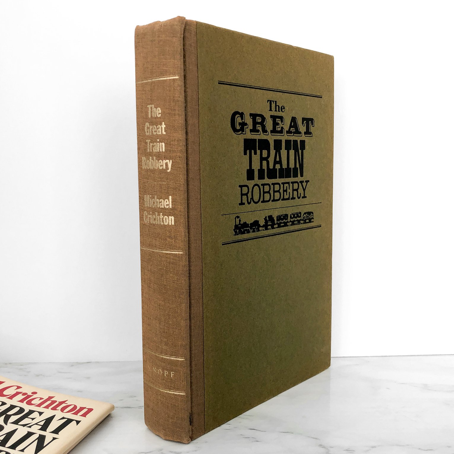
Book cover with spine, Albert A. Knopf edition
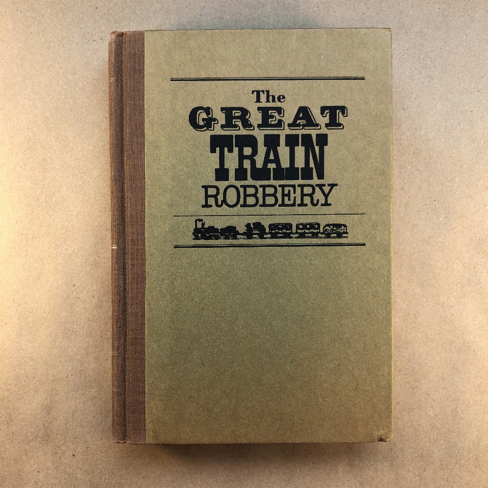
Book cover (front), Albert A. Knopf edition

Book jacket, Albert A. Knopf edition


")


")


")


")


4 Comments on “The Great Train Robbery by Michael Crichton (Knopf; Cape, 1975)”
I’m curious to know where the train illustration was taken from. Chances are it’s a pictorial train font as found in the back of some old specimen book, or clip art based on such a showing. Among digital fonts, there’s Pardon Me Boy! by Greater Albion Typefounders, and the silhouette fonts by Benjamin Coifman’s Rail Fonts.
Is it me, or does the C in Hawthorn look more polished here than on the cover of Searching for Caleb? The weight distribution in the lower half seems slightly different, with a bit of a bulge on the left side in the Caleb version.
Mmh, it could be a combination of fidelity (size), colors, and context (adjacent letters). I don’t think the letterforms were altered.
Yeah, looks like that’s it.