
Isabella Stewart Gardner Museum logo
Contributed by Florian Hardwig on Feb 3rd, 2014. Artwork published in
circa 2004
.
Source: www.dottedroute.com License: All Rights Reserved.

Source: miladysboudoir.wordpress.com License: All Rights Reserved.


5 Comments on “Isabella Stewart Gardner Museum logo”
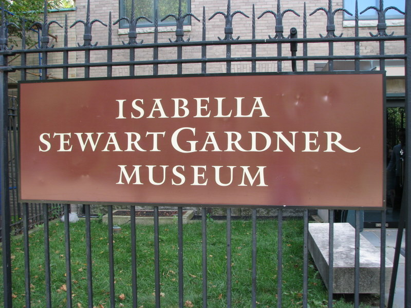
Am I the only one thinking how crap this wordmark looks? What’s with the combined 'T’ and 'E’ in 'Stewart’? It looks like 'Sewart’.
From what I can see of the character map of Mantinia, 'TE’ is not even a ligature as a feature of the font. Someone has just thought it was a good idea and made it.
And why is 'Gardner’ the only one of the three names to have a capital letter? Should all 3 names be lead with capitals? It just doesn’t look right.
Someone with a bit more sense should have stopped this idea before it started.
ps, as to my last response, I can see that 'TE’ is a feature of the font – code 2020. That doesn’t mean it is a good idea to use it in a wordmark…
Apparently, there was the wish to make the big ‘G’ the center of the wordmark. In this regard, the fancy ‘TE’ ligature makes sense. Otherwise, the three lines wouldn’t be centered anymore. The swash ‘R’ on the right takes the same line. But I agree that the idea doesn’t really work well. The ‘G’ does not stand out enough.
I guess there were two colliding ideas: to state the full name of the patron and to accentuate the initial ‘G’ of the actually used name, which is, short and simple, “the Gardner”.
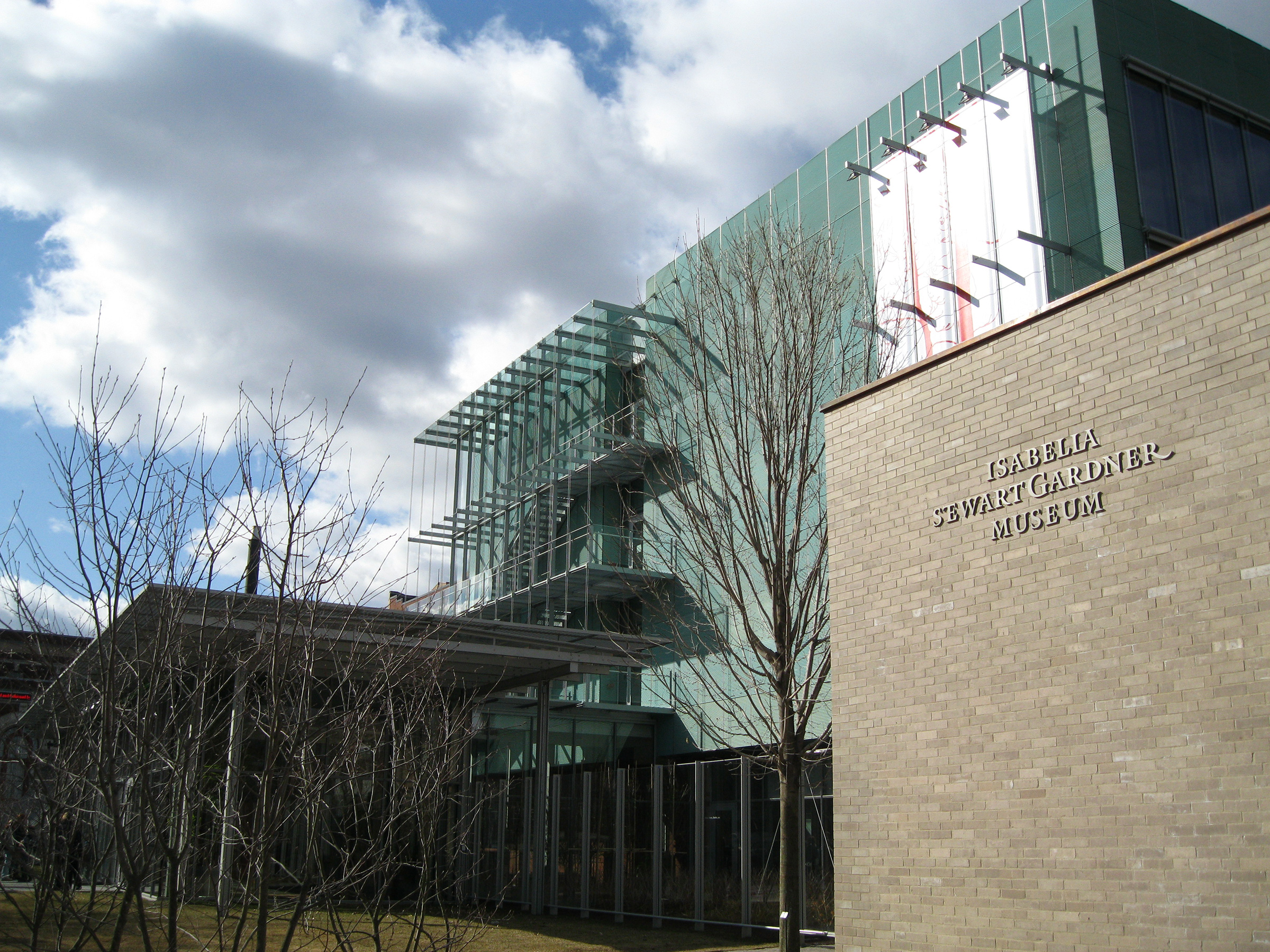
This is by 2x4. Was done about ten years ago, I think, before the museum expanded.
Thank you, Chris. I’ve added the designer credits. See more work for the Gardner Museum on the 2×4 website.