
re:publica posters, 1913–2013

Re:publica is an annual conference that deals with web-related topics like blogging, social media, digital society, and web politics. On the occasion of re:publica 13 which opened it doors in Berlin today, Wortfeld has published a series of historic conference posters, claiming that they were discovered “in the attic of the state archives in Berlin-Dahlem”. The posters purportedly prove that the roots of re:publica go back not only to 2007, but actually a full hundred years, when “engineers, artists, painters and musicians first met in a Berlin machine factory in 1913, under the wary eyes of the Prussian secret police”.
Although there are a couple of details that challenge their authenticity, the posters do a remarkable job at emulating the various historic styles of graphic design. It’s obvious that the designer(s) had lots of fun with these.
The images were published under a CC-by license.

While all genres here are more or less historically accurate, this spoof is easily detectable: The Art Nouveau letterforms by Charles Rennie Mackintosh (1868–1928) were not made into a typeface before 1996, when Phil Grimshaw digitized them as ITC Rennie Mackintosh. Also, such a combination of Jugendstil and blackletter was rather unusual.
Bonus points for correctly using the two forms of ‘s’ in ‘Diskuſſion’! (However, ‘Maſchinenfabrik’ would have needed a ‘long s’, too.)

Berthold Block is a very plausible choice for a German interwar poster. The condensed weights were not released before 1920, though.
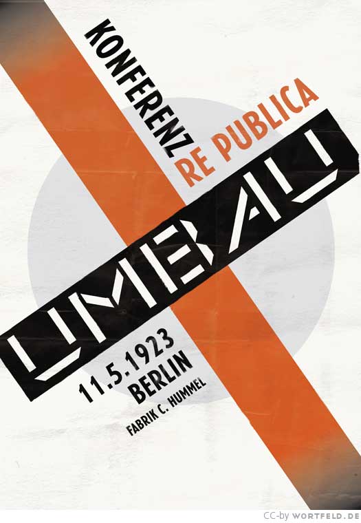
Constructivist typography similar to the works of El Lissitzky or Jan Tschichold, featuring the rarely seen P22 DeStijl Stencil. Erbar-Grotesk schmalhalbfett was not available before 1929, but this still feels pretty correct.

The 1928 poster is a nod to Kurt Schwitters and his MERZ collages, with a mix of Wilhelm Klingspor Gotisch, Akzidenz-Grotesk, some more Rennie Mackintosh, Block, Futura – and Adobe Garamond (1989).

This one is great! Every design that uses Reporter is great. The secondary typeface is Alternate Gothic No. 2.
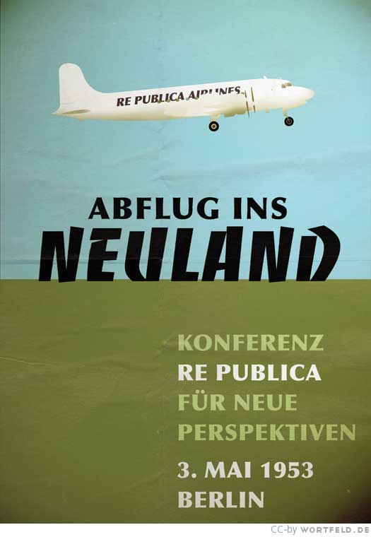
Roger Excoffon’s Banco (1951) and Hermann Zapf’s Optima Bold (1968) – almost. Fun fact: A specimen for Optima showed an airplane, too.
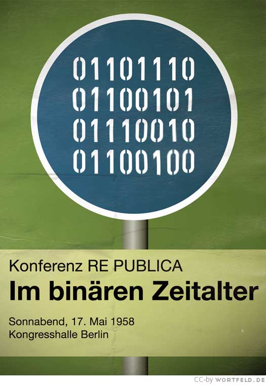
This poster feels the least authentic to me. Yes, Helvetica was already released in 1958 (at least the regular weight). Yes, multi-color photographic reproduction was possible, theoretically. The devil is in the details: the spacing – word spaces in particular – is way too wide for a pre-digital poster design.
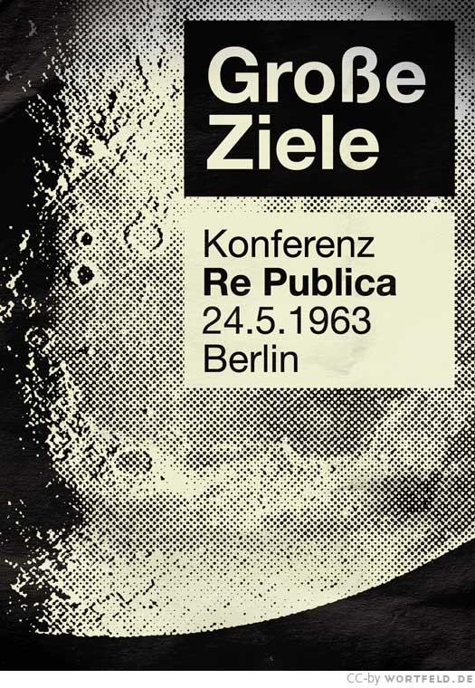
The 1963 edition is more credible: an economical one-color print with a coarse half tone image.


ITC Lubalin Graph was released in 1974, but apart from that, this is another good one. ITC Avant Garde Gothic really shines with that rainbow. Minor quibble: It looks more like a paperback cover than a poster.

Futura Extra Bold Condensed, tightly spaced and with heavy underlines – spot on for Germany anno 1978, cf. this poster by Klaus Staeck.
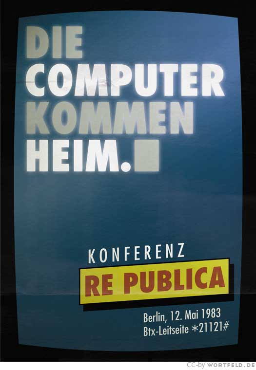
More Futura Condensed, now in several weights and all caps. Complete with a reference to the “Btx-Leitseite” – hilarious!

The 1988 poster features various styles of ITC Franklin Gothic. With the contrasty color blocks and the pipes as date separators, it successfully establishes a late eighties/early nineties atmosphere.

Props for using the actual Lucky Strike typeface here: This is Concorde, not Times New Roman.

Emigre’s Mrs Eaves indeed was an ubiquitous typeface in the late 1990s. Here it is paired with Akzidenz-Grotesk.

Last but not least, this is FF DIN Alternate (featuring the narrow C), with roughened contours.


 Czechoslovak movie posters (1978)")


")


3 Comments on “re:publica posters, 1913–2013”
See also the Homeland Vintage Jazz Record Covers.
Thanks for the detailed review! (Maſchinenfabrik: duh, should have spotted that.) I tried to aim for the typefaces that were designed at that time, but I didn’t research the release dates of each available weight…
By the way, “all rights reserved” should read “some rights reversed” since the posters are under a CC license.
Thank you for creating these! Such a series would make for a funny student assignment.
One thing that I didn’t touch upon in the comments is the fact that the lettershapes on posters often are not typographic (i.e. made with fonts), but lettered (drawn, painted, stencilled etc.) – certainly in 1913, but also in post-war decades. Of course I realize that drawing custom letters would have gone beyond the scope of this hoax …
For the “all rights reserved” bit: that’s a known bug – the template is not attuned to CC-licenses yet. Will look into this.