Roy Haynes – Cymbalism album art
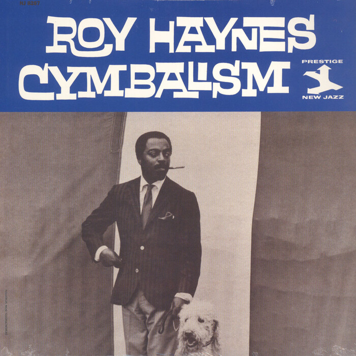
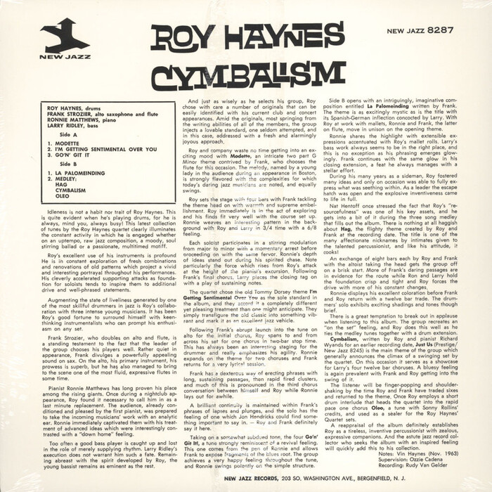
Roy Haynes is an American jazz drummer born in 1925 and active since 1942. His Cymbalism album was recorded in 1963 for New Jazz, a sublabel of Prestige Records.
For the cover typography, Don Schlitten (b. 1932) worked with Benguiat Interlock. Announced in 1959, this design by Ed Benguiat was Photo-Lettering’s first interlocking release, and, maybe together with Filmotype’s series, probably one of the earliest fontifications of such a lettering style.
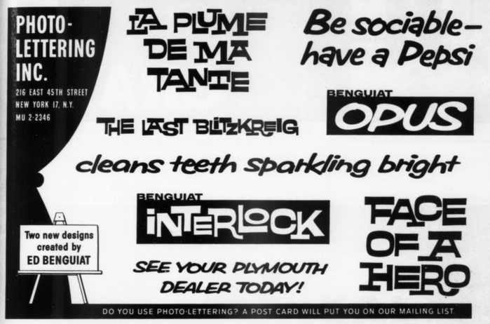
Print ad announcing Benguiat Interlock and Opus, “two new designs created by Ed Benguiat”, in Art Direction, Vol. 11, No. 3, June 1959
Without having access to a complete glyph set, it’s difficult to say to what extent the letterforms seen on the album cover come directly from PLINC’s film negative, and to what extent they were touched up. As the name implies, Photo-Lettering’s process was a hybrid one: the settings were based on prefabricated (i.e. typographic) letterforms stored on photographic film, but could be modified and elaborated on by one of their lettering artists on staff. What’s certain is that Benguiat drew a boatload of alternates to allow for a hand-rendered look with nicely interlocking pairs. The partial glyph set reproduced in Alphabet Thesaurus Vol. 2 includes a staggering sixteen different forms for the letter A, eleven for E, eight for S, seven for R, and still five for Y.
Formats
- Album Art (3439)
Topics
- Music (5197)
Designers/Agencies
- Don Schlitten (12)
Tagged with
- Roy Haynes (1)
- Prestige Records (15)
- album records (2182)
- vinyl records (2754)
- jazz (403)
- hard bop (12)
- post bop (9)
- 1960s albums (286)
- 1960s (623)
- reversed type (2921)
- all caps (5981)
- interlocking letterforms (73)
- back covers (1671)
- liner notes (132)
- Vin Haynes (1)
- three columns (212)
- justified text (808)
- alternate glyphs (1137)
- track listings (943)
Artwork location
- United States (8320)
- Bergenfield (7)
- New Jersey (81)
- New York City (2339)


